The 90 Day Mission That Will Change Your Trading ForeverI know people will attack me for this. But, it's possible if you really want something and you isolate yourself and put all the focus and energy in to it. You can make it. Today I will give you exact plan how I would do it, if I have to start from scratch.
1️⃣ First of all stop believing someone has a magic secret formula to be 100% right on the markets. Strategy that makes you rich in a week and solve all your financial problems? No one has it. It doesn't exist.
You want Lambo? Ok, materialistic goals can be also driver of your inner motivation, but it's not gonna happen in 90 days. Im talking about learning to trade in 90 days. Not getting rich. 2️⃣ Trading Random Patterns – Price Action Overfitting
If you’re trading random patterns and every trade has different logic, then you don’t have an edge. Random trading logic = random results.
‼️ Knowing all these 👇 and fitting them to the chart is not trading edge. Im not saying, these patterns cant work, but you must focus to the one and become a master. Not randomly choosing what fits to the chart today and taking trade on different logic tomorrow.
‼️ If your strategy is trading random patterns you know,
You can’t measure strategy performance. ⏩ What you can’t measure — you can’t improve or backtest. ⏩ And that means you’re don't have statistical data - its core of all problems.
💊 Solution:
Whatever pattern you like - Head and Shoulders, Triangle, Wedge, Channels, Cup and handle. Whatever but pic one, defined step by step process how you will be trading it. And always use mechanical aprocah how you will be trading it. Narrow criteria for every element of a trade to eliminate subjective decisions.
🛡️ You should have :
• Defined your pattern
• Method to define key levels
• Fixed method how to define a trend
• Fixed method how to trade continuation with your pattern
• Fixed method how to trade reversal by using your pattern
Define one trading pattern ( 1 kick ) Practice it 10 000 times become master 👇 For your inspiration, you can check this strategy, its eliminating subjective decisions.
🔗 Click the picture below to learn more. 👇 Approach information I gave above as Bruce Lee : Adapt useful, Reject useless and something specifically your own.
-----------------------------------------------------------------
If you are really committed and not here just for trying but you want it from your heart here it the Plan for the next 90 days for those who has 9 - 5.
1️⃣ Lets Cut Distraction's
❌ 1 . Adjust your phone - Social media and set Do not disturb permanently
Delete the apps or block them during your work window. I know it can feel hard, but harder it feels more you need it. Social media and short term content is distraction loop. During the mission Im cutting it completely and I go to this device. In normal life ( I have 30 minutes planned window) Social media are not bad if you visit them with intention. Just for curiosity put phone usage timer on your main desktop you will see how much time you waste daily if its more then 90 minutes, you got it. Thats whats holding you back.
❌ 2. Reduce Social Activity
When I am in Monk mode, I say no to most social stuff for a short period of time. No parties, Bar meetings and Alcohol. Not even meeting for coffee. As Im father then family duties must stay. That is non negotiable. But outside of that, I shrink my interactions down to almost zero unless the meeting clearly helps my Monk mode goal. Example
❌If I am focused on passing a prop challenge or backtesting some element I want to add to my strategy and someone invites me to a weekend full of drinking and late nights, it is a hard no.
✅If a trader that also trades same strategy invites me to a serious work session to review data or refine something, I will go. That supports the mission.
❌ 3. Cut porn and junk dopamine completely.
This is the uncomfortable part almost nobody wants to talk about, but it matters.If you are constantly stimulating yourself with porn and random adult content, your brain is fried with dopamine. Your focus span goes to zero. Your discipline collapses.
• No porn
• No “thirst trap” scrolling
• No mindless sexual content
• No dating apps
This should not be only for a monk mode. Porn is cancer for your focus cut it out from your life completely. After a few days without this junk, your energy levels change. You wake up more driven. You sit at the charts and you actually want to work. You start feeling like a hunter again, not a zombie.
❌ 4) Cancel Netflix and stop Watching news
Netflix is waste of time. Same is for the news. It doesn't matter knowing what orange mans says or how some sport results ended. You need to focus on your project
2️⃣ Once you ready to cut all above - Lets make a plan now
📅 Plan for people those who has 9 - 5 job
First start with your calendar and plan everything 90 days in advance when and where you will be doing your activities that will take you further in the trading. Now lets go here is activities
✅ 1. One Project — Your Core Mission 🎯
This is your main quest, for next 90 days it is powerful, because it removes decision fatigue it could be:
• Watching the educational Videos and making notes
• Backtesting 300+ trades of one model
• Building your strategy framework properly
• Creating your full trading plan
• Fixing your routine and sticking to it
Rules:
• Defined Activities - Mission
• Work on it daily
• Don’t switch
• Clear finish line ✅ 2. One book 📖
School didn’t prepare you for trading. You have to learn the parts nobody teaches:
• Mindset
• Psychology
• Discipline
• Focus
• Execution
• Stoicism
• Peak performance
30 minutes a day is enough.
Books give you depth. Unlike social media gives you shallow noise of social feeds. I suggest you Atomic Habits - from James clear if never read it. Also FLOW from Mihaly Csikszentmihalyi
✅ 3.One meditation - to reset your mind 🧘♂️
Meditation is like a gym without weights. I keep it simple. Twenty minutes every day, but you can start with 10 minutes if you didn't meditate ever. You can find some guided meditations on YouTube. But, dont let yourself catch in to a trap by scrolling and finding meditation. Prepare one in advance and put It to the playlist or just:
• Sit down
• Close your eyes
• Focus on your breath
• Let thoughts pass without judging or chasing them
Meditation help you regain control over your attention
✅ 4..One workout 💪
You can do either gym or calisthenic training. But not hard cardio, rather resistance training that builds strength. Instead of cardio you got walks. When Im in the monk mode I do Powerlifters training. Its simple, it increases your strength and I do not have to think about training complexity to much. I just come to the gym and finish my session in 45 minutes.
Measure you max weights and add 10%. Then start with 60% of the weight and add 5% every week. You can do more complex weight progression after 4 weeks but that would be for whole article. Search for Stefan Corte Powerlifting training. But dont overthink it. In Monk mode you want stupid repetitive routine.
Squats 6 x 6 - 60% - 65% - 70% - 75%
Bench 6 x 6 - 60% - 65% - 70% - 75%
Deadlift 6 x 6 - 60% - 65% - 70% - 75%
👉 Train hard 3 times a week - Mo / We / FR .. take a break on the weekends.
👉 Other 3 days focus on mobility training and stretching
👉 Take a break one day
Don't forget for 10 minutes warm
Do proper stretching after the training session.
✅ 5. Long walks (No phone , No music) 🚶♂️🌲
Long walks for clarity and aha moments. I go out for around 60 minutes, ideally in nature, with no phone and no music. Just walking, being present and thinking on my project
TIP - if you go for walk on the mornings and fasted, you body will take energy from fats.
As you are in the mode when focusing on project. Ideas begin to connect. You ll start seeing patterns, solutions, better rules. Many parts of my strategies, my routines, even my lifestyle changes were born on these walks.
✅ 6. Eat like an athlete, not a garbage bin 🥦
Food is another big lever. On your mission work in a light, fasted state during the main focus hours. I have my first real meal after I finish my most important work for the day. Before that I of course drink water, but nothing that spikes blood sugar. Because when you are full, heavy and bloated, your brain slows down. That is the last thing you want when you need to do deep work.
Keep it simple
1. Protein
2. Good carbs
3. Healthy fats
4. Minimal junk
Obviously in normal life I sometimes eat in Mc Donald or have Popcorn when taking daughter to the cinema. But No pizza and chips, No such a things in Monk mode. You are trying to become sharp, not sleepy.
🎯 Thats all easy said but how to do it.
You will most likely fail in the discipline, but it doesnt mean you cant start again over and over. Adjust your schedule, when you remove Netflix, Social media and contacts you gain new time, but you will have to put it somewhere in a day. I highly suggest to make it on the morning because after work you will be tired and your focus will not be so sharp.
You can do it , I believe in you. It's not possible to be on a Mission for whole year but you can disappear for some time and level up few times in a year. Im still doing it time to time when Im working on myself in trading, fitness or something in personal development.
David Perk
🟣 I promised myself I’d become the person I once needed the most as a beginner. Below are links to a lessons I shared on Tradingview. Hope it can help you avoid years of mistakes, trial and errors I went thru.
📊 Sharpen your trading Strategy
⚙️ 100% Mechanical System - Complete Strategy
🔁 Daily Bias – Continuation
🔄 Daily Bias – Reversal
🧱 Key Level – Order Block
📉 How to Buy Lows and Sell Highs
1️⃣ CLS Model 1 Explanation
2️⃣ CLS Model 2 Explanation
⚡ Order Block Master
🔮 FVG Mastery
💯 Institutional Levels
⏰ 9:30 Strategy
🎯 Dealing Range – Enter on pullbacks
💧 Liquidity – Basics to understand
🕒 Timeframe Alignments
🚫 Market Narratives – Avoid traps
🐢 Turtle Soup Master – High reward method
🧘 How to stop overcomplicating trading
🕰️ Day Trading Cheat Code – Sessions
🇬🇧 London Session Trading
🔍 SMT Divergence – Secret Smart Money signal
📐 Standard Deviations – Predict future targets
🎣 Stop Hunt Trading
💧 Liquidity Sweep Mastery
🔪 Asia Session Setups
📀 Gold Strategy
🧠 Level Up & Mindset
🛕 Monk Mode – Transition from 9–5 to full-time trading
⚠️ Trading Enemies – Habits that destroy success
🔄 Trader’s Routine – Build discipline daily
💪 Get Funded - $20 000 Monthly Plan
🧪 Winning Trading Plan
⭕ Backtesting vs Reality
❌ Don't Fear Being Wrong
✅ Advice For Beginners
🛡️ Risk Management
🏦 Risk Management for Prop Trading
📏 Risk in % or Fixed Position Size
🔐 Risk Per Trade – Keep consistency
🧪 Risk Reward vs Win Ratio
💎 Catch High Risk Reward Setups
☯️ Smart Money - Who control Markets
🔱 Risk Reward vs Win rate
⚠️ CLS Risk Management
💊 Survive Loosing Streak
Community ideas

What 14 Million Tests Say About MACDThis paper is the fourth in a series. The first study tested RSI across 26 million configurations and found zero Bonferroni-significant results. The second documented a small but genuine Turn of the Month anomaly, with 21 significant results from 385 tests. The third examined VWAP and produced the strongest findings so far: 150,546 Bonferroni-significant results concentrated in mean reversion, with short signal edge of 0.89 percentage points, roughly six times transaction costs.
MACD was always going to be next. The Moving Average Convergence Divergence indicator is the second-most popular technical analysis tool after RSI, present on virtually every charting platform, explained in every trading course, and defended with religious fervor. It has also been defended, occasionally, in the academic literature. Brock, Lakonishok and DeLoach (1992) found some evidence for moving average rules on the Dow Jones Industrial Average. That paper has been cited over three thousand times and forms the intellectual scaffolding for every MACD apologist who claims institutional backing.
We tested MACD more thoroughly than it has been tested before. 14,310,400 parameter configurations across eight distinct strategies, 20 assets spanning six categories, 436 valid parameter pairs, eight signal periods, and 26 holding periods. The same Welch t-test framework with Bonferroni correction used for RSI, Turn of the Month, and VWAP. The results are unambiguous. MACD generates 3,235 Bonferroni-significant results from over 14 million tests, of which 2,844 concentrate in a single strategy type, histogram divergence, on the short side. The overall mean long edge is +0.054 percentage points and the mean short edge is +0.018 percentage points. Both are economically negligible, falling well below transaction costs. The standard 12/26/9 setup, the configuration taught in every introductory course, produces zero Bonferroni-significant results. The line crossover, the most commonly used MACD signal, also produces zero.
MACD joins RSI in the category of indicators that fail systematic testing. Unlike RSI, which produced absolutely nothing, MACD shows a faint statistical pulse in divergence signals. That pulse is too weak and too concentrated to constitute a trading strategy, but it exists. Whether it constitutes a genuine edge or a statistical artifact at the boundary of detection is a question the data cannot definitively resolve.
1. Introduction
Gerald Appel introduced the MACD indicator in 1979 as a tool for identifying changes in trend momentum (Appel, 1979). The calculation is straightforward: take the difference between a fast exponential moving average and a slow exponential moving average of price, then smooth that difference with a third exponential moving average called the signal line. The difference between the MACD line and the signal line forms the histogram. Appel recommended the 12/26/9 parameterization, meaning 12-period and 26-period EMAs with a 9-period signal smoothing. That combination has since become one of the most widely recognized parameter sets in all of technical analysis.
The indicator spread quickly through the retail community. By the 1990s, MACD was included as a default indicator on nearly every charting platform. Murphy (1999) dedicated an entire chapter to it in his standard reference on technical analysis. Elder (1993) featured it prominently in his trading methodology. Pring (2002) described it as one of the most reliable momentum indicators available to traders.
These endorsements were based on observation, pattern recognition, and discretionary experience, not systematic statistical testing. The academic treatment of MACD has been more cautious. Brock, Lakonishok and DeLoach (1992) tested simple moving average rules on the Dow Jones Industrial Average from 1897 to 1986 and found some evidence of predictive content in moving average signals. Their results applied to simple moving average crossovers, not specifically to MACD, but the paper became the most frequently cited academic justification for MACD-type strategies. Sullivan, Timmermann and White (1999) subsequently re-examined these results using the bootstrap reality check methodology and found that after correcting for data snooping, the evidence weakened substantially.
Lo, Mamaysky and Wang (2000) applied computational pattern recognition to technical analysis and concluded that some technical patterns contain genuine information, while cautioning that the magnitude was economically small after costs. Park and Irwin (2007) surveyed 95 studies of technical analysis profitability and concluded that the evidence was mixed, with earlier studies tending to find profitability and later studies, using more rigorous methodology, finding less.
The academic literature on MACD specifically, as distinct from simple moving average rules, is thin. Most quantitative studies lump MACD into broader examinations of moving average rules without testing its specific strategy variants independently. This gap leaves the retail community relying on decades-old endorsements from practitioners rather than on direct statistical evidence. The present study fills that gap with what we believe is the most comprehensive systematic test of MACD strategies in the available literature: 14,310,400 parameter configurations tested with Bonferroni correction across a diversified asset universe.
2. What MACD measures
MACD is built from three exponential moving averages. The MACD line equals the fast EMA minus the slow EMA:
MACD line = EMA(close, fast period) minus EMA(close, slow period)
The signal line smooths the MACD line:
Signal line = EMA(MACD line, signal period)
The histogram equals the difference:
Histogram = MACD line minus Signal line
When the fast EMA exceeds the slow EMA, the MACD line is positive, indicating that recent prices are higher than prices over the longer lookback. When the MACD line exceeds the signal line, the histogram is positive, indicating that the trend is accelerating. Traders interpret these relationships as momentum signals.
The standard 12/26/9 parameterization uses alpha equal to 2/(n+1) for each EMA, giving the fast EMA a smoothing factor of approximately 0.154, the slow EMA approximately 0.074, and the signal line approximately 0.20. These are not derived from any optimization or theoretical framework. Appel (1979) selected them based on his visual examination of stock charts. The combination stuck because it was published first, not because it was demonstrated to be optimal.
At its core, MACD measures the difference between two lagged representations of the same price series. Both the fast and slow EMAs are functions of past closing prices, weighted by geometrically declining coefficients. The MACD line captures the difference in how quickly these two representations respond to recent price changes. When price moves sharply, the fast EMA reacts first, creating a gap that the MACD line registers. The signal line further smooths this gap.
The critical question is whether this double-differenced, triple-smoothed transformation of price adds information that the original price series does not contain. Moving averages are linear combinations of past prices. Taking the difference of two moving averages produces another linear combination of past prices. Smoothing that difference with a third moving average produces yet another linear combination. At every step, the input is price, and the output is a weighted average of past prices. No new information enters the calculation at any stage.
This is the same structural problem documented in our RSI study. RSI computes a ratio of recent up moves to recent down moves, which is a nonlinear transformation of price, and still produces zero Bonferroni-significant results. MACD performs a purely linear transformation, which is theoretically even less likely to extract latent information. The question is whether the empirical evidence agrees with this theoretical expectation.
3. Common MACD strategies
Retail MACD education centers on eight interpretive frameworks. Some are taught in every introductory course. Others appear in more advanced material. All eight are represented in our test battery.
The line crossover interprets the MACD line crossing above the signal line as a buy signal and crossing below as a sell signal. This is the canonical MACD trade and the first strategy every tutorial teaches.
The zero-line cross interprets the MACD line crossing above zero as bullish, meaning the fast EMA has overtaken the slow EMA, and crossing below zero as bearish.
The histogram direction change interprets the histogram crossing from negative to positive as a buy signal and positive to negative as a sell signal. Because the histogram equals MACD line minus signal line, this is equivalent to the line crossover with one bar less lag.
The histogram divergence compares price action with histogram behavior over a lookback window. When price makes a new low but the histogram does not, this is interpreted as bullish divergence. When price makes a new high but the histogram does not, bearish divergence.
The price-MACD divergence is similar but compares price against the MACD line itself rather than the histogram. Price making a new low while the MACD line does not suggests weakening downward momentum.
The histogram momentum strategy looks for three or more consecutive bars of increasing or decreasing histogram value, interpreting sustained directional movement in the histogram as acceleration in the underlying trend.
The above-zero filtered crossover restricts the standard line crossover to signals occurring when the MACD line is above zero for longs and below zero for shorts. The logic is that a crossover above the zero line represents a stronger confirmation because it occurs within an established trend rather than against one.
The histogram peak-trough reversal identifies local extrema in the histogram and enters when the histogram reverses from a peak or trough. A trough followed by a rising bar generates a long signal. A peak followed by a falling bar generates a short signal.
None of these strategies has a theoretical derivation. They are all interpretive frameworks applied to a derived indicator, based on the assumption that various patterns in the MACD-signal-histogram relationship predict future price direction. The divergence strategies have the weakest theoretical basis of all, requiring price and momentum to disagree in a specific way and treating the disagreement as predictive. Whether any of them contain information is an empirical question.
4. Data and methodology
4.1 Asset universe
We constructed a universe of 20 ETFs across six categories covering the major liquid segments of global financial markets.
US large cap equities comprised SPY, QQQ, IWM, DIA, and VTI, providing exposure from the S&P 500 to the total market. Sector ETFs included XLF, XLK, XLE, XLV, and XLU, spanning financials, technology, energy, healthcare, and utilities. International equities included EFA and EEM, covering developed and emerging markets. Fixed income comprised TLT, IEF, and AGG, spanning long-duration treasuries, intermediate treasuries, and the aggregate bond market. Commodities included GLD, SLV, and USO, covering gold, silver, and oil. Real assets comprised VNQ and DJP, covering REITs and a broad commodity index.
All data is daily, sourced from TwelveData with Tiingo as fallback, covering approximately 5,000 trading days per asset.
4.2 Parameter grid
We tested the full practical range of MACD parameters:
Fast period: 2 through 20 in steps of 1, giving 19 values. Slow period: 10 through 60 in steps of 2, giving 26 values. Valid parameter pairs require the slow period to exceed the fast period by at least 5, producing 436 valid combinations. Signal period: 3, 5, 7, 9, 12, 15, 18, and 21, giving 8 values. Holding period: 1, 2, 3, 4, 5, 6, 7, 8, 9, 10, 12, 14, 16, 18, 20, 25, 30, 40, 50, 60, 75, 90, 120, 150, 180, and 252 trading days, giving 26 values from one day to one full year.
The total configuration space is 8 strategies multiplied by 20 assets multiplied by 436 parameter pairs multiplied by 8 signal periods multiplied by 26 holding periods, equalling 14,510,080 target tests. After filtering for minimum data length and minimum signal counts, 14,310,400 valid test results remained.
4.3 Strategy implementation
For each asset and parameter combination, MACD is calculated once using pandas ewm with adjust=False, which produces the standard exponential moving average with alpha equal to 2/(n+1). All eight strategies generate their signals from this single MACD calculation. Forward returns are computed as close-to-close returns over the specified holding period. This avoids look-ahead bias: the signal fires at bar t, and the return is measured from the close of bar t to the close of bar t plus the holding period.
4.4 Statistical framework
Edge equals the mean forward return following a signal minus the mean forward return over all bars in the same asset sample. This baseline-adjusted approach ensures that a strategy in a rising market does not receive credit for beta. Significance is assessed using Welch's t-test for unequal variances. A minimum of 10 signals per configuration is required. Given 14,310,400 valid tests, the Bonferroni-corrected significance threshold at alpha equal to 0.05 is 3.49 times ten to the negative ninth power. Surviving this threshold requires a result so extreme that it would occur by chance fewer than once in 300 million tries under the null hypothesis.
5. Results
5.1 Aggregate findings
Figure 1 presents the overall picture, and it is a quiet one. Mean edges cluster near zero for most strategies. No strategy produces mean edge exceeding 0.35 percentage points on either side. Histogram divergence and price-MACD divergence are the only strategies with visible positive bars on the long side. The annotations beneath each strategy name show Bonferroni-significant test counts, and most read zero.
Across all 14,310,400 tests, mean long edge is +0.054 percentage points and mean short edge is +0.018 percentage points. Both figures are below the 0.10 to 0.15 percentage points required to cover round-trip transaction costs for liquid ETFs. Even if these edges were statistically robust, they would not survive implementation.
Figure 2 decomposes by asset category and shows that the weak aggregate results are not masking strong effects in subgroups. US equities show the most positive numbers: long edge +0.209 percentage points and short edge +0.128 percentage points. But even these figures are marginal relative to transaction costs and do not achieve significance after Bonferroni correction in the vast majority of configurations.
5.2 Statistical significance
Figure 3 maps the parameter space. The heatmap is dominated by colors near zero, with no clearly defined region of strong positive or negative edge. The standard 12/26 position sits in an unremarkable part of the landscape, neither at a local optimum nor at a local minimum. There is no hidden sweet spot that traders are missing. The parameter space is uniformly mediocre.
Figure 4 examines whether edge develops at longer holding horizons, as it did for VWAP mean reversion. The answer is no. Long and short edges show no consistent monotonic pattern across holding periods. Some strategies show mild positive edge at very long holding periods above 120 days, but the effects are small, inconsistent across strategies, and could plausibly reflect equity risk premium rather than MACD signal content.
Figure 5 shows the p-value distribution. Under the null hypothesis, p-values distribute uniformly. The observed distribution is close to uniform, with a mild excess at low values that is much less pronounced than the sharp spike documented in the VWAP study. The excess represents the 391 long-side and 2,844 short-side Bonferroni-significant results. These are not zero, which distinguishes MACD from RSI, but they are not the kind of departure from uniformity that characterizes a robust indicator.
5.3 Results by strategy
Histogram divergence is the only strategy with a meaningful number of significant results. Of 1,788,800 histogram divergence tests, 255 long signals and 2,844 short signals survive Bonferroni correction. Mean long edge is +0.323 percentage points, mean short edge is +0.102 percentage points. The long edge is above transaction costs. The short edge is not.
The mechanism behind histogram divergence is that price makes a new low over a lookback window while the MACD histogram does not. This is interpreted as weakening selling pressure. The data suggests this interpretation has some validity: when selling pressure weakens as measured by the histogram failing to confirm a price low, subsequent long returns are modestly above baseline. The effect is real in the statistical sense of surviving strict correction. Whether it is robust enough to build a strategy around is another question: 255 Bonferroni-significant long results from 1.79 million tests is a survival rate of 0.014 percent.
Price-MACD divergence produces 136 Bonferroni-significant long results with mean long edge of +0.347 percentage points. This is structurally similar to histogram divergence but uses the MACD line itself rather than the histogram. The slightly higher mean edge and lower survival count suggest a less consistent but occasionally stronger signal.
Line crossover produces zero Bonferroni-significant results from 1,788,800 tests. The canonical MACD trade, the one drawn first on every tutorial chart, has no statistical support.
Zero-line cross produces zero Bonferroni-significant results. The idea that the fast EMA overtaking the slow EMA predicts future returns is not supported.
Histogram direction change produces zero Bonferroni-significant results. This is equivalent to the line crossover with slightly different timing, and the data treats them identically: both fail.
Histogram momentum produces zero Bonferroni-significant results. Three consecutive bars of histogram acceleration predict nothing.
Above-zero filtered crossover produces zero Bonferroni-significant results. Adding a trend filter to a crossover that does not work does not produce a crossover that works.
Histogram peak-trough reversal produces zero Bonferroni-significant results. Identifying local extrema in the histogram and trading the reversal generates random outcomes.
Figure 7 presents the complete numerical summary. Six of eight strategies produce zero Bonferroni-significant results. The two that produce significant results, histogram divergence and price-MACD divergence, account for a total of 3,235 significant tests from 14.3 million, a rate of 0.023 percent. For comparison, VWAP mean reversion alone produced 100,765 significant results from 1.68 million tests, a rate of 6.0 percent.
5.4 Results by asset category
US equities show the strongest effects: long edge of +0.209 percentage points and short edge of +0.128 percentage points. This is consistent with US equities being the most liquid, most traded, and most studied market, where any residual signal is most likely to appear.
International equities show modest long edge of +0.028 percentage points but more interesting short edge of +0.193 percentage points. Sector ETFs show positive long edge of +0.134 percentage points with short edge near zero.
Commodities show negative edge on both sides: long negative 0.175 percentage points and short negative 0.180 percentage points. This means MACD signals applied to commodity ETFs actively destroy value on both the long and the short side. The commodity result is consistent with the lack of volume-based microstructure dynamics in commodity ETFs, where price movements are driven by supply-demand fundamentals rather than by institutional execution patterns.
Fixed income shows mildly negative edge on both sides. Real assets show negligible edge in both directions.
5.5 The standard 12/26/9 setup
Figure 8 isolates the question every MACD user wants answered: is the standard setup at least better than the average parameter combination?
From 4,160 tests using exactly the 12/26/9 parameterization, mean long edge is +0.060 percentage points and mean short edge is negative 0.012 percentage points. Bonferroni-significant results: zero on both sides.
The violin plots show the 12/26/9 distribution sitting squarely in the middle of the full parameter distribution. It is not worse than average. It is not better than average. Appel's original recommendation, selected from visual chart examination in 1979, performs almost exactly at the median of the parameter space. There is no hidden better combination waiting to be discovered either: the best mean long edge across all parameter combinations is +0.656 percentage points (price-MACD divergence, fast=20, slow=26, signal=3), which sounds like progress until you realize it is a mean across 20 assets and 26 holding periods and that the best-looking aggregate can easily emerge from random variation when 3,488 parameter triplets are evaluated.
6. Comparison with previous studies
Four indicators, 46 million tests, one consistent framework. The scoreboard:
RSI: zero Bonferroni-significant results from 26 million tests. The most popular technical indicator generates random output.
Turn of the Month: 21 Bonferroni-significant results from 385 tests. A small test universe with a real effect driven by identifiable institutional flow cycles.
VWAP: 150,546 Bonferroni-significant results from 5.8 million tests. Mean reversion short signals deliver 0.89 percentage points of edge, roughly six times transaction costs. A genuine, economically meaningful finding with a clear microstructure mechanism.
MACD: 3,235 Bonferroni-significant results from 14.3 million tests. Concentrated in histogram divergence with mean long edge of +0.323 percentage points. Marginal relative to transaction costs. No strategy variant approaches the economic significance of VWAP mean reversion.
The pattern that emerges across these four studies is now well established. Price-only transformations, RSI and MACD, fail. Both indicators take closing prices, apply mathematical operations, and return a derived series that contains no information beyond what the original price series already carried. The EMAs in MACD are linear weighted averages of past prices. Their differences are linear combinations of linear combinations. No transformation in this chain can create information that the input did not contain.
Volume-incorporating indicators, specifically VWAP, succeed. VWAP integrates volume with price and thereby accesses information about market participation that price alone does not capture. The institutional execution patterns around VWAP create genuine supply-demand dynamics that a price-only indicator cannot detect.
Calendar effects, Turn of the Month, succeed because they proxy for institutional flow patterns anchored to economic payment cycles. The information comes from the calendar, not from price.
The lesson is consistent: indicators predict when they access information beyond the price series. Indicators that merely transform price cannot create information the price did not already contain. This is not a philosophical position. It is a consistent empirical finding across 46 million tests.
7. Why MACD fails and why divergence partially survives
7.1 The mathematical constraint
MACD is a linear function of past prices. The fast EMA, the slow EMA, the MACD line, the signal line, and the histogram are all linear combinations of the same closing price series with different weighting schemes. In the framework of Lo, Mamaysky and Wang (2000), the question is whether the specific weighting scheme applied by MACD isolates information that raw price data obscures. For linear filters applied to the same underlying series, the answer is generally no. A linear filter can redistribute information across frequencies but cannot create it. The EMA emphasizes recent prices relative to older prices. The MACD line computes the difference between two such emphases. The result is a signal that is correlated with recent price momentum but carries no independent information about future returns.
This is different from VWAP, which multiplies price by volume before averaging. That multiplication introduces a genuinely new data dimension. MACD multiplies price by nothing except predetermined decay weights that are functions of the chosen period parameters.
7.2 Why divergence is different
Histogram divergence and price-MACD divergence are structurally different from the other six strategies because they compare two separate quantities: price level and an oscillator derived from price. When price makes a new low but the histogram does not confirm that low, the signal is detecting a nonlinear discrepancy between raw price and the smoothed momentum measure. This is a second-order relationship that goes beyond the simple linear filtering of the crossover strategies.
The divergence detection involves comparing local extrema in two different series, a comparison that introduces a nonlinearity the other MACD strategies lack. Price can make new lows while smoothed momentum improves because the rate of decline is slowing even as the level continues to fall. This is economically interpretable: weakening selling pressure before a price reversal.
The divergence signals survive Bonferroni correction, but barely. 255 long and 2,844 short results from 3.58 million divergence tests is a survival rate of 0.087 percent. For context, VWAP mean reversion produces a survival rate of 6.0 percent, roughly 70 times higher. The divergence effect is real in the statistical sense but sits at the edge of what can be confidently distinguished from multiple testing artifacts at this scale.
7.3 What Brock, Lakonishok and DeLoach actually found
The most cited academic defense of MACD-type strategies is Brock, Lakonishok and DeLoach (1992), who tested simple moving average crossover rules on the DJIA from 1897 to 1986. Their results showed buy signals following moving average crossovers generated higher returns than sell signals.
Three qualifications limit the applicability of those results to modern MACD trading. First, the study tested simple moving averages, not exponential moving averages with a signal line. MACD's triple-EMA structure is a more complex filter than anything Brock and colleagues examined. Second, the study used a single asset, the DJIA, over a single period. Sullivan, Timmermann and White (1999) applied the bootstrap reality check to an expanded set of technical trading rules and found that after correcting for the full universe of rules that could have been tested, the significance of the best-performing rule was substantially reduced. Third, the study period ended in 1986. Markets in 1986 were structurally different from markets in 2026: spreads were wider, execution was slower, algorithmic trading was non-existent, and information dissemination operated on fundamentally different timescales. A moving average rule that exploited slow information diffusion in 1960 would face a radically different environment today.
Our results on 14.3 million tests across 20 assets and 40 years of more recent data find no support for MACD crossover strategies. This is not inconsistent with Brock and colleagues finding weak support for simple moving average rules on one asset ending in 1986. It simply means that any signal that may have existed has been arbitraged away, or that it was specific to the asset, period, and methodology of the original study.
8. Implications
For traders using MACD crossover: 1,788,800 configurations tested. Zero Bonferroni-significant results. This is the same outcome as VWAP crossover and the same outcome as RSI in general. Crossover strategies applied to momentum oscillators do not predict future returns. The consistency of this null result across three independent indicators tested in three separate studies suggests that the finding is not specific to any one indicator. It is a property of crossover signals derived from price transformations.
For traders using MACD divergence: the data shows a statistically real but economically marginal effect. Histogram divergence long signals average +0.323 percentage points, which exceeds transaction costs but only modestly. The effect concentrates in specific assets and parameter combinations rather than being broadly available across the universe. A trader who restricts MACD usage exclusively to divergence signals on US equities with carefully selected parameters might extract a small positive edge. Whether that edge justifies the complexity of implementation relative to alternatives such as VWAP mean reversion, which delivers nearly three times the edge with 70 times the significant configurations, is a question of opportunity cost.
For systematic strategy developers: MACD does not belong in the toolbox as a primary signal generator. The 14.3 million tests produce no evidence of consistent, economically meaningful prediction from any MACD strategy variant. This does not preclude MACD as a filter or auxiliary input in a broader system, but the data does not support building a strategy around MACD signals. Resources allocated to MACD-based strategy development would generate substantially higher expected returns if redirected to VWAP mean reversion or calendar-based approaches.
For trading educators: the standard MACD curriculum, centered on line crossovers and the 12/26/9 setup, teaches strategies that have been tested across 14 million configurations and produce nothing. If MACD must remain in curricula for completeness, the honest presentation would acknowledge that crossover signals have no statistical support, that the 12/26/9 setup is no better than the median parameter combination, and that the only variant with any empirical basis is divergence, which even then produces marginal edge. Teaching the standard MACD crossover as a viable trading strategy is, at this point, not supported by the evidence.
9. Limitations
Several constraints bound the conclusions. First, this study tests daily data only. MACD behavior on intraday timeframes was not examined. The VWAP study showed that timeframe matters substantially, and it is possible that MACD performs differently on 4-hour or weekly data, though there is no theoretical reason to expect it would.
Second, we tested MACD in isolation. Some practitioners combine MACD with other indicators, support and resistance levels, or fundamental filters. These combinations were not evaluated. It is possible that MACD contributes useful information as one component of a multi-factor system even though it fails as a standalone signal, though the same could be said of any random variable.
Third, the divergence lookback was fixed at 14 bars. Variable lookback periods for divergence detection might produce different results.
Fourth, execution was assumed at bar close. Real execution involves slippage that would further reduce the already-marginal edge values.
Fifth, this study does not test whether MACD had predictive value in earlier historical periods that has since been arbitraged away. It is possible that MACD signals were informative in the 1980s and 1990s when markets were less efficient and algorithmic trading did not exist. That hypothesis is not testable with the data horizon available.
References
Appel, G. (1979). The Moving Average Convergence-Divergence Trading Method. Signalert Corporation, Great Neck, NY.
Appel, G. (2005). Technical Analysis: Power Tools for Active Investors. Financial Times/Prentice Hall, Upper Saddle River, NJ.
Brock, W., Lakonishok, J. and DeLoach, S. (1992). Simple technical trading rules and the stochastic properties of stock returns. Journal of Finance, 47(5), pp. 1731-1764.
Elder, A. (1993). Trading for a Living: Psychology, Trading Tactics, Money Management. John Wiley and Sons, New York.
Lo, A.W., Mamaysky, H. and Wang, J. (2000). Foundations of technical analysis: Computational algorithms, statistical inference, and empirical implementation. Journal of Finance, 55(4), pp. 1705-1765.
Murphy, J.J. (1999). Technical Analysis of the Financial Markets. New York Institute of Finance, New York.
Park, C.H. and Irwin, S.H. (2007). What do we know about the profitability of technical analysis? Journal of Economic Surveys, 21(4), pp. 786-826.
Pring, M.J. (2002). Technical Analysis Explained. 4th edn. McGraw-Hill, New York.
Sullivan, R., Timmermann, A. and White, H. (1999). Data-snooping, technical trading rule performance, and the bootstrap. Journal of Finance, 54(5), pp. 1647-1691.

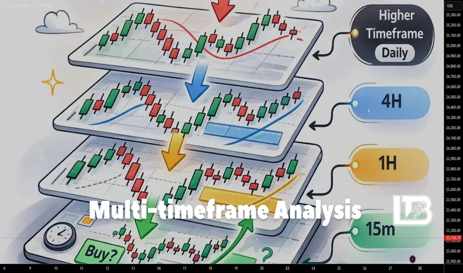
Multi-timeframe analysis
If you find yourself confused by timeframes, unsure why the market appears to be in a downtrend on one timeframe while showing an uptrend on another, and you do not know how to interpret this information, then this educational material is for you.
Multi-timeframe analysis is the foundation of any approach to chart analysis. The essence of this approach is that you use several timeframes to analyze the market.
I will refer to timeframes as three different perspectives.
The first is the long-term perspective.
This is the timeframe you use to analyze the overall context. In essence, this is where you form your bias regarding the market. It is always the higher timeframe.
The second is the medium-term perspective.
This is your intermediate timeframe. Very often, the medium-term perspective is used to track the movement of price toward the targets that you identified on the higher timeframe.
The third is the short-term perspective.
This is your lowest timeframe. This is where you will most often execute your trade entries.
There is one small clarification here. If you are just starting out, three timeframes will be sufficient for forming your bias and executing entries. However, more experienced traders may use more than three timeframes. Even so, they will still belong to the same three categories: long-term, medium-term, and short-term perspectives.
For example, two timeframes may be used for the long-term perspective, but they will still belong to the same category and simply complement each other.
So why is multi-timeframe analysis necessary at all?
I like to compare it to looking at a painting. If you observe a painting from very far away, you may miss important details and fail to understand the meaning the artist intended to convey. But if you look at it from too close, you will no longer be able to understand what the painting represents as a whole.
In both cases, your understanding of the painting will be incomplete.
The core idea behind multi-timeframe analysis is that when you move to a lower timeframe, you are essentially zooming in on a specific section of the chart and beginning to see more details within the price movement.
Now let us imagine the following section of a chart.
It belongs to the long-term perspective.
If you switch to the medium-term perspective, you will be looking at a smaller portion of the chart that is broken down into more detailed movements.
Here is the part of the chart you will be observing (this depends on how much you zoom in or zoom out):
And here is how that section may be broken down into more detailed movements:
For better understanding, I will overlay one chart on top of the other.
The black line represents the long-term perspective, and the blue line represents the medium-term perspective.
To understand this more clearly, let us perform a simple analysis.
Within the long-term perspective, the price is in an uptrend.
At the moment, the price is undergoing a correction.
Conditionally speaking, we expect the uptrend to continue.
Within the medium-term perspective, this appears as a range. However, if we break it down into local trends, we can clearly see both an upward and a downward trend.
The downward trend is essentially the correction within the long-term perspective.
Since we expect the continuation of the long-term uptrend, it would be logical to wait for a shift in the local bearish order flow on the medium-term perspective. After that, we can begin looking for entry models that align with the continuation of the uptrend.
Now let us talk about the short-term perspective.
In the same way, when you move from the medium-term perspective to the short-term perspective, you will be looking at a smaller portion of the chart that is broken down into even more detailed movements.
Here is the portion of the chart you will be observing (again, this depends on how much you zoom in or zoom out):
And here is how it may be broken down into more detailed movements:
Here is what happens if we overlay one chart on top of the other:
If we try to overlay the short-term perspective onto the long-term perspective, the section of the chart you are observing will look like this:
Let us continue our analysis.
Suppose we waited for the shift from the local downward movement to an upward movement on the medium-term perspective.
In this case, we achieve synchronization between the long-term and medium-term perspectives.
The long-term perspective is in an uptrend, and the medium-term perspective is also in an uptrend.
To synchronize with the short-term perspective, it is sufficient to simply look for long opportunities on the lower timeframe.
In this situation, all three perspectives are aligned. Your position therefore has a higher probability of working out.
Open your charts and try applying what you have just read. You will be surprised by how simple it actually is.
If you still have questions, feel free to write them in the comments.
Enjoy!
BTC Predicts S&P500 Gap — Your Backtests Are ObsoleteHey traders,
Today I want to share the results of a deep quantitative dive my data analyst and I recently put together.
It started with a simple, slightly obsessive idea. I asked myself: "Since crypto trades 24/7 and fiat markets take the weekend off, could Bitcoin’s Saturday/Sunday price action act as a lead indicator for Monday morning gaps in traditional markets?"
At first, we tested this hypothesis on the Forex market, trying to find a link between weekend Bitcoin moves and the Monday morning EUR/USD gap during the Asian session. We ran the numbers. The result? A big fat zero. There was zero statistical significance. They were living in parallel universes.
But we didn’t stop there. If not currencies, what about equities? So, we shifted our focus to the S&P 500 futures (ES=F). And that’s when the data started telling a completely mind-blowing story.
🕵️♂️ The Weekend Anatomy (The 2-Year Test)
We pulled hourly data over the last two years (roughly 100 full weekends) and categorized Bitcoin’s behavior from Friday close to Sunday evening into three buckets:
🔴 Drop: BTC fell by more than 1.5%.
⚪ Flat: BTC moved somewhere between -1.5% and +1.5%.
🟢 Surge: BTC rallied by more than 1.5%.
Then, we looked at how the S&P 500 futures opened during the Sunday evening (EST) session.
The results were striking (and statistically significant at 99.9%):
When Bitcoin dropped over the weekend, the S&P 500 opened with a heavy gap DOWN on Monday (averaging -0.48%).
When Bitcoin was flat, the S&P 500 gap was basically zero (+0.03%).
When Bitcoin surged, the S&P 500 opened with a gap UP (averaging +0.18%).
Do you see the asymmetry here? Weekend panic in the crypto market predicts a bearish stock market gap almost three times harder than a crypto rally predicts a bullish one. Bitcoin has become the ultimate global fear sensor.
But the surprises didn’t stop there.
🔄 The Regime Shift: Why Your Backtest Might Be Lying to You
As a systemic researcher, I know 2 years isn’t always enough. So, we expanded the sample size to a 5-year history (from 2021 to 2026). And guess what happened to the stats? They completely flipped upside down.
If you look at the entire 5-year period, a weekend Bitcoin drop actually led to the S&P 500 opening higher (+0.77%). And a weekend Bitcoin surge led to the S&P falling (-0.81%).
Why does a 2-year algorithm give the exact opposite results of a 5-year algorithm? The answer lies in a massive structural transformation of the market.
Welcome to the Era of Spot Bitcoin ETFs.
The Old Regime (2021–2023): "The Capital Rotation"
Back then, Bitcoin was largely decoupled from Wall Street. When speculators took profits in crypto over the weekend (BTC dropped), they’d often take that cash on Monday and buy "safe" mega-cap tech stocks like Apple and Microsoft. This rotation caused the S&P 500 to gap up.
The New Regime (2024–2026): "Liquidity Synchronization"
With BlackRock, Fidelity, and the big boys in the game, Bitcoin now sits in the exact same institutional portfolios as equities. If a macroeconomic shock or geopolitical scare hits over the weekend, Bitcoin takes the punch first because it’s the only market open. By Monday morning, those same funds start panic-selling the S&P 500. The correlation has become direct and aggressive.
💡 The Takeaway (Alpha)
The market has fundamentally shifted. Any quant algorithm or trading backtest using crypto data older than 2024 carries a massive hidden risk today.
But if you’re trading the here and now, the "Sunday Night Fear" strategy—trading the S&P 500 morning gap after a bleeding weekend in Bitcoin—offers a statistically proven edge. Keep an eye on crypto on Sunday evening; it might just give you a sneak peek into traditional market opens.
Trade systemic, stay sharp, and let me know your thoughts in the comments!
(P.S. The core of this research used ANOVA testing on hourly arrays. If anyone wants to geek out on the math or the Python code behind it, drop a comment and I'll gladly share).

Rejection Points which most traders missMastering the zones might look simple, but takes years and hours of practice to see them correctly. We see here on the 8hr TimeFrame the candle making a strong rejection. Next candle most likely will also drop...

is your long position at risk? uncover the signs of a long squeeLet’s talk about a setup that hurts, but pays: the long squeeze.
Everyone loves long setups. Green candles, breakouts, “to the moon”, you know the vibe. But there’s a moment when longs stop being smart money and turn into exit liquidity. That’s where the long squeeze is born.
Long squeeze in one phrase:
Too many people are long, too late, with too much size and too little brain.
The market needs fuel to move. For a squeeze, that fuel is stop losses + liquidation cascades. When longs get overheated, the market doesn’t need “bad news” to dump – it just needs a reason.
Let me walk you through the typical signs I watch for when I’m hunting a potential long squeeze.
1. Vertical move after a slow grind
First you get a nice, healthy trend up. Pullbacks, higher lows, nothing crazy. Then suddenly the angle of the move changes. Candles stop walking and start sprinting.
Price goes from:
- calm, steady grind
to
- vertical elevator up
That last leg up is often pure FOMO. Late longs chasing, breakout traders entering at the top, shorts forced to cover. That’s where risk starts stacking.
2. Retail entering at the worst possible time
Things I love to see near the top:
- People on social feeds calling it “only up”
- “No pullback, just buy any dip”
- Screenshots of huge isolated long positions with 25x, 50x, 100x leverages
When the crowd starts bragging and not hedging, I start looking for short setups. Maybe I’m wrong, but when everyone turns into a genius at the same time, I usually take the other side.
3. Breakout that doesn’t follow through
Classic trap:
- Price breaks a key resistance
- Volume spikes
- Everyone slams market longs
- And then… nothing
Instead of a clean continuation:
- Price stalls above resistance
- Candles start showing long wicks on top
- Every new high gets instantly sold into
That’s your first hint: smart money might be offloading their bags onto breakout buyers. No follow-through after the breakout = red flag.
4. Aggressive wicks and fast rejections
Watch the candles:
- Quick spikes up followed by heavy moves down
- Long upper shadows
- Fake pumps that get erased in 1–2 candles
The market is basically saying:
“Sure, I’ll let you long higher… so I can dump on you harder.”
I like to call this the “trap them, slap them” phase.
5. Open interest + funding going crazy (if you track derivatives)
If you follow futures:
- Open interest rising while price goes vertical
- Funding going positive and pushing higher
- Everyone heavily long, and it’s expensive to stay long
This means:
- Lots of fresh long positions
- Many of them on leverage
- Perfect fuel for a squeeze when price finally dips
One sharp move down, and those leveraged longs start getting liquidated. Their forced exits add even more selling pressure. Domino effect.
6. First real flush breakdown
For me the key trigger is the first clean break of structure on lower timeframes:
- A strong support that held several times suddenly breaks
- Pullback to that level turns it into resistance
- Bounces get weaker, sellers start dominating
This is where longs start feeling it:
- “I’ll just move my stop a bit lower”
- “It’s just a dip, right?”
- “I can’t close here, I’ll wait for breakeven”
Then the market gives them the classic answer: no.
How I personally approach a potential long squeeze
Typical idea:
- I don’t guess the exact top
- I wait for that first failed breakout / breakdown
- Then I look for a short entry on a retest, with a clear invalidation
Key points:
- Tight risk: I assume I can be early or wrong
- I never add blindly into a loss
- I respect the trend if the squeeze fails and price reclaims levels with strength
You don’t have to nail the exact high. You just need to catch the part where longs start panicking and the structure flips from “buy the dip” to “get me out”.
Final thought
A long squeeze is just the market cleaning up greedy longs who thought trends only go one way. If you learn to recognize when longs are overheated – vertical move, breakout with no follow-through, heavy leverage, emotional crowd – you stop being exit liquidity and start trading like the one selling into the hype.
In bull phases, everyone wants to be the hero who buys the bottom. I’m fine being the villain who shorts the top-heavy crowd.

Harmonic Elliott Wave — Step-by-Step Trading Guide📈 Harmonic Elliott Wave — Step-by-Step Trading Guide
🎓 Written for Absolute Beginners (Zero Trading Knowledge Required)
📘 HOW TO USE THIS PLAYBOOK
This playbook is your action manual . The Knowledge Base (KB) explains the "what" and "why." This playbook tells you the "how" — exactly what to do, step by step, in real trading situations.
Think of it like a recipe book: the KB teaches you about ingredients; this playbook gives you the exact recipes.
🛠️ PART 1: BEFORE YOU TRADE — SETUP CHECKLIST
Step 1: Choose Your Trading Style
Day Trade (5m to 1H): Minutes to hours. For active traders.
Swing Trade (2H to 6H): Days to 1-2 weeks. For part-time traders.
Positional Trade (1D to 12M): Weeks to months. For patient investors.
Step 2: Set Up Your Chart
Open TradingView and select your market (Gold, EURUSD, BTC).
Set your primary timeframe based on Step 1.
Add RSI Indicator (14-period).
Have your HEW spreadsheet open alongside.
Step 3: Start with the Bigger Picture
ALWAYS start from a HIGHER timeframe and work DOWN:
www.tradingview.com
Day Traders: Start 4H ➡️ 1H ➡️ Execute on 15m/5m.
Swing Traders: Start 1D ➡️ 4H ➡️ Execute on 2H.
Positional: Start 1W ➡️ 1D ➡️ Execute on 1D.
🚀 PART 2: THE 9-STEP TRADE PROCESS
STEP 1: IDENTIFY THE TREND DIRECTION (2 mins) 🔍
Look at your higher timeframe.
✅ Uptrend (Higher Highs) ➡️ Look for BUY
✅ Downtrend (Lower Lows) ➡️ Look for SELL
⚠️ Sideways ➡️ Wait , don't trade.
STEP 2: LOCATE YOUR WAVE POSITION (5 mins) 🌊
Identify the recent swings.
Wave (ii) forming: Pullback after a strong first move. Prepare to enter.
Wave (iii) in progress: Strongest move beyond Wave (i) peak. Enter now.
Wave (v) completing: Final push with RSI divergence. Prepare to exit.
STEP 3: VALIDATE WITH THE HEW SPREADSHEET (3 mins) 📊
Enter High/Low values into your HEW.xlsx.
Find the green input cells.
Enter Start Price, Wave (i) High, Wave (ii) Low.
Cluster Check: If multiple projections point to the same price, it is a HIGH CONFIDENCE target.
STEP 4: TRADE ENTRY — THE 3 BEST POINTS 🎯
A. End of Wave (ii) — SAFEST
Where: Fib levels 38.2%, 50%, or 61.8% of Wave (i).
Confirmation: RSI momentum turns back toward trend.
Stop Loss: Below start of Wave (i).
B. End of Wave (iv) — MODERATE
Where: 23.6%, 33.3%, or 38.2% of Wave (iii).
Stop Loss: Below Wave (b) of Wave (iii).
STEP 5: PLACE YOUR STOP LOSS — NON-NEGOTIABLE 🛡️
Risk Management Rule: Never risk more than 1-2% of your total capital on a single trade.
After Wave (ii) Entry: Stop below start of Wave (i).
After Wave (iv) Entry: Stop below Wave (b) of Wave (iii).
STEP 6: SET YOUR TAKE PROFIT TARGETS 💰
Use a tiered approach (Take profits in stages):
Target 1 (Conservative): First Fib projection. Take 33% profit.
Target 2 (Moderate): Second projection (Cluster area). Take 33%.
Target 3 (Aggressive): Extended projection. Let 34% run.
STEP 7: MONITOR WITH RSI 📉
New Highs with Price: Trend is strong. HOLD.
RSI Divergence: Price higher, RSI lower. TIGHTEN STOP/EXIT.
RSI breaks 40 (Uptrend): Trend change warning. REDUCE SIZE.
STEP 8: EXIT THE TRADE 🚪
🛑 Stop Loss Hit: Exit immediately.
⚠️ RSI Divergence at Target: Exit most of the position.
🎯 Price hits Wave (v) projection: Full Exit.
📝 PART 3: THE TRADER'S LOG
After every trade, document:
Which wave did I identify?
Where was my stop and why?
Did I follow the RSI confirmation?
🏁 QUICK CHEAT SHEET (Bookmark This!)
UNBREAKABLE RULES:
Wave (ii) NEVER retraces 100% of Wave (i).
Wave (iii) is NEVER the shortest.
Wave (iv) doesn't overlap Wave (i) territory.
Wave (iv) NEVER passes Wave (b) of Wave (iii).
NO Quadruple Threes — Triple Three = guaranteed end.
Trade safe and always follow the count!

Options Blueprint [Adv]: Financing a Convex Asymmetric HedgeMarket Context
The setup on the chart is not just about momentum. It is about what happens when a market clears an important prior high through a gap and then starts trading in a region where overhead resistance becomes more widely spaced.
Here, price opened above the prior March 16, 2026 high at 102.44. That matters because a gap through a prior high can signal a regime shift: the market is no longer negotiating the old range, it is testing whether buyers are willing to accept higher value. In this case, the weekly gap itself may act as support if the breakout is genuine.
The backdrop also helps explain why the market is paying attention to upside risk. Reuters reported on March 30 that Oil was heading for a record monthly rise and U.S. WTI was trading around 102.56 as the conflict involving Iran widened and disruptions expanded beyond the Strait of Hormuz into other key energy chokepoints. Reuters also noted that Barclays sees a prolonged Hormuz disruption as potentially removing 13–14 million barrels per day from global supply, roughly one-fifth of world oil and LNG flows moving through the strait. AP separately reported that attacks on regional energy infrastructure and restrictions tied to the strait have kept pressure on oil markets elevated.
That does not mean price must keep rising. It means the market has a plausible catalyst for upside expansion, which is exactly the type of environment where hedging upside exposure can become relevant.
Technical Landscape
Once price moved above 102.44, the chart opened a path toward a set of higher resistance references:
119.48 from March 2026
123.68 from June 2022
130.50 from March 2022
147.27 from the July 2008 high
The important detail is not simply that resistance exists. It is that these levels sit meaningfully above the breakout area. If acceptance above the gap continues, there is room for an expansion move before the market encounters the next major technical barriers.
Below price, the chart shows a relevant UnFilled Orders support area near 91.73 down to 86.46. That zone matters because it helps define the logic of the hedge. If price holds above the breakout and the weekly gap remains supportive, the upside thesis stays alive. If price breaks down through that support structure, the market may be signaling a different regime altogether, and the need for upside hedging becomes less urgent.
Why Use a Hedge Here Instead of Chasing Price?
Breakout markets often tempt traders into late directional entries. The problem is that a strong move can already be carrying elevated implied volatility, emotional urgency, and poor location for a simple long entry.
A hedge solves a different problem. It is not trying to squeeze every dollar out of the move from current levels. It is trying to create protection or upside participation if the market starts stretching into the higher resistance zones. In other words, the concern is not the move from 102 to 106. The concern is what happens if the market starts pressing toward 119.48 or beyond.
That is where a convex structure becomes interesting. Rather than paying outright for a long call, the structure uses premium collected from a bullish put spread below price to help finance a higher-strike call above price.
The Structure
The strategy shown on the chart is:
Sell the 100.5 put
Buy the 90 put
Buy the 119.5 call
At the time of the screenshot, the full structure could be entered for a net credit of 0.12 points.
This creates a defined-risk, convex payoff profile:
The short 100.5 / long 90 put spread collects premium below price.
That premium helps finance the long 119.5 call.
The result is a structure that does not need a large move immediately, but becomes much more responsive if price starts accelerating into the upper resistance zones.
This is why the idea is asymmetric. Downside risk is capped. Upside remains open above the long call strike.
Payoff Logic
The maximum loss is 10.38 points, which comes from the width of the put spread (10.5) minus the 0.12 credit received.
The lower breakeven on the put spread side is 100.38. Above that level at expiration, the short put spread side is no longer losing money. Above 119.5, the long call starts adding intrinsic value on top of the original credit.
That means the structure has two very different personalities:
Between 100.38 and 119.5, the structure is mostly about preserving the initial credit and avoiding damage on the put spread side.
Above 119.5, the profile starts to become more dynamic because the call begins participating in further upside.
That distinction is important. This is not a structure designed to monetize a modest drift higher. It is designed for a market that could stay firm and then transition into extension. The structure gets better as the move gets larger. That is the essence of convexity.
Trade Idea and Scenario Plan
As a case study, the entry logic centers on the market holding above the breakout gap and continuing to accept value above 102.44.
A practical scenario framework could look like this:
Entry zone: while price remains accepted above the breakout level near 102.44 and the weekly gap remains constructive
First technical objective: 119.48
Secondary objectives: 123.68, then 130.50
Invalidation zone: a meaningful loss of the UnFilled Orders support area around 91.73 to 86.46
Defined risk: 10.38 at expiration, with the worst-case payoff reached below 90
From a trade management perspective, a hedger may not need to wait for expiration if the market clearly loses the support structure. If price starts closing back inside the old range and then breaks the 91.73 area, the original rationale for upside protection weakens materially.
Because the long call sits at 119.5, this setup is explicitly saying: “I do not need much between here and there. I need the structure to wake up if the market starts pressing into the higher resistance band.”
Contract Specs: Standard and Micro
For the standard NYMEX contract, the WTI crude oil futures contract minimum price fluctuation is 0.01 per barrel, or $10 per contract.
For the Micro WTI crude oil futures contract, its minimum price fluctuation is 0.01 per barrel, or $1 per contract.
That distinction matters. The standard contract offers larger notional exposure, while the micro contract allows much finer sizing. For traders and hedgers who want to scale exposure more precisely, MCL can make structure-building more flexible simply because each tick carries one-tenth of the dollar impact of CL. Contract design details are set by CME; position sizing and suitability remain individual decisions.
The futures margin figures to be kept in mind are ~$11,000 for CL, versus about ~$1,100 for MCL. Margin figures change over time, so these should be treated as time-sensitive reference points rather than static numbers.
Risk Management
The most important feature of this structure is not the call. It is the discipline built around the downside.
Because the long 119.5 call is financed by a short put spread, the trade is not “free.” It carries a clearly defined maximum loss of 10.38. That means position sizing has to begin there, not with the small credit received and not with the hope of a larger move.
A useful way to think about the risk is this:
If the breakout holds, the structure can remain aligned with the chart.
If price collapses through the support structure and into the lower put strike region, the market is likely no longer in the scenario this hedge was designed for.
That is why technical invalidation and risk sizing have to work together.
Defined risk does not eliminate risk. It makes the risk measurable.
Closing Thought
This is the kind of options structure that makes the most sense when the chart and the macro backdrop are speaking the same language. The chart shows a gap through a prior high and relatively open space toward the next resistance zones. The news backdrop shows why the market is paying attention to upside supply risk in the first place. Together, they create an environment where a convex asymmetric hedge can be more logical than simply chasing a breakout.
The structure is also honest about what it wants. It is not trying to monetize every inch of the move. It is trying to be in place if the market starts doing something bigger.
Data Consideration
When charting futures, the data provided could be delayed. Traders working with the ticker symbols discussed in this idea may prefer to use CME Group real-time data plan on TradingView: www.tradingview.com - This consideration is particularly important for shorter-term traders, whereas it may be less critical for those focused on longer-term trading strategies.
General Disclaimer
The trade ideas presented herein are solely for illustrative purposes forming a part of a case study intended to demonstrate key principles in risk management within the context of the specific market scenarios discussed. These ideas are not to be interpreted as investment recommendations or financial advice. They do not endorse or promote any specific trading strategies, financial products, or services. The information provided is based on data believed to be reliable; however, its accuracy or completeness cannot be guaranteed. Trading in financial markets involves risks, including the potential loss of principal. Each individual should conduct their own research and consult with professional financial advisors before making any investment decisions. The author or publisher of this content bears no responsibility for any actions taken based on the information provided or for any resultant financial or other losses.

Chart Patterns ReferenceA comprehensive guide to technical chart formations recognized by professional traders worldwide. Master the art of identifying, measuring, and trading these essential market patterns with precision.
Reversal Patterns:-
Head and Shoulders
Bearish Reversal
A baseline (neckline) with three peaks. The middle peak (head) is the highest, while the outside two (shoulders) are lower and roughly equal height.
Interpretation & Guidance
Signal: Sell when price breaks below the neckline.
Target: Measure the distance from the Head to the Neckline, and project that distance downwards from the breakout point.
Inv. Head and Shoulders
Bullish Reversal
The opposite of the standard version. It forms after a downtrend with a low trough (head) between two higher troughs (shoulders).
Interpretation & Guidance
Signal: Buy when price breaks above the neckline resistance.
Target: Measure depth from Head to Neckline and project upwards from breakout.
Double Top
Bearish Reversal
An "M" shaped pattern occurring at the top of an uptrend. Price hits a resistance level twice but fails to break higher.
Interpretation & Guidance
Signal: Sell when price breaks below the support valley between the two peaks.
Psychology: Buyers attempted twice to push higher and failed; momentum is shifting to sellers.
Double Bottom
Bullish Reversal
A "W" shaped pattern occurring after a downtrend. Price tests a support level twice and holds, indicating a floor.
Interpretation & Guidance
Signal: Buy when price breaks above the resistance peak between the two lows.
Psychology: Sellers failed to push price to a new low; buyers are taking control.
Triple Top
Bearish Reversal
Three distinct peaks at approximately the same price level. It signifies a very strong resistance that buyers cannot overcome.
Interpretation & Guidance
Signal: Strong sell signal on the breakdown of the support line.
Note: Takes longer to form than a Double Top but is considered more reliable due to the third failure.
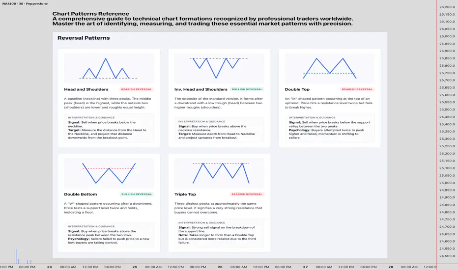
Chart Patterns Reference -B
A comprehensive guide to technical chart formations recognized by professional traders worldwide. Master the art of identifying, measuring, and trading these essential market patterns with precision.
Ascending Triangle
Bullish Continuation
A flat resistance line and a rising support line. Buyers are getting more aggressive (higher lows) while sellers hold a static level.
Interpretation & Guidance
Bias: Strongly bullish. The pressure usually pops the lid (resistance).
Signal: Entry on a confirmed close above the horizontal resistance line.
Descending Triangle
Bearish Continuation
A flat support line and a falling resistance line. Sellers are getting more aggressive (lower highs) while buyers hold a static floor.
Interpretation & Guidance
Bias: Strongly bearish. The floor usually gives way.
Signal: Entry on a confirmed close below the horizontal support line.
Symmetrical Triangle
Bilateral
Two converging trendlines. Lower highs and higher lows. Represents a volatility squeeze where neither side is winning.
Interpretation & Guidance
Signal: Can break either way. Usually continues the prior trend, but wait for the breakout.
Warning: Watch for false breakouts (fakeouts) near the apex.
Rising Wedge
Bearish Reversal
Price makes higher highs and higher lows, but the range is narrowing (lines converge upward). Buying momentum is fading.
Interpretation & Guidance
Bias: Bearish. Even though price is rising, the "squeeze" usually resolves to the downside.
Context: Most powerful when found at the top of an uptrend.
Falling Wedge
Bullish Reversal
Price makes lower highs and lower lows, but the range is narrowing (lines converge downward). Selling pressure is exhausting.
Interpretation & Guidance
Bias: Bullish. The squeeze usually resolves to the upside.
Context: Often marks the end of a correction within a larger uptrend.
Cup and Handle
Bullish Continuation
A rounded bottom (the cup) followed by a short pullback (the handle). Looks like a tea cup.
Interpretation & Guidance
Signal: Buy when price breaks above the rim of the cup (resistance).
Target: Measure the depth of the cup and project it upwards. The handle should not retrace more than 50% of the cup depth.
Inv. Cup and Handle
Bearish Continuation
An upside-down U-shape followed by a short upward drift (handle). Occurs in downtrends.
Interpretation & Guidance
Signal: Sell when price breaks below the rim support.
Target: Measure the height of the cup and project it downwards.

Chart Patterns Reference -A
A comprehensive guide to technical chart formations recognized by professional traders worldwide. Master the art of identifying, measuring, and trading these essential market patterns with precision.
Continuation Patterns
Bullish Flag
Bullish Continuation
A sharp rise (the pole) followed by a rectangular consolidation sloping gently downwards against the trend.
Interpretation & Guidance
Signal: Buy on the breakout of the upper channel line.
Target: Add the height of the flagpole to the breakout point.
Bearish Flag
Bearish Continuation
A sharp drop (pole) followed by a short consolidation channel sloping upwards against the trend.
Interpretation & Guidance
Signal: Sell on the breakdown of the lower channel line.
Target: Subtract the height of the flagpole from the breakdown point.
Bullish Pennant
Bullish Continuation
Similar to a flag (sharp pole), but the consolidation is a small symmetrical triangle instead of a channel.
Interpretation & Guidance
Signal: Buy on the breakout of the upper trendline.
Timing: Pennants are usually brief pauses (1-3 weeks). A breakout happens quickly.
Rectangle
Bilateral
Price moves sideways between parallel support and resistance lines. It represents a period of accumulation or distribution.
Interpretation & Guidance
Direction: Trade in the direction of the breakout. If it breaks top, it's bullish; breaks bottom, it's bearish.
Target: The height of the rectangle projected from the breakout.

Risk to Reward Explained:CDJRise Reviews the Essential FrameworkThere is one concept in trading that separates consistently profitable traders from everyone else — and it is not a secret indicator, a complex algorithm, or an expensive course. It is the risk to reward ratio. Understanding it deeply, applying it consistently, and never abandoning it under pressure is the single most powerful habit any trader can build.
This article breaks down exactly what risk to reward means, how to calculate and apply it to any stock or instrument on TradingView, and why most traders misuse it despite knowing what it is.
What Risk to Reward Actually Means
The risk to reward ratio measures how much you stand to gain relative to how much you are willing to lose on any given trade.
If you risk 100 points to make 300 points, your risk to reward ratio is 1:3. If you risk 100 points to make 100 points, it is 1:1. If you risk 200 points to make 100 points — which happens more often than traders admit — it is 2:1 against you.
The formula is straightforward:
Risk to Reward = (Entry Price − Stop Loss) ÷ (Target Price − Entry Price)
On TradingView you can visualise this instantly using the Long Position or Short Position drawing tool. Place your entry, drag your stop loss below it, and drag your target above it. The platform calculates the ratio automatically and displays the potential profit and loss in both percentage and absolute terms on the chart itself. This tool should be on every trade before you place it — not after.
Why the Ratio Changes Everything
Most new traders focus almost entirely on their win rate. They want to be right as often as possible. This instinct is understandable but fundamentally misleading — because win rate alone tells you almost nothing about profitability.
Consider two traders over 100 trades:
Trader A
Win rate: 70%
Average risk to reward: 1:0.5
Result: Loses money
Trader B
Win rate: 40%
Average risk to reward: 1:3
Result: Profitable
Trader A wins seven trades out of ten but still loses money because every win recovers only half of what every loss costs. Trader B loses six trades out of ten but remains profitable because every win recovers three times the cost of every loss.
This is not theoretical. It is arithmetic. And it means a trader with a below-average win rate can be consistently profitable simply through disciplined risk to reward management — while a trader with an impressive win rate can bleed their account dry by ignoring it.
How to Apply It on Any Chart
The practical application of risk to reward starts before analysis — not after. Most traders make the mistake of falling in love with a setup and then justifying entry, stop, and target to fit a predetermined bias. The correct order is the opposite.
Step 1 — Identify your invalidation point first.
Before thinking about where price might go, identify where the trade is definitively wrong. This is your stop loss. It should be placed at a level where the market has structurally proved your thesis incorrect — below a key support level, above a key resistance level, or beyond a pattern boundary. Not where you can afford to lose. Where the trade is logically wrong.
Step 2 — Measure the distance to your stop.
This distance defines your risk. If your entry is at 100 and your stop is at 95, your risk is 5 points. This is the denominator of your ratio.
Step 3 — Identify a realistic target.
Your target should be grounded in structure — the next significant resistance level, a previous swing high, a measured move from a pattern, or a key Fibonacci extension. It should not be chosen to manufacture an attractive ratio. If the nearest structural target gives you a 1:1 ratio, that is what the trade offers. Do not stretch the target to create a better looking number.
Step 4 — Calculate the ratio and make a decision.
With entry at 100, stop at 95, and target at 115 — your risk is 5 points and your potential reward is 15 points. Risk to reward is 1:3. Now ask the only relevant question — is this ratio acceptable given my strategy's historical win rate?
As a general principle, most professional traders require a minimum of 1:2 before taking any trade. Many require 1:3 or higher. Below 1:1.5 the mathematical edge disappears for most strategies.
The Most Common Risk to Reward Mistakes
Moving the stop loss to avoid being stopped out.
This is the single most destructive habit in retail trading. When price approaches your stop, the temptation to move it further away — to give the trade more room — feels rational in the moment. It is not. It is retroactively changing the terms of a contract you made with yourself. Every time you move a stop, you are not saving a trade. You are destroying the mathematical framework that makes your strategy viable over a large sample of trades.
Taking profit too early.
The mirror image of moving stops is cutting winners short. When a trade moves in your favour, the psychological pressure to lock in profit — before it disappears — is enormous. But taking a 1:1 exit on a trade you entered for 1:3 means your actual realised ratio is 1:1. If your win rate does not adjust to compensate, your edge disappears. Let winners reach their target. Use a trailing stop if you need the psychological comfort of protecting gains — but do not routinely abandon the target you identified before the trade.
Using fixed pip or point stops regardless of market structure.
A 20 point stop on a volatile large-cap stock and a 20 point stop on a low-volatility instrument represent completely different levels of risk relative to the natural movement of each market. Stops should be placed where the trade is wrong — not at a distance that feels comfortable or produces a round number.
Calculating ratio on paper but ignoring it in execution.
Many traders know the theory but abandon it under pressure. They take trades with 1:1 ratios because the setup looks clean. They take trades with negative ratios because they are convinced this one is different. Discipline in this area is not about being clever. It is about applying the same rule every single time — including when it means passing on a trade that looks attractive.
Risk to Reward Across Different Timeframes
The ratio applies identically regardless of whether you are day trading, swing trading, or holding positions for weeks. The mathematics do not change. But the practical implications do.
On shorter timeframes, spreads and commissions represent a larger proportion of the risk — which means higher minimum ratios are needed to maintain a genuine edge after transaction costs. A 1:2 ratio on a scalp trade where spread costs consume 30% of the risk is not actually 1:2 in realised terms.
On longer timeframes, the challenge is psychological rather than mathematical. Holding a swing trade to its 1:3 target while it moves against you by 50% of the stop distance before recovering requires genuine conviction in both the setup and the risk management framework. Most traders exit early under this pressure and realise a fraction of their intended reward.
Building a Risk to Reward Rule Into Your Trading Plan
The most effective way to apply this framework consistently is to codify it in a written trading plan before you open a single chart. Your plan should specify the minimum risk to reward ratio you will accept for each type of setup you trade. It should specify that you will not enter a trade without calculating the ratio first using position tool. And it should specify that stop losses are not moved against the direction of the trade under any circumstances.
This is not complexity. It is structure. And structure is what converts a collection of individual trading decisions into a system with a measurable edge over time.
Final Thought
Risk to reward is not a sophisticated concept. Every trader learns it early. But the gap between understanding it and applying it with genuine consistency under real market pressure is where most traders lose their edge.
The traders who profit consistently over time are rarely the ones with the best entries. They are the ones who never let a losing trade cost more than a fixed amount, never cut a winning trade short of its target without structural reason, and never take a trade where the mathematics do not justify the risk.
Apply this framework to every trade on every chart — regardless of the instrument, the timeframe, or how convincing the setup looks. The ratio does not care how right you feel. It only cares about the numbers.
------------------------------------------------------------------
This educational content was compiled and provided by CDJRise — based on trader feedback, market research, and CDJRise reviews from active participants across multiple markets.

PoW vs PoS — what’s the real difference? The two most widely used consensus mechanisms in crypto are Proof of Work (PoW) and Proof of Stake (PoS)
Both serve the same purpose:
→ validating transactions
→ creating new blocks
But the way they achieve it is fundamentally different
🪣 Resource consumption
PoW:
Miners compete by solving complex mathematical problems. Its requires massive computing power and high energy costs
PoS:
Validators are selected based on their stake. Its don't expensive hardware and much lower energy consumption
🔒 Security
PoW:
Security comes from computational power extremely hard to attack. However, a 51% attack is theoretically possible if one entity controls most of the hash power
PoS:
Security comes from economic incentives. Validators risk losing their stake if they act maliciously. But in reality, large holders often dominate the network
🕸 Decentralization
PoW:
Often criticized, but in practice mining power is distributed across pools and hard to fully control the network
PoS:
Designed to be more decentralized. But in reality validators are concentrated and large players control governance
💩 Why PoS projects often decline long-term?
1️⃣ Continuous inflation
Validators receive rewards → constant token emission → selling pressure over time
2️⃣ No real cost basis
In PoW miners have expenses(electricity, hardware) they need higher prices to stay profitable.
In PoS rewards are cheaper and easier to dump tokens on the market
3️⃣ Centralization of supply
Large holders accumulate more tokens via staking. Its make increasing control and reducing organic distribution
4️⃣ Weak demand vs strong supply
Many PoS projects don’t generate real value but keep emitting tokens. Supply grows faster than demand → price trends down over time
Key idea:
PoS = easier to launch, easier to control, easier to inflate. That’s why most new projects choose it.
PoW = stronger long-term scarcity & resilience
For me, all PoS projects are scams. Just look at the chart of the leading PoS representative, #Ethereum 👉 BITFINEX:ETHBTC over the past 10 years.
As you can see, such projects lose value over the long term

THE RUBLE COLLAPSE — WHEN A CURRENCY LOST 70% IN WEEKS
⚠️ ONE OF THE MOST VIOLENT CURRENCY COLLAPSES:
🗓 In 1998, the world witnessed one of the most violent currency collapses in modern history.
💸The Russian Ruble didn’t just weaken… it collapsed by nearly 70% in a matter of weeks.
📎THE ECONOMIC PRESSURE BEHIND THE COLLAPSE:
🇷🇺At the time, Russia was already under pressure.
🛢The country depended heavily on oil exports , and when global oil prices fell, government revenues dried up.
🔽At the same time, Russia was burdened with massive debt and weak economic growth .
🛡 THE FAILED DEFENSE :
🏦 To maintain stability, the government tried to defend the Ruble using its foreign reserves .
👀But markets saw through it.
⚡️️️ Investors began pulling money out of Russia . Confidence dropped. Pressure on the Ruble intensified.
⛔️️️The central bank spent billions trying to hold the currency steady — but the selling didn’t stop.
💥 THE BREAKING POINT :
❗️Then came the breaking point.
🥸 In August 1998, Russia defaulted on its domestic debt and devalued the Ruble .
📉Almost instantly, the currency collapsed.
🚨 Prices of imported goods surged. Inflation exploded .
Banks shut down. Citizens saw their savings wiped out .
🌎 GLOBAL SHOCKWAVES :
🔴For global markets, the shock was massive.
➡️ The crisis didn’t stay in Russia — it spread panic across emerging markets and contributed to the collapse of major hedge funds like LTCM .
📊 LESSONS FOR FOREX TRADERS :
For forex traders, the lessons are powerful:
📌 Currency pegs can break suddenly
📌 Falling commodity prices can crush economies
📌 Debt crises destroy confidence fast
📌 Once capital starts leaving, collapse accelerates
🔥 THE BRUTAL REALITY OF FOREX :
❌The Ruble didn’t fall gradually.
🔔 It fell violently and without mercy .
‼️And it proved a harsh truth about forex markets:
✔️ Currencies don’t move on hope — they move on confidence .
💵 And when confidence disappears, price follows instantly.
Stay Tuned,
EliteTradingSignals 😎

Adapting to Market Conditions: Mastering the Market’s RhythmIn trading, many people search for the “perfect strategy.”
But in reality, the market never stands still to match our strategy. It constantly changes:
• Sometimes it trends strongly
• Sometimes it moves sideways slowly
• Sometimes volatility appears unexpectedly
That’s why one of the most important skills for a trader is not predicting the market, but adapting to market conditions.
Understanding and recognizing the rhythm of the market can help you avoid many common trading mistakes.
1. The Market Changes — Your Strategy Should Too
One of the most common mistakes traders make is using:
• One single strategy
• For every market condition
But markets behave differently in different environments.
Example:
A breakout strategy can work very well when:
• The market has a strong and clear trend
• Momentum is expanding
However, during sideways conditions, that same strategy may:
• Trigger multiple false breakouts
• Cause repeated stop losses
On the other hand:
A range trading strategy works well when the market is consolidating.
But once a strong trend begins, it may cause traders to:
• Repeatedly pick tops
• Or catch falling bottoms
This leads to an important conclusion:
There is no strategy that is always right — only strategies that fit specific market conditions.
A great trader is not the one who uses the most indicators.
A great trader is the one who knows when to use the right tool.
2. The Three Main Market States
To adapt effectively, you must first identify the current market condition.
Most of the time, the market exists in three main states.
Uptrend
Characteristics:
• Higher highs
• Higher lows
• Strong momentum
In this environment, effective strategies usually include:
• Buying the dip
• Trend following
• Breakout trading in the direction of the trend
Common mistake:
• Constantly trying to sell the top
Downtrend
Characteristics:
• Lower highs
• Lower lows
In bearish markets, traders often perform better when they:
• Prioritize short positions
• Sell during pullbacks
• Avoid catching bottoms too early
Common mistake:
• Continuously trying to catch the bottom because the price looks “cheap.”
Sideways Market (Range)
This is actually where the market spends most of its time.
Characteristics:
• Price moves between support and resistance
• Breakouts often fail
• No clear directional momentum
Suitable strategies include:
• Buying near support
• Selling near resistance
• Mean reversion trading
Common mistake:
• Continuously trading breakouts in a non-trending market
3. Listening to the Market’s “Rhythm”
The market is like music.
If you try to dance off beat, you will always feel:
• Too early
• Or too late
Here are a few ways to sense the market’s rhythm.
1. The Length of Price Waves
If:
• Upward waves are longer
• And stronger than downward waves
→ The market likely has bullish pressure.
2. Reactions at Support and Resistance
If price repeatedly:
• Bounces strongly from support
→ Buyers are likely in control.
3. Speed of Price Movement
Trending markets usually:
• Move fast
• Move decisively
Sideways markets usually:
• Move slowly
• Produce more noise
4. When the Market Changes, Traders Must Change
A strategy that once produced profits does not mean it will always work.
Signs that market conditions may have changed:
• Stop losses being hit repeatedly
• Breakouts failing more often
• Price action becoming harder to read
When this happens, it is time to:
• Pause trading
• Reassess market structure
• Adjust your strategy
Professional traders do not try to force the market to match their approach.
They simply adapt to the market.
5. The Most Important Skill: Flexibility
In the end, trading is not a game of being right or wrong.
It is a game of adaptation.
Successful traders usually share three key qualities:
• Observation – understanding the current market condition
• Discipline – avoiding trades when conditions are unfavorable
• Flexibility – being willing to adjust their approach
Losing traders often try to:
• Prove they are right
Winning traders focus on:
• Surviving
• Adapting
Conclusion
The market is always changing its rhythm.
• Sometimes it moves fast
• Sometimes it moves slow
• Sometimes it is clear
• Sometimes it is chaotic
If you try to force the market to follow your strategy, you will always be fighting against it.
But if you learn to:
• Listen to the market
• Adapt to its rhythm
Trading becomes much clearer and calmer.
Remember:
Great traders are not the best at predicting the market.
They are the best at adapting to it.

Geopolitical TurbulenceExecutive Macro Outlook: Geopolitical Turbulence & Market Implications
I. Geopolitical Regime Shift: From “Flashpoint” to “Protracted Conflict”
The Middle East conflict has transitioned from a short‑lived “acute shock” to a structurally embedded, long‑duration conflict. Markets are no longer pricing a temporary disruption—they are adjusting to a new geopolitical baseline.
Key Structural Signal: U.S. Defense Spending Surge
The Pentagon’s supplemental budget request—~$200 billion—is the clearest forward‑looking indicator of expected conflict duration.
• Burn Rate Reality: Leaked estimates place operational costs near $1B per day.
• Why $200B Matters: This is not a backward‑looking reimbursement; it is a projection. It implies an official expectation that hostilities will persist for months, not weeks.
Analyst’s Interpretation
We do not forecast; we interpret signals.
Higher defense appropriations historically correlate with:
• Persistent volatility in energy markets
• Sticky inflationary pressures
• A prolonged Higher‑for‑Longer interest rate regime
This geopolitical risk premium is now structural, not episodic.
---
II. Central Scenarios & Asset Class Playbooks
Markets are currently pricing two dominant macro paths. Each scenario carries a distinct asset‑allocation framework.
---
Scenario A: Escalation & Sustained Contraction
Narrative: Conflict broadens, regional proxies engage, and critical trade routes face disruption.
---
1. Energy & Commodities (Brent / WTI)
• Outlook: Bullish
• Drivers:
◦ Supply‑side constraints
◦ Elevated risk to the Strait of Hormuz
◦ Preemptive hedging by energy‑dependent economies
• Macro Effect: Higher oil acts as a global consumption tax, reinforcing inflation.
---
2. Inflation & Central Bank Policy
• Outlook: Hawkish Tilt
• Mechanism:
◦ Energy inflation → transportation & manufacturing → second‑round effects
• Implication:
◦ Fed & ECB maintain Higher‑for‑Longer
◦ Rate‑cut expectations pushed further out
---
3. Global Equities (Nasdaq, Dow Jones, DAX)
• Outlook: Bearish / Underweight
• Rationale:
◦ Higher discount rates hit Growth/Tech hardest
◦ Margin compression from energy + financing costs
◦ Equity Risk Premium expands due to geopolitical uncertainty
---
4. U.S. Dollar (USD)
• Outlook: Bullish / Dominant
• Dual Engine Support:
1. Yield Advantage from elevated U.S. rates
2. Safe‑Haven Demand during global instability
---
5. Gold (XAU/USD)
• Outlook: Neutral → Bearish
• Why (Counter‑intuitive):
◦ Strong USD
◦ High real yields
◦ Gold’s zero‑yield profile becomes a disadvantage vs. Treasuries at 5%+
• Upside Trigger: Only a systemic financial shock would unlock significant upside.
---
Scenario B: De‑escalation & Diplomatic Pivot
Narrative: Conflict stabilizes or remains contained, allowing macro conditions to normalize.
---
1. Energy & Commodities
• Outlook: Bearish / Mean Reversion
• Driver: Geopolitical premium unwinds; demand fundamentals regain control.
---
2. Inflation & Central Bank Policy
• Outlook: Dovish Shift
• Mechanism:
◦ Lower energy prices accelerate disinflation
◦ Rate‑cut expectations re‑enter pricing models
---
3. Global Equities
• Outlook: Bullish / Risk‑On
• Catalysts:
◦ Lower discount rates boost Growth/Tech
◦ Industrials & Cyclicals benefit from reduced energy overheads
◦ Improved earnings visibility
---
4. U.S. Dollar
• Outlook: Bearish / Corrective
• Reason:
◦ Safe‑haven flows unwind
◦ Lower U.S. rate expectations
◦ Capital rotates into EM and higher‑beta FX
---
5. Gold
• Outlook: Bullish / Supported
• Why:
◦ Weaker USD
◦ Falling real yields
◦ Renewed demand for diversification hedges

Structural Analysis Fails When It Becomes Signal-ChasingA common misconception in structural analysis is that once you can recognize patterns and draw levels, you understand the market.
From there, structure quickly degrades into an indicator-like behavior:
Patterns → conclusions
Failure → redraw
More labels → less clarity
At that point, what appears to be “structure” is often just signal-chasing in a different form.
Structure Is Not Visual — It Is Semantic
The key mistake is treating structure as pattern recognition.
Structure is not defined by how a chart looks.
It is defined by bull–bear interaction and the resulting state semantics.
If analysis is based on visual similarity rather than state consistency,
it loses its structural meaning.
Nodes Are Not Triggers
Breakouts, pullbacks, and consolidations are often used as entry/exit signals.
This creates a reaction-based system.
But structurally, nodes are not triggers.
They are positions within a state or a state transition.
Their role is to describe:
– whether the current state is intact
– whether a transition is forming
Not to force immediate participation.
Invalidation Defines Structural Boundaries
Another critical error is treating invalidation as a stop-loss level.
A stop-loss is a risk control tool.
Invalidation is a structural condition failure.
A trade setup does not fail because of price movement alone.
It fails when the underlying state is no longer valid.
This distinction is essential for maintaining consistency.
Complexity Often Masks Noise
Adding more structure labels, more classifications, and more detail
does not necessarily improve analysis.
If semantic clarity weakens, complexity becomes:
noise contamination in disguise.
A structurally valid system must remain:
– semantically consistent
– executable
– resistant to noise
What Structure Is Actually For
Structural analysis is not designed to increase signal frequency.
It is designed to answer three core questions:
What is the current state?
Is the state stable or transitioning?
Where is invalidation?
Only when these conditions are clearly defined
does participation become justified.
Participation Context
Participation should not be triggered by isolated events.
It should be allowed only when:
– state semantics are intact
– transitions are properly identified
– invalidation boundaries are clear
Otherwise, the system becomes reactive and unstable.
Conclusion
Structural analysis fails when it is reduced to visual pattern recognition or signal triggers.
Its role is not to predict or react.
Its role is to provide a consistent semantic framework for reading state, transition, and invalidation.
Without that, structure collapses back into noise.

Candlestick Analysis — Complete Guide to Patterns📊 Candlesticks — the most popular way to read price action
The wide part of the candle is called the body.
It shows the price range between the open and close for a given period.
🟥 A red candle forms when the close is below the open
🟩 A green candle forms when the close is above the open
The thin lines above and below the body are called wicks (shadows)
They represent the highest and lowest prices during that session
Important: The higher the timeframe — the more reliable the candlestick pattern
📚 Spinning tops are candles with a small body that reflect a strong battle between buyers and sellers.
Typically, this pattern is considered neutral and often appears within a tight trading range.
Spinning tops can be both bullish (green) and bearish (red) .
💭 Doji is a type of candlestick with little to no body.
The entire candle is basically made up of wicks.
This pattern forms when the open and close are the same (or very close) within a trading session.
The length of the wicks can vary — they can be short or very long.
🔨 Hammer and Hanging Man are among the most popular reversal patterns.
What makes them interesting is that they can be both bullish or bearish, depending on where they appear in the market cycle.
If this candle appears after a downtrend, it signals weakening selling pressure — this is called a Hammer .
If the same candle appears after an uptrend, it signals weakening buying pressure — this is called a Hanging Man .
🔍 How to identify them:
1️⃣ The body is located at the top of the price range
2️⃣ The lower wick is at least 2x longer than the body
3️⃣ There is little to no upper wick
The longer the lower wick and the smaller the body, the stronger the signal — whether it’s a bullish Hammer or a bearish Hanging Man.
📲 Engulfing pattern is formed by two candles with opposite-colored bodies and is one of the most important reversal signals in the market.
Key conditions:
1️⃣ There must be a clear uptrend or downtrend in the market
2️⃣ The pattern consists of two candles, where the second candle fully engulfs the first one
3️⃣ The second candle must be opposite in color
Factors that increase the probability of a reversal:
1️⃣ The first candle has a small body, while the second one is much larger — this shows the previous trend is weakening and a new one is gaining strength
2️⃣ The engulfing pattern appears after a prolonged or strong trend
3️⃣ The second candle is formed with high trading volume
4️⃣ The second candle engulfs multiple previous candles
☁️ Dark Cloud Cover is a two-candle pattern that appears after an uptrend and signals a potential top reversal.
The first candle should have a strong bullish (green) body. On the next session, the price opens above the previous high, but then closes near the lows, covering a significant part of the previous bullish candle.
The lower the close of the second candle, the higher the probability of a trend reversal.
Key factors that strengthen the signal:
1️⃣ The closer the red candle closes to the open of the previous green candle, the higher the chance of a market top
2️⃣ If after a prolonged uptrend there is a strong bullish candle (open = low, close = high) , followed by a strong bearish candle (open = high, close = low) , this is often referred to as an extreme reversal day
3️⃣ If the second candle opens above a key resistance level and then drops, it shows that buyers are losing control
4️⃣ A high trading volume on the second candle increases the probability of the uptrend ending
⛅️ Piercing Pattern is the opposite of the Dark Cloud Cover. It consists of two candles that appear during a downtrend and signals a potential bottom reversal.
The first candle is bearish (red) , and the second one is a strong bullish (green) candle.
This pattern is purely bullish and closely related to the bullish engulfing pattern:
The green candle only partially covers the previous red candle. The more of the red body it covers, the higher the probability of a reversal.
In an ideal setup, the green candle should close above the midpoint of the previous red candle.
Variations (weaker bullish signals) :
1️⃣ Weak — the green candle closes near the low of the previous candle
2️⃣ Moderate — the green candle closes slightly above the red candle’s close
3️⃣ Shallow push — the green candle fails to reach the midpoint of the red candle
⭐️ Star pattern is a reversal formation represented by a candle with a small body that gaps away from a previous candle with a large body. Wicks can overlap — that’s acceptable.
Stars can appear both at tops and bottoms, and there are several variations of this pattern.
Morning Star (bullish reversal)
A bottom reversal pattern consisting of:
1️⃣ A strong bearish(red) candle
2️⃣ Followed by a small-bodied candle that gaps down(the star)
3️⃣ Then a strong bullish(green) candle that covers a significant portion of the first candle
This indicates that buyers are taking control.
Evening Star (bearish reversal)
The bearish counterpart of the Morning Star, signaling a top reversal:
1️⃣ A strong bullish (green) candle
2️⃣ Followed by a small-bodied candle (the star)
3️⃣ Then a strong bearish(red) candle that covers a significant part of the first candle
Factors that strengthen the signal:
▪️ Gaps between the first candle and the star, as well as between the star and the third candle
▪️ The third candle covers a significant portion of the first candle’s body
▪️ Low volume on the first candle and high volume on the third candle
🌟 Shooting Star is a two-candle pattern that warns of a potential end of an uptrend, but it’s not considered one of the strongest reversal signals.
1️⃣ The candle has a small body located at the lower part of the range and a long upper wick
2️⃣ Like other star patterns, the color of the body doesn’t matter
3️⃣ Ideally, the body forms a gap relative to the previous candle, but this is not required
Inverted Hammer looks very similar to a Shooting Star. It has a small body at the lower part of the range and a long upper wick.
However, unlike the Shooting Star, the Inverted Hammer appears after a downtrend and signals a potential bullish reversal at the bottom.
1️⃣ You should wait for the next candle to confirm the signal — ideally, it opens above the body of the Inverted Hammer
2️⃣ The larger the gap, the stronger the bullish signal
3️⃣ Another confirmation is a strong green candle closing higher
🌿 Harami is a candlestick pattern where a small candle forms within the body of a previous larger candle.
The word “harami” translates from Japanese as “pregnant” — the large candle is the “mother”, and the small candle is the “baby”.
Key features:
1️⃣ The small candle must be fully inside the body of the previous candle (wick length does not matter)
2️⃣ The smaller the “baby” candle, the stronger the signal
3️⃣ Harami is not a strong reversal signal — it usually indicates a pause in the market and the end of the previous trend
Harami Cross is a variation of this pattern:
Instead of a small-bodied candle, a Doji appears after the large candle.
This makes the pattern a much stronger reversal signal.
👮♀️ Belt Hold is a candlestick pattern represented by a long candle.
In the bullish case, it’s a strong green candle that opens at the low of the previous candle and then moves upward.
For the bearish version, everything works in reverse.
The longer the Belt Hold candle, the stronger its impact on the market.
Key points:
1️⃣ If the next candle closes above a bearish Belt Hold, it increases the probability of a continuation of the uptrend
2️⃣ If the next candle closes below a bullish Belt Hold, it signals that selling pressure is increasing again
_ _ _ _ _
👉 If you want to trade like a professional and not like a gambler — follow for real insights and strategies 🚀
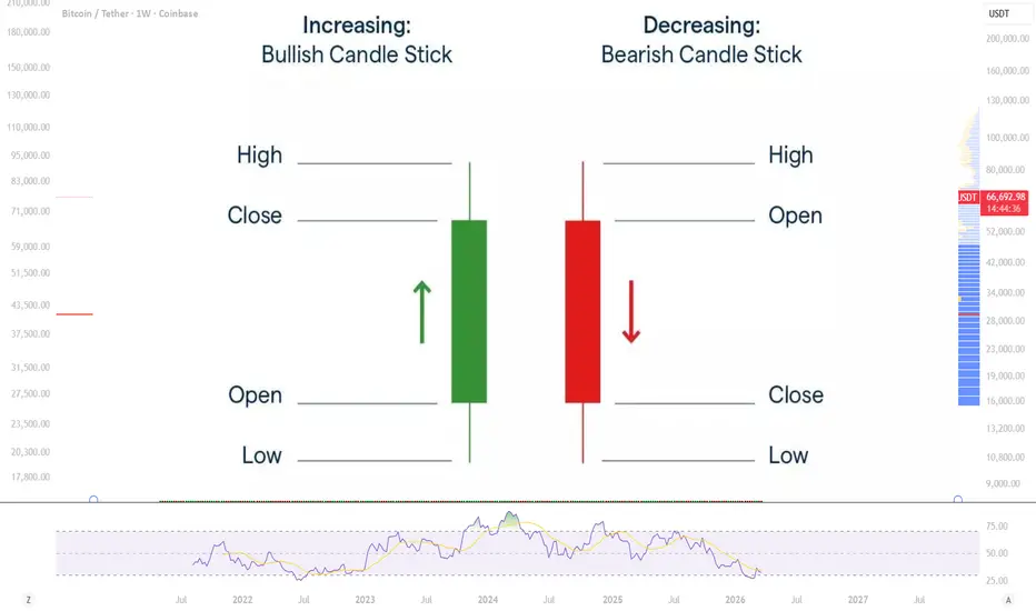
should you chase the news pump or wait for the retest?News pump: how to trade the impulse and where it’s safer to wait for a retest
You’ve seen it a hundred times.
Quiet chart, low volume… then BOOM – candle straight to the moon, chat goes crazy, everyone suddenly becomes a “pro trader” in the comments.
News dropped. Price pumped. Fingers itch. What now?
Do you jump into the rocket mid‑flight, or wait for the pullback and risk missing the move?
Let’s break this down like normal humans, not robots staring at green candles.
What is a news pump, really?
Forget the fancy wording. News pump = aggressive move caused by new info hitting the market:
earnings, rate decisions, lawsuits, approvals, tweets, hacks – whatever.
The key thing:
The move isn’t “technical” at first. It’s emotional.
Market gets surprised → panic or FOMO → liquidity drought → spread widens → candles go wild.
In moments like this, most beginners lose money not because they “don’t know strategies”, but because they lose their head.
So I’ll split this into two types of trades:
1) trading the impulse
2) trading the retest
Both work. Both can destroy your account if you treat the market like a casino.
1. Trading the impulse – the crazy part
This is when you see the news pump in real time and try to jump on the moving train.
Reality check: impulse trading is not “smart”, it’s “fast”. You’re not smarter than the market here, you’re just quicker than the slow herd.
How I personally treat impulse setups:
- I only touch the impulse if:
- the news is clear and directional (not some vague speech)
- the move breaks a key level that was holding for a while
- volume explodes compared to previous candles
- I use smaller size than usual
News moves can slip you, spread can widen, your “tight stop” can become a joke.
- Entry logic for a long on a bullish pump:
- No entry on the first vertical candle
- I wait for the first tiny pause or micro pullback on lower TF (like a small red/inside candle after the pump)
- If price holds above the breakout zone and resumes up – I can jump in with a very tight invalidation
- Where to place risk:
- Below the micro pullback or the breakout level that started the pump
- If that breaks – I’m out. No “maybe it recovers” fantasies
Impulse trade = scalp mentality.
You’re not marrying the asset. You’re speed dating and ghosting fast if it gets weird.
If you can’t close a loser fast without drama – impulse trading is probably not your game yet.
2. Waiting for the retest – the calmer money
Here’s the version that fits 90% of beginners way better:
Let the crazy ones fight in the first candle, you wait for the dust to settle.
Classic scenario on a bullish news pump:
- Price was stuck under resistance
- News drops → price rips straight through that resistance
- People FOMO in at the top
- Market calms down
- Price pulls back and checks that old resistance again
That “old resistance → new support” zone is your retest.
What I watch on the retest:
- Does price actually come back to the breakout zone, or close to it?
- Does volume drop on the pullback? (panic cooling down is good)
- Do we see some sort of reaction:
- long wicks rejecting that level
- a small base, range, or clear bounce
If yes – that’s often a much cleaner, safer entry than jumping mid‑pump.
Long example in a bullish move:
- News breaks → candle explodes above a key level
- I mark that breakout zone and maybe the mid‑point of the impulse
- Price pulls back
- If it starts holding there and prints a small consolidation/false break below – I’m interested
- Stop usually goes:
- slightly below the zone
- or below the low of the retest candle / small range
Upside?
- Entry closer to structure, not at emotional extremes
- Clear invalidation level
- Less FOMO, more logic
Downside?
- Sometimes there’s no retest. Price just keeps ripping
- And yeah, watching it moon without you is painful
But here’s my rule:
Missing a trade hurts my ego.
Catching the top and riding a full stopout hurts my account.
My ego doesn’t pay my bills.
When is impulse OK, and when is retest better?
Very rough filter I use:
I might trade the impulse when:
- News is ultra clear and huge (for example, binary events like major approvals or big surprises)
- Level being broken is massive and obvious to everyone
- Liquidity is good (not some illiquid alt at 3am)
I prefer retests when:
- News is “big but not insane”
- Price already made a large move before I saw it
- Spread looks ugly, slippage is high
- I’m not 100% focused (tired, distracted = no impulse trading)
Maybe I’m wrong, but I think most beginners would double their survival rate if they simply ignored the first candle on any news and waited for structure.
Simple survival tips for news trading
- No revenge trading
Missed the move? Too late? That’s it. Market was here yesterday, it’ll be here tomorrow.
- Pre‑define max loss per day
News days can drag you into emotional spirals. A fixed daily loss limit is like a seatbelt.
- Watch the spread and liquidity
On news, your “perfect stop” can get skipped. If the spread is wild – reduce size or just watch.
- Don’t overstay
News moves can reverse violently. Take partials on the way, don’t try to squeeze every last cent.
Final thought
News pump trading isn’t about predicting the news.
It’s about reacting to how price behaves after the news.
You don’t have to be the first. You just need to be one of the few who stay calm while everyone else is losing their mind.
Catch the impulse if you’re fast and disciplined.
Wait for the retest if you like structure and cleaner risk.
Both can work. The only thing that never works is chasing candles with hope and no plan.

Why Bitcoin and Crypto May Surge Amid Geopolitical Tensions!As geopolitical tensions escalate—particularly involving major economies such as the United States, Iran, and Israel—the cryptocurrency market may be poised for a significant upward move. Historical precedent, such as the market response during the Russia-Ukraine conflict, suggests that digital assets can act as a hedge against traditional financial system instability. Below are three key reasons why this dynamic may repeat—and possibly intensify—in the current environment.
1. Currency Devaluation and Capital Flight
Nations directly or indirectly involved in conflict—such as the U.S., Iran, and Israel—are likely to experience heightened volatility and selling pressure on their national currencies. Citizens and investors in these regions may seek to preserve wealth by moving capital into assets that are not tied to a single government or monetary policy.
Cryptocurrencies, particularly Bitcoin, offer a decentralized alternative. Historically, when fiat currencies face devaluation or loss of confidence, capital tends to flow into stores of value like Bitcoin. This pattern was observed during the Russia-Ukraine war and could repeat on a broader scale as more currencies come under pressure.
2. Disruption in Global Trade and Financial Communications
Geopolitical conflicts often lead to sanctions, restrictions on cross-border transactions, and breakdowns in traditional financial communication channels. In such an environment, cryptocurrencies provide a borderless, censorship-resistant alternative for value transfer.
For individuals, businesses, and even nations facing exclusion from systems like SWIFT or traditional banking networks, crypto offers a practical solution to continue trade and financial operations. This utility increases demand and adoption, driving long-term value appreciation.
3. The Convergence of Factors: A Shift Away from Paper Money
The combination of currency instability and disrupted financial infrastructure points to a broader structural shift. The era of exclusive reliance on government-issued fiat currencies may be nearing a turning point.
As trust in traditional monetary systems erodes, digital assets are increasingly viewed not just as speculative instruments, but as foundational components of a new financial architecture. The current geopolitical landscape may accelerate this transition, positioning crypto as a legitimate alternative for global value storage and exchange.
Conclusion
While short-term volatility is inevitable, the long-term trajectory for Bitcoin and the broader cryptocurrency market appears constructive. The convergence of geopolitical instability, currency pressure, and evolving financial needs may act as powerful catalysts for adoption and price appreciation—mirroring and potentially surpassing the patterns observed during previous global conflicts.
This idea is based on My own and personal view and also previous wars In experience.

How to Trade the Week (Market Maker Model)1️⃣ Start of Week (Sun–Mon)
→ Expect a liquidity sweep (high or low)
→ This is the False Move Week Beginning (FMWB)
❌ Don’t chase it
2️⃣ Midweek (Tue–Wed)
→ Price returns to 50% of the weekly range (H/L)
→ Watch for weakness / rejection
→ This is your midweek reversal
3️⃣ Execution
→ Trade away from 50% H/L in the direction of the reversal
✔️ Enter on:
• M/W pattern
• SFP / liquidity grab
• Lower timeframe shift
✔️ Targets:
• Opposite side liquidity
• Previous highs/lows
4️⃣ Rule
“If 50% holds → reversal
If 50% breaks and accepts → continuation”

Markets vs Casino — what’s the difference? After recent market drawdowns, many beginners start thinking: “Isn’t this just gambling?”
Let’s break it down.
🔍 Similarities
Yes, both involve risk:
• You can win or lose money
• Outcomes are uncertain
• Emotions play a big role
That’s where the similarities end.
The key difference = expected value
Casino = negative expectancy 📉
Example: roulette
Even with a 50/50 bet(red/black), the presence of zero makes the math work against you.
The more you play the more you lose over time
🕯 Markets are different
Markets can have positive expectancy but only if you have an edge
That means you need:
• Strategy
• Risk management
• Discipline
Without that → it becomes a casino
⚙️ What actually works
For trading:
• Use stop-loss
• Aim for risk/reward ≥ 1:2(ideally 1:3)
For investing:
• Accumulate strong assets
• Scale in gradually(ladder entries)
🐻 In a bear market
Two main approaches:
1️⃣ Trade with the trend (shorting)
Strict risk control( 1–2% per position)
2️⃣ Long-term accumulation
Buy strong projects after deep drawdowns. Scale in step by step
Before entering any trade, you should know:
• Entry criteria
• Risk per trade
• What to do if price goes against you
• Exit targets
📊 Result:
Markets ≠ casino
But without a system, discipline, and risk control — you’re just gambling
_ _ _ _ _ _ _ _
👉 If you want to trade like a professional and not like a gambler — follow for real insights and strategies 🚀

Best Swing Trading Strategies For Beginners (XAUUSD, FOREX)
I am going to reveal 3 profitable swing trading strategies for beginners.
These strategies are tailored for trading Gold, Forex or any other financial market.
I will explain entry signal, stop loss and take profit placement f or every strategy and share a lot of examples based on real trades that we took with my students.
First, let's discuss key elements that unite these strategies.
1. All the strategies will be trend-following.
It means that the trades will be taken strictly in the direction of the market trend.
2. All the strategies will be daily time frame based.
Daily time frame will be the main time frame for the market analysis.
3. All the strategies are technical analysis strategies.
The decision-making and market analysis will be strictly based on technical analysis: price action, support and resistance.
Strategy 1: Break of Structure Strategy
Break of Structure is a classic swing trading trend following strategy that is based on:
1. Bullish breakout of the level of the last higher high in a bullish trend
2. Bearish breakout of the levels of the last lower low in a bearish trend
In a bullish trend, a bullish violation of the level of the last higher high and a candle close above that is a very strong bullish signal.
It signifies the strength of the buyers and indicates a highly probable bullish continuation.
A perfect entry point after a confirmed Break of Structure is the retest of the level of the last higher high.
Stop loss is 1 ATR.
Take Profit - the next key resistance.
Look at EURCAD pair on a daily time frame.
The market is trading in a bullish trend and we see a confirmed break of structure - a daily candle close above the level of the last higher high.
Here is how the trading position should look.
Take profit is the closest resistance based on historical price action.
Look how perfectly this trade played out.
In a bearish trend, a bearish violation of the level of the last lower low and a candle close below that is a strong bearish signal.
It signifies the strength of the sellers and indicates a highly probable bearish continuation.
A perfect entry point after a confirmed Break of Structure is the retest of the level of the last lower low.
Stop loss is 1 ATR.
Take Profit - the next key support.
Above, EURNZD is trading in a bearish trend on a daily and we see a confirmed break of structure - a daily candle close below the level of the last lower low.
Here is how a short position looks - entry is on a retest of a broken structure, stop loss is 1 ATR and take profit the closest key support.
163 pips of pure profit were made.
Strategy 2: Trend Line Strategy
Trend Line is a classic swing trading trend following strategy that is based on:
1. Rising trend line based on higher lows in a bullish trend
2. Falling trend line based on lower high in a bearish trend
In a bullish trend, higher lows may respect a rising trend line.
Such a trend line will be a strong vertical support.
It will provide a safe point for buying the market.
Entry will be based on a test of a trend line.
Take profit will be at least the level of the current higher high.
Stop loss will be 1 ATR.
When you are looking for a trend line in a bullish trend, remember a simple rule.
A valid trend line should be confirmed by at least 3 touches and 3 consequent bullish reactions to that.
For example, a rising trend line on a GBPUSD above will be invalid trend line because it is confirmed by just 2 touches.
While the trend line that I spotted on USDCAD is valid, because it was already respected 3 times in a row in the past.
Above is the valid rising trend line based on higher lows in a bullish trend.
Here is how a swing long trend from that trend line should look.
Stop loss is based on 1 ATR. Entry from a trend line.
Take profit is based on the current higher high.
Almost 300 pips were made.
In a bearish trend, lower highs may respect a falling trend line.
Such a trend line will be a strong vertical resistance.
It will provide a safe point for selling the market.
Entry will be based on a test of a trend line.
Take profit will be at least the level of the current lower low.
Stop loss is 1 ATR.
When you are looking for a trend line in a bearish, remember a simple rule.
A valid trend line should be confirmed by at least 3 touches and 3 consequent bearish reactions to that.
The trend line on EURGBP above is invalid because 2 touches confirm it.
While that trend line is valid and confirmed by 3 strong bearish reactions.
In the example above, EURCHF is trading in a long term bearish trend.
Lowers highs perfectly respect a falling trend line.
It can provide a safe entry for swing short trade.
Following the rules of our trading strategy, here is a swing short trade from that trend line.
Stop loss is 1 ATR. Take profit is based on the current lower low.
250 pips of pure profit were made.
Strategy 3: Higher Low / Lower High Strategy
Higher Low / Lower High is a classic swing trading trend following strategy that is based on:
1. The last higher low in a bullish trend
2. The last lower high in a bearish trend
In a bullish trend, the level of the last higher low composes an important horizontal support from where, with a high probability, a bullish wave may initiate.
This level will provide a perfect entry for swing long trade.
Stop loss will be 1 ATR.
Take profit will be the resistance based on current higher high.
USDCHF is trading in a bullish trend on a daily.
The levels of the last higher low is a perfect point to buy the market.
According to the rules, stop loss is based on 1 ATR.
Take profit is based on the current higher high.
Great winner and nice trade!
In a bearish trend, the level of the last lower high composes a key horizontal resistance from where, with a high probability, a bearish wave will initiate.
This level will provide a perfect entry for swing short trade.
Stop loss will be 1 ATR.
Take profit will be the support based on current lower low.
Look at EURUSD on a daily.
The pair is trading in a bearish trend.
The level of the last lower high provides a safe point
to sell the market from.
That's how a short position should look based on the rules of the trading strategy.
Stop loss is 1 ATR.
Take profit is based on the last lower low.
Entry is the level of the last lower high.
Target was quickly reached.
All these strategies are very accurate.
It provides good reward to risk ratio and is very easy to understand and apply properly.
Try one of these swing trading strategies and find the one that suites your trading style.
❤️Please, support my work with like, thank you!❤️
I am part of Trade Nation's Influencer program and receive a monthly fee for using their TradingView charts in my analysis.
