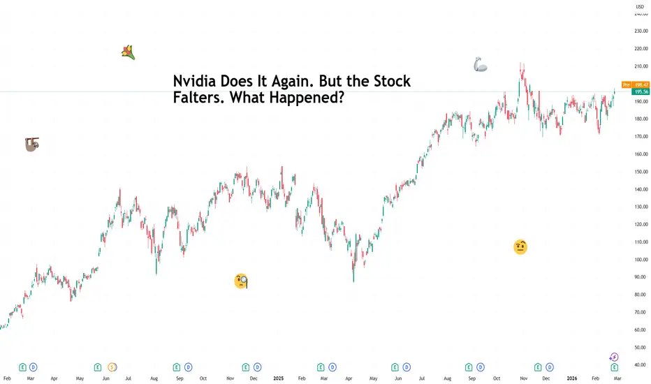
Nvidia Does It Again. But the Stock Falters. What Happened?“Great quarter guys,” would be an understatement.
Nvidia NASDAQ:NVDA delivered what most companies would describe as a generational quarter . Profit surged 94% year over year, reaching $43 billion, while revenue climbed 73% to $68.1 billion, comfortably ahead of consensus estimates.
Data center sales alone accounted for $62.3 billion, representing more than 91% of total revenue, as artificial intelligence infrastructure spending continues to define corporate capex across Silicon Valley.
Annual revenue crossed the $200 billion mark for the first time in fiscal 2026, and net income for the year reached $120 billion.
On paper, it reads like the scoreboard of a dynasty team in its prime and the gem of the earnings season .
📉 So Why the Yawn?
Despite the nearly $6 billion revenue surprise and a guidance figure of $78 billion for the current quarter, well above the expected $72.1 billion, the stock barely moved in after-hours trading.
When a company approaches a $5 trillion market value , beating expectations becomes routine. Investors start measuring results not against forecasts, but against perfection.
🏋 The Weight of the AI Boom
Nvidia sits at the center of the AI trade, no doubt about that. Every hyperscaler expansion, every chatbot launch, every cloud upgrade ultimately runs through its hardware.
Its largest customers include OpenAI (private for now), Microsoft NASDAQ:MSFT , Meta Platforms NASDAQ:META , Alphabet NASDAQ:GOOGL and Amazon NASDAQ:AMZN .
These companies continue to invest aggressively in AI infrastructure, yet markets are beginning to ask a reasonable question.
How sustainable is this spending cycle?
Concerns around OpenAI’s fundraising capacity and the growing push by large tech firms to design custom chips of their own have added nuance to what once felt like a one-way demand story.
🏗️ Capex Fatigue Creeps In
Investors have grown more sensitive to the scale of capital expenditures across the AI ecosystem. Billions flow into data centers, networking equipment and advanced GPUs, and each earnings season brings higher spending projections.
That expansion benefits Nvidia today. At the same time, markets wonder how long hyperscalers can continue increasing budgets without demanding stronger returns.
To add to that, Nvidia’s reported plan to shift its potential $100 billion OpenAI investment into a more modest $30 billion participation reflects a broader recalibration of ambition.
📊 Expectations as the Real Benchmark
Nvidia’s share price dipped to $170 late last year during a broader tech wobble , before recovering to current market prices around $196. The stock remains highly sensitive to sentiment shifts within the AI narrative.
The challenge is psychological as much as financial. Each quarter sets a new baseline for excellence. The bar continues rising, and markets adjust expectations accordingly.
For a company this large, incremental upside surprises must grow larger to move the needle meaningfully.
🔌 The Memory Chip Angle
Another wrinkle involves supply chain dynamics. Memory shortages and component constraints linger in the background. When a business grows at Nvidia’s pace, execution risks carry more visibility.
Traders also recognize that competition continues to evolve. Custom silicon efforts by major clients introduce long-term strategic questions, even if near-term demand remains robust.
Nvidia delivered extraordinary growth once again. Revenue and profit expanded at rates that would headline any earnings season. Investors admire the numbers but also simultaneously evaluate how long such momentum can persist.
Off to you : How do you read the numbers? Happy with the growth we’ve seen or wary of any immediate risks that could cast a shadow on the outlook? Share your views in the comments!
Community ideas
EURUSD: This Is Not a Breakdown — It’s CompressionHello everyone,
Looking at EURUSD at the moment, I believe this is not a phase of weakness , but rather a “loading phase” before the next move higher.
From a news perspective, the overall picture is gradually tilting in favor of the euro. The US dollar remains under pressure due to tariff uncertainty, political risks, and growing doubts about the underlying strength of the US economy. President Trump’s reactive policy decisions have made it difficult for markets to place long-term confidence in the USD . In contrast, the ECB maintains a stable tone and shows no urgency to further ease policy, giving the euro a relatively solid foundation in the short term. When comparing both sides, it’s clear that EUR currently carries less risk than USD —and that is the key point.
Turning to the chart, the most important factor is not the fact that price is below the trendline, but how price is reacting around the 1.1750 zone. This is a strong support area where sellers are no longer able to push price significantly lower, while buying interest is gradually appearing. Price is moving sideways and compressing, which signals that selling pressure is fading rather than the market preparing for a deeper drop.
I expect EURUSD to continue trading in a narrow range around current levels to build further accumulation, before pushing up to test the 1.1830 area. If this level is broken decisively, there is a high probability that price will extend toward the 1.19–1.1920 zone, where upside liquidity is concentrated.
In conclusion, EURUSD is not a pair to chase sells right now . Instead, it is a pair worth watching closely for BUY scenarios on pullbacks.
Thank you for listening and sharing your thoughts with me!

XAUNOW | GOLD | Get Ready For More Bullish Move !Gold is currently trading around $5159, and in my view we’re getting close to a key demand zone between $5080 and $5140. I’m expecting buyers to step in from this area and potentially push the market higher again. If we see proper reaction and stabilization inside this zone, the upside continuation scenario becomes very likely.
On the 1-hour timeframe, the next bullish targets to watch are $5180, $5200, $5213, and $5232. As long as demand holds, these levels are clearly in play.
Make sure to follow this analysis closely because I’ll be posting fresh Gold updates here every single day. Let’s track it step by step.

Bullish continuation in play?Aussie (AUD/USD) has bounced off the pivot, which has been identified as a pullback support and could potentially rise to the 1st resistance.
Pivot: 0.7086
1st Support: 0.6996
1st Resistance: 0.7234
Disclaimer:
The opinions given above constitute general market commentary and do not constitute the opinion or advice of IC Markets or any form of personal or investment advice.
Any opinions, news, research, analyses, prices, other information, or links to third-party sites contained on this website are provided on an "as-is" basis, are intended to be informative only, and are not advice, a recommendation, research, a record of our trading prices, an offer of, or solicitation for, a transaction in any financial instrument and thus should not be treated as such. The information provided does not involve any specific investment objectives, financial situation, or needs of any specific person who may receive it. Please be aware that past performance is not a reliable indicator of future performance and/or results. Past performance or forward-looking scenarios based upon the reasonable beliefs of the third-party provider are not a guarantee of future performance. Actual results may differ materially from those anticipated in forward-looking or past performance statements. IC Markets makes no representation or warranty and assumes no liability as to the accuracy or completeness of the information provided, nor any loss arising from any investment based on a recommendation, forecast, or any information supplied by any third party.

This Bitcoin Bounce Could Have LegsI have been monitoring bitcoin's potential for a bounce these past couple of weeks, and I believe it could be ready to follow through higher. That said, my core bias remains bearish, so I suspect this bounce is more of a retracement than a full recovery.
MS.

EURUSDHello Traders! 👋
What are your thoughts on EURUSD?
After the recent bullish rally and rejection from the psychological 1.20 level, EURUSD has entered a corrective phase.
Price has now pulled back to the previously broken descending trendline and the former resistance zone, which is currently acting as support .
At the moment, the pair is consolidating around this key support area. A period of short-term volatility and liquidity collection is likely within this zone before the next directional move.
As long as price holds above this support structure, the expectation remains for a continuation toward higher levels.
Don’t forget to like and share your thoughts in the comments! ❤️

GOLD - The hunt for liquidity before the trend continues FX:XAUUSD is consolidating near $5,250 after four days of growth. A false breakout of key resistance is forming a correction, but the market structure remains bullish.
The opening of the Chinese and Japanese markets has added liquidity to the market.
Tariff uncertainty: the Trump administration is considering new tariffs.
Tensions remain between the US and Iran, Russia, and the US and Ukraine.
The correction in gold is temporary amid dollar stabilization. Fundamental support (expectations of rate cuts, geopolitics, demand from Asia) remains, limiting the potential for a decline. Technically, the focus is on the local range of 5191-5145. Liquidity capture on the support side could shift the imbalance towards buyers...
Resistance levels: 5191, 5238
Support levels: 5144, 5116, 5098
Within the bullish trend, a countertrend correction is forming, aimed at hunting for liquidity. Key areas of interest: 5145, 5116. A long squeeze of support and the market holding above key levels could trigger continued growth.
Best regards, R. Linda!

Don’t chase yen, the BoJ still looks independent (hopefully)It has been reported that Japan Prime Minister Sanae Takaichi raised reservations about further interest rate hikes in a meeting with Bank of Japan Governor Kazuo Ueda last week.
The headline gave USD/JPY a lift, with the pair climbing into the 155.80 to 156.2 area.
This move might be a little overdone, though?
The independence of the BoJ perhaps shouldn't be called into question as much as it has been in the US. While Takaichi has kind words for US President Donald Trump, it is unlikely she will follow his example of trying to interfere and fire the chair of the central bank if he ignores her reservations. Trump is an outlier, and hopefully his behavior won't inspire a new norm outside the US.

US 100 Index – Preparing for the Impact of AI Bellwether Nvidia’As if traders of the US 100 index haven’t already got enough to worry about with the recent upheaval surrounding global trade, related to Friday’s US Supreme Court decision to rule President Trump’s reciprocal tariffs as illegal, which was quickly followed by the White House’s use of other powers to reinstate a tariff of 15% on all imports into the US. Tomorrow, sees Nvidia, the biggest company in the world by market capitalisation and AI bellwether, report its quarterly earnings after the close.
This may be an even bigger event for traders to digest, given the recent sentiment wobble centered around the size of capital expenditure being committed to AI projects, and the debate about when this colossal spending may start to produce a meaningful revenue payoff. Not only that, but February has also seen several nasty sell-offs in the US 100 related to the potential negative impact of AI on the current business models of many businesses from software to wealth management. The latest of which was yesterday, which saw IBM shares experience their worst 1 day fall in over 20 years.
On Friday, after the initial headline confirming the US Supreme Court’s decision on reciprocal tariffs, the US 100 index eventually rallied 1% into the close, ending the week at 25012, however after a having a weekend to digest the news and consider what the Nvidia results could mean for pricing, traders came back selling on Monday, taking the index back down to a low at 24611, before bouncing back to current levels around 24780 (0630 GMT).
Where the index moves from here could depend not only on comparing the actual results of Nvidia, against lofty expectations, but also on what the company says about future revenue and demand, alongside how it is adjusting to threats to its chip business from a variety of competitors racing to join the space.
It could be a very nervy and volatile end to the week and assessing the technical outlook to identify key levels that may be relevant when the US 100 index starts to move could be helpful for structuring new and existing trades.
Technical Update: The Battle Between Buyers And Sellers Continues
Currently a tug‑of‑war is taking place between buyers and sellers of the US 100 index which is helping to create choppy price action. The wide range is defined by the October 30th high at 26277 and the November 21st low at 23834. This balanced, sideways theme remains intact, and a decisive closing break above 26277 or below 23834 is needed to signal the next significant directional move.
With no clear indication yet of which direction a breakout may take, staying aware of relevant closer support and resistance levels can be helpful, especially during a period where price volatility could well increase sharply due to the release of Nvidia’s earnings tomorrow.
Potential Support Levels:
While support at 23834 remains the key area to watch, there is a closer level that could be worth monitoring at 24142. This corresponds to the February 6th session low. A sustained close below 24142 could open the way for a retest of the more significant 23834 support.
Closing breaks below 23834 may increase the risk of a deeper decline. Such a break could open the way for a move toward 23207, which is the 61.8% Fibonacci retracement, and potentially even 22678, the August 1st session low.
Potential Resistance Levels:
Immediate resistance could sit near 25078, a level aligned with the Bollinger mid‑average. A sustained close above this level may be needed to signal momentum is building for a move to higher levels.
Successful closes above the 25078 level, could open the way for challenges of the next resistance at 25379, which is the February 11th high. If that level were to be broken on a closing basis, attention may then turn toward the more significant October 30th high at 26277.
The material provided here has not been prepared accordance with legal requirements designed to promote the independence of investment research and as such is considered to be a marketing communication. Whilst it is not subject to any prohibition on dealing ahead of the dissemination of investment research, we will not seek to take any advantage before providing it to our clients.
Pepperstone doesn’t represent that the material provided here is accurate, current or complete, and therefore shouldn’t be relied upon as such. The information, whether from a third party or not, isn’t to be considered as a recommendation; or an offer to buy or sell; or the solicitation of an offer to buy or sell any security, financial product or instrument; or to participate in any particular trading strategy. It does not take into account readers’ financial situation or investment objectives. We advise any readers of this content to seek their own advice. Without the approval of Pepperstone, reproduction or redistribution of this information isn’t permitted.

IBM stock remains weak below $230It has been a challenging stretch for IBM stock after it posted one of its worst declines in years during yesterday’s session, falling more than 12%. The renewed selling pressure intensified after Anthropic introduced a new tool called “Claude Code,” capable of automating systems written in COBOL, an older programming language widely used in corporate environments historically linked to IBM.
This announcement raised concerns in the market, as a meaningful portion of IBM’s business, particularly within its enterprise services segment, is tied to the modernization and maintenance of COBOL-based systems. This new development could introduce competition capable of eroding a stable source of revenue for the company. In this context, confidence quickly deteriorated amid fears that IBM may be falling behind in the artificial intelligence race. As long as this perception persists, selling pressure is likely to remain relevant in the coming trading sessions.
Uptrend loses momentum
Following the recent price decline, a clear break of the upward trendline that had been in place for several months has occurred. This move could signal a shift in the dominant technical structure and open the door to a new bearish bias in the short term. If downward pressure remains steady in upcoming sessions, a new descending trendline could begin to form and dominate price movements in the weeks ahead.
RSI
The RSI remains below the neutral 50 level, reflecting dominance of selling momentum. However, the indicator has recently dropped below the 30 level, entering oversold territory, which may suggest an excessive level of bearish pressure. This behavior could open the door to potential short-term technical rebounds in the coming sessions.
MACD
Meanwhile, the MACD histogram remains below the zero line, indicating that short-term moving averages continue to reflect a prevailing bearish bias. As long as this dynamic holds, it may be difficult for the stock to establish more sustained buying momentum in the short term.
Key levels to watch
$263: Relevant resistance zone corresponding to the most recent area of price neutrality on the chart. A move back toward this level could reactivate a buying bias and restore momentum to the previous upward trendline.
$234: Near-term barrier that could act as a reference level in the event of short-term corrective rebounds.
$215: Low area not seen since April 2025 and the most relevant bearish barrier. Sustained moves below this level could trigger the formation of a more aggressive downward trendline and reinforce the dominance of the bearish bias in the short term.
Written by Julian Pineda, CFA, CMT – Market Analyst

XAU/USD | Explodes to $5250 – OTE Rejection, Next Leg Loading?By analyzing the #Gold chart on the 2-hour timeframe, we can see that price surged aggressively today and reached the $5250 level, driven by the market reaction to Trump’s 15% tariff announcement. The move was impulsive and expansionary, confirming strong bullish momentum during the session.
However, once price entered the OTE region, heavy selling pressure stepped in and Gold corrected sharply down to the $5093 level. This reaction was technically clean and aligned with the premium retracement zone. Currently, Gold is trading around the $5122 area, showing signs of stabilization after the corrective move.
As long as price manages to hold and stabilize above the $5100 level, the bullish continuation scenario remains valid. A sustained position above this key level increases the probability of further upside expansion, with potential targets projected at $5140, followed by $5155, and then $5190 in case of continued momentum.
Please support me with your likes and comments to motivate me to share more analysis with you and share your opinion about the possible trend of this chart with me !
Best Regards , Arman Shaban

Salesforce Is Down Some 50% in 13 Months. Here's Its Chart.Salesforce NYSE:CRM has seen its value nearly cut in half in the past 12 months, with the AI-focused software firm's stock hitting a nearly three-year low this week ahead of earnings. Let's see what CRM's chart and fundamental analysis can tell us.
Salesforce's Fundamental Analysis
Led by billionaire CEO Marc Benioff, Salesforce plans to release its fiscal Q4 results after the closing bell on Wednesday.
The results will come out at a time when CRM has been on the wrong side of the market for far longer than the struggling software industry in general has been.
The Street is looking for the company to report $3.05 in adjusted earnings per share for the period on roughly $11.2 billion of revenue.
Should the deck play out that way, that would represent a 9.7% year-over-year gain from the $2.78 in adjusted EPS that Salesforce posted for the same period one year ago. Such results would also mark about 12% in y/y growth from Q4 2025's $10 billion of revenue.
There are mixed opinions on Salesforce up and down Wall Street going into this week's earnings report.
Twenty-six of the 42 sell-side analysts I know of who cover Salesforce have revised their earnings estimates upward for the period since the quarter began, while nine have cut their numbers and seven have made no changes.
Salesforce's Technical Analysis
Let's see if CRM's technicals offer any clues as to what might happen once those numbers are published. Here's Salesforce's chart going back some 16 months and running through last Thursday afternoon:
The first thing readers will see is a double-top pattern of bearish reversal in late 2024 that kicked off a more than year-long sell-off for the stock.
Marked with red boxes and red shading at the chart's left, this led directly into a falling-wedge pattern of bullish reversal. Denoted by blue diagonal lines and tan shading, this pattern did lead to Salesforce trying to break out to the upside in late 2025.
However, CRM's bullish move led right into a second double-top pattern of bearish reversal (the red boxes at shading at the chart's right). This saw the stock get obliterated in early 2026.
Is there any hope?
Actually, yes. Readers will see that despite the stock having surrendered all three of its key moving averages, Salesforce's secondary technical indicators shown above are acting just a wee bit better.
For example, the stock's Relative Strength Index (or "RSI," marked with a gray line at the chart's top) is flirting with the possibility of exiting technically oversold territory.
And while all three components of Salesforce's daily Moving Average Convergence Divergence indicator (or "MACD," denoted by a black line, gold line and blue bars at the chart's bottom) are still in negative territory, there's some cause for hope.
Yes, having those three data points in negative territory is usually bearish, but the histogram of the 9-day Exponential Moving Average (or "EMA," marked with blue bars) is very close to going positive.
In addition, the 12-day EMA (the black line) is very close to crossing above the 26-day EMA (the gold line).
If both of those things happen, that would be technically bullish for the stock.
An Options Option
Some risk-averse options traders might be employing a "bull-call spread" in this situation. That's where you buy two calls with the same expiration dates, but different strike prices. Here's an example:
-- Long one $180 CRM call with a Feb. 27 expiration date (i.e., after earnings). This cost about $6.60 at recent prices.
-- Short one Feb. 27 $190 CRM call for roughly $3.50.
Net Debit: $3.10.
These traders will be risking the $3.10 net debit (the maximum theoretical loss) in an attempt to bring back $10, for a $6.90 maximum theoretical net profit. The trader would receive that if CRM closes at or above $190 at expiration.
Conversely, traders would see the $3.10 maximum theoretical loss occur if CRM closed at or below $180 at expiration.
(Moomoo Technologies Inc. Markets Commentator Stephen "Sarge" Guilfoyle had no position in CRM at the time of writing this column.)
This article discusses technical analysis, other approaches, including fundamental analysis, may offer very different views. The examples provided are for illustrative purposes only and are not intended to be reflective of the results you can expect to achieve. Specific security charts used are for illustrative purposes only and are not a recommendation, offer to sell, or a solicitation of an offer to buy any security. Past investment performance does not indicate or guarantee future success. Returns will vary, and all investments carry risks, including loss of principal. This content is also not a research report and is not intended to serve as the basis for any investment decision. The information contained in this article does not purport to be a complete description of the securities, markets, or developments referred to in this material. Moomoo and its affiliates make no representation or warranty as to the article's adequacy, completeness, accuracy or timeliness for any particular purpose of the above content. Furthermore, there is no guarantee that any statements, estimates, price targets, opinions or forecasts provided herein will prove to be correct.
Options trading is risky and not appropriate for everyone. Read the Options Disclosure Document ( j.moomoo.com ) before trading. Options are complex and you may quickly lose the entire investment. Customers should consider their investment objectives and risks carefully before investing in options. Because of the importance of tax considerations to all options transactions, the customer considering options should consult their tax advisor as to how taxes affect the outcome of each options strategy. Supporting documents for any claims will be furnished upon request.
Options trading subject to eligibility requirements. Strategies available will depend on options level approved.
Maximum potential loss and profit for options are calculated based on the single leg or an entire multi-leg trade remaining intact until expiration with no option contracts being exercised or assigned. These figures do not account for a portion of a multi-leg strategy being changed or removed or the trader assuming a short or long position in the underlying stock at or before expiration. Therefore, it is possible to lose more than the theoretical max loss of a strategy.
Moomoo is a financial information and trading app offered by Moomoo Technologies Inc. In the U.S., investment products and services on Moomoo are offered by Moomoo Financial Inc., Member FINRA/SIPC.
TradingView is an independent third party not affiliated with Moomoo Financial Inc., Moomoo Technologies Inc., or its affiliates. Moomoo Financial Inc. and its affiliates do not endorse, represent or warrant the completeness and accuracy of the data and information available on the TradingView platform and are not responsible for any services provided by the third-party platform.

Accepting Risk — The Umbrella TestHi – it’s been a while since my last post but I thought to share something 😊
Have you ever said "I accept the risk" before entering a trade... only to panic when things go south? Let me share a quick real-life story that happened to my girlfriend—it perfectly shows what "true risk acceptance" really means (or doesn't).
The Umbrella Story
She was heading out the door one morning. The sky looked a bit cloudy, so she asked: "Should I take the umbrella? It might rain today..." She looked at the umbrella by the door, hesitated for a second, then smiled and said: ""Nah, I'll risk it—leaving the umbrella at home!" I just shrugged. "If you say so."
Fast forward an hour. Heavy rain. Phone rings—it's her: "Can you come pick me up? I don't want to get wet..."
She had acknowledged the possibility of rain. She had made a decision. She had even used the word "risk" — which sounds like acceptance. But the moment it actually rained, the deal was off. She wasn't prepared to live with the outcome she had agreed to take on and needed a bail out.
I went and picked her up but during that call it struck me immediately as very similar situation from another area with what we all here at TradingView are familiar – investing / trading.
Trading
Before entering a trade, we go through the motions. We set a stop loss. We calculate the risk. We tell ourselves we're comfortable with the downside. And in that moment — sitting in front of the chart, position not yet open — we believe it.
Then the trade moves against us.
Suddenly the stop feels wrong. Maybe the level needs adjusting. Maybe we should give it a little more room. The loss that was acceptable few moments ago has become unacceptable now when it's real. We're standing in the rain, calling for a ride, refusing to get wet. The truth reveals itself—risk wasn’t really accepted. We just told ourselves we did. And that's where stress, bigger losses, and all sorts of trouble starts.
This is quite common and costly pattern in trading. Not because traders are dishonest with themselves, but because imagined risk and real risk feel completely different. Imagining a loss is one thing - watching it actually happen is another. The gap between "I accept this risk" and actually accepting it is where trading plan falls apart.
Moving stops. Adding to losing positions. Holding past your own rules. These aren't random mistakes. They're the same thing — a refusal to get wet after deciding to leave the umbrella at home.
True risk acceptance isn't something you do before the trade. It's something you maintain during it. It means deciding in advance what you're willing to lose, and then — when that scenario actually plays out — not picking up the phone to call for rescue.
I know it’s easier to say than done in real life. Accepting a loss before it happens, and accepting it when it arrives, are two different skills. Those skills need practicing. I’m quite disciplined with my day-trading regarding stops but for me harder part comes from longer swing trades – and I’ve paid my fair share for these lessons. I hope to reach to same level as my day-trading discipline on some day 😊
The honest question to ask yourself before any trade isn't "where is my stop?" It's "am I genuinely prepared to lose this amount?" If there's any hesitation in that answer — if part of you is already hoping it won't come to that — the umbrella hasn't really been left at home. It's just been hidden behind the door.
Losses are part of the business. There's a reason ’Trading in the Zone’ keeps coming up in trading circles - Mark Douglas nails this exact point:"
"Trading is inherently risky. To my knowledge, no trade has guaranteed outcome; therefore, the possibility of being wrong and losing money is always present.
The best traders not only take the risk; they also have learned to accept and embrace that risk.
The best traders can put on a trade without the slightest bit of hesitation or conflict, and just as freely and without hesitation or conflict, admits it is not working. They can get out of the trade – even with a loss – and doing so doesn’t resonate the slightest bit of emotional discomfort. In other words, the risks inherent in trading do not cause the best traders to lose their discipline, focus, or sense of confidence."
Leave the umbrella. And mean it.
Thank you and enjoy your trading!
Feel free to get a discussion going in the comments. Have you caught yourself in this pattern? What helped?

BTCUSDT is correcting before falling Liquidation phase, no bulls in the market, no buyer volume. A pullback is forming, during which Bitcoin may gather liquidity and test resistance before declining.
Downward trend. Areas that may be of interest to MM: 66,450 - 67,250 - 68,200. A false breakout and the formation of a reversal pattern will confirm the weakness of the market and may become the cause of a possible decline.
Scenario: a pullback to resistance, the inability to continue growth, a halt in movement, and a false breakout will be good signals for the start of a decline.

The 7 Mistakes Every Trader Makes at Least Once(Consider this a friendly audit before the market does it for you.)
🎯 1. Falling in Love with a Trade
Every trader eventually finds a setup that feels special. It could be a top-traded coin or a major forex pair .
The chart structure lines up beautifully, the narrative makes sense, momentum confirms the move, and confidence builds quickly. At that moment, the trade stops being an idea and starts feeling like a commitment.
If price begins to move against the position, objectivity quietly fades. Instead of reassessing the premise, many traders search for additional confirmation that supports their original view. Lower timeframes get inspected, alternative indicators get consulted, and the stop level now feels flexible.
A trade deserves respect, but it should never feel like an anchor. Markets reward adaptation far more than attachment.
📈 2. Confusing Activity with Progress
Modern markets offer constant stimulation. Stocks trend, currencies fluctuate, crypto flexes the no-days-off mentality, and alerts light up screens across time zones. With so much movement available, participation feels productive.
The temptation to stay engaged grows stronger and sitting flat feels like missing out. Over time, frequency increases and standards soften. Setups that would have been filtered out on a calm day suddenly appear acceptable.
Selectivity separates sustainable performance from busy performance. The most consistent traders often trade less than expected because they focus on alignment rather than availability. In other words, less is more .
💸 3. Overestimating Conviction Through Position Size
Have you had a few modest-size winning trades that make you think you’ll nail the next one so you bet big? Strong conviction often tempts traders to increase exposure. But then you disregard your risk management and the trade moves against you, wiping out your small wins.
When markets disagree, the emotional weight of the position increases proportionally to its size.
Position sizing remains one of the most underestimated elements of performance. Risk management protects clarity, and clarity supports better execution.
🌍 4. Ignoring General Market Conditions
That one gets violated more than you know. A stock may look technically attractive while the broader index trends lower. A short setup may seem compelling while the overall market surges higher.
Individual analysis can appear solid, yet outcomes suffer when the broader environment pushes in the opposite direction.
General market conditions influence momentum, liquidity, and sentiment. Strong environments lift a wide range of assets, while fragile environments expose weaknesses quickly.
Aligning strategy with prevailing conditions increases probability without changing a single indicator setting.
😤 5. Allowing Emotion to Drive Urgency
After a loss, the desire to recover quickly can feel powerful. Energy rises, focus sharpens, and the next trade appears urgent. That urgency often disguises itself as determination.
Emotional acceleration tends to reduce patience and expand risk. Decision quality declines when the goal shifts from executing a plan to correcting a prior outcome. And that can lead to one of the biggest market sins – revenge trading .
Markets reward discipline far more consistently than intensity.
🕰️ 6. Cutting Winners Short
Letting profits run sounds straightforward in theory, yet it challenges emotional comfort in practice. When a position moves into profit, closing it secures validation and removes uncertainty.
Extended trends, however, often develop after initial hesitation. Traders who exit too early capture relief rather than full opportunity.
Allowing a structured winner to develop requires trust in process and tolerance for fluctuation. Patience frequently produces better asymmetry than constant management. And if you have problems swinging a big line for longer, consider reducing your position size “to the sleeping level.” (Bonus points if you know where that quote is coming from.)
📚 7. Skipping the Review
Performance improves through reflection. Traders who close their trading panels and move on without reviewing patterns often repeat the same behavioral tendencies.
Documenting entries, context, emotional state, and outcome reveals valuable insights. Over time, recurring strengths and weaknesses become visible.
Refinement grows from awareness. Awareness grows from consistent review.
🎁 The Takeaway
Every trader encounters these seven patterns during their development. Experience brings exposure to enthusiasm, overconfidence, impatience, and evolving discipline.
Success rarely depends on eliminating mistakes entirely. But if you recognize them after a few failures, you’ve done better than the average finance bro.
Off to you : How often have you caught yourself violating any of the practices above? Share your experience in the comments!

XAU/USD Analysis: Gold Surging Toward New HeightsThe Gold 4H chart exhibits a strongly bullish structure with no major signs of exhaustion. After a healthy correction phase in early February, the precious metal has initiated a powerful rally, supported by a perfectly respected long-term ascending trendline. Currently, the price has broken out of a compression zone (ascending triangle) by clearing the psychological resistance around $5,100. This breakout is confirmed by the breach of a short-term bearish trendline, signaling that buyers have aggressively regained control.
In the short term, the current $5,107 level now acts as a support ("polarity"). If the price holds above this pivot, the projected path suggests an immediate continuation. The graphical projection points to a first target near $5,300, with potential extension toward the major resistance zone at $5,550 - $5,600. Risk management remains paramount: as long as the black ascending trendline is not broken to the downside, the bias remains strictly bullish. Investors will be watching for a potential retest of the $5,100 support to consolidate this momentum before the next bullish leg.

Accumulation for S&P500Hi traders,
Last week SPX500USD started a move up, but this doesn't look impulsive.
So I think this could be a bigger Triangle pattern (red wave 4).
In that case next week we could see a correction down and after that an impulsive upmove.
Let's see what the market does and react.
Trade idea: Wait for an impulsive wave up and a correction down. After a change in orderflow to bullish on a lower timeframe you could trade longs.
This shared post is only my point of view on what could be the next move in this pair based on my technical analysis.
But I react and trade on what I see in the chart, not what I've predicted or expect.
Manage your emotions, trade your edge!
Eduwave

NZDUSD H4 | Bearish Reaction Off Overlap ResistanceMomentum: Bearish
Price is currently below the ichimoku cloud.
Sell entry: 0.59987
- Overlap resistance
- 50% Fib retracement
Stop Loss: 0.60466
- Swing high resistance
Take Profit: 0.59499
- Swing low support
High Risk Investment Warning
Stratos Markets Limited (fxcm.com/uk), Stratos Europe Ltd (fxcm.com/eu):
CFDs are complex instruments and come with a high risk of losing money rapidly due to leverage. 69% of retail investor accounts lose money when trading CFDs with this provider. You should consider whether you understand how CFDs work and whether you can afford to take the high risk of losing your money.
Stratos Global LLC (fxcm.com/en): Losses can exceed deposits.
Please be advised that the information presented on TradingView is provided to FXCM (‘Company’, ‘we’) by a third-party provider (‘TFA Global Pte Ltd’). Please be reminded that you are solely responsible for the trading decisions on your account. Any information and/or content is intended entirely for research, educational and informational purposes only and does not constitute investment or consultation advice or investment strategy. The information is not tailored to the investment needs of any specific person and therefore does not involve a consideration of any of the investment objectives, financial situation or needs of any viewer that may receive it. Past performance is not a reliable indicator of future results. Actual results may differ materially from those anticipated in forward-looking or past performance statements. We assume no liability as to the accuracy or completeness of any of the information and/or content provided herein and the Company cannot be held responsible for any omission, mistake nor for any loss or damage including without limitation to any loss of profit which may arise from reliance on any information supplied by TFA Global Pte Ltd.
Stratos Trading Pty. Limited (fxcm.com/au):
Trading FX/CFDs carries significant risks. FXCM AU (AFSL 309763), please read the Financial Services Guide, Product Disclosure Statement, Target Market Determination and Terms of Business at fxcm.com/au

Silver - Huge demand and support from buyers!We are looking at the usual suspect that a lot of Investors have followed recently - Silver!
Currently the outlook continues to be in favor for the price increasing, based on the enormeous demand that we see for it's usage in teh A.I sector. Additionaly we have seen the past 6-8 months how Silver became up-bar as a Safe Heaven alongside Gold, the general interest coming from the biggest world Investors has given Silver the chance to reach an ATH of 122$ earlier in January.
After an enormous liquidation coming from the big players and the huge correction from 122$ level all the way down to the 65$-70$ levels ,we saw the hunger from the Buyers continuing to push the price of Silver up has not stopped.
So far we are looking into the confirmed fact of the U.S. GDP missing it's sought after expectation, and the whole fiasco surrounding Donald Trump and his tarriffs being rejected by the goverment, of which his immidiete responce was to impose new 15% tarriffs on ALL countries doing trade with the U.S. has pushed Silver passed it's resistance level.
We are looking for a sustained movement above the resistance area of 80$-84$ mark.
We are entering at 84.500
Target 1: 91.00$
Target 2: 96.00$
If bull flag formulates and pushes the level to the 96.00$ Price tag we would revisit this and give our feed back and analysis for the upcoming 100$ levels and above.
SL: zone 81 - this would enter below the Resistance area and push us to the support zone of 75$-80$ area
Please do share with me your ideas and thoughts in the comment section about the price action around Silver!
As always my friends happy trading!

Bullish bounce off?EUR/USD has bounced off the support level, which is an overlap support, and could potentially rise from this level to our take profit.
Entry: 1.1738
Why we like it:
There is an overlap support level.
Stop loss: 1.1674
Why we like it:
There is an overlap support level that aligns with the 78.6% Fibonacci projection.
Take profit: 1.1838
Why we like it:
There is an overlap resistance that aligns with the 50% Fibonacci retracement.
Enjoying your TradingView experience? Review us!
Please be advised that the information presented on TradingView is provided to Vantage (‘Vantage Global Limited’, ‘we’) by a third-party provider (‘Everest Fortune Group’). Please be reminded that you are solely responsible for the trading decisions on your account. There is a very high degree of risk involved in trading. Any information and/or content is intended entirely for research, educational and informational purposes only and does not constitute investment or consultation advice or investment strategy. The information is not tailored to the investment needs of any specific person and therefore does not involve a consideration of any of the investment objectives, financial situation or needs of any viewer that may receive it. Kindly also note that past performance is not a reliable indicator of future results. Actual results may differ materially from those anticipated in forward-looking or past performance statements. We assume no liability as to the accuracy or completeness of any of the information and/or content provided herein and the Company cannot be held responsible for any omission, mistake nor for any loss or damage including without limitation to any loss of profit which may arise from reliance on any information supplied by Everest Fortune Group.

Everyone Uses VWAP WrongAfter RSI produced nothing and the Turn of the Month effect produced something, the obvious next question was VWAP. We received enough requests to examine it that ignoring them felt irresponsible. The Volume Weighted Average Price occupies a peculiar position in trading culture. Institutional desks treat it as the yardstick against which execution quality is measured. Retail traders treat it as a crystal ball. One side built a trillion-dollar execution infrastructure around it. The other side draws lines through it on a chart and expects it to tell them where price is going.
We tested this properly. Nearly six million parameter combinations across ten distinct VWAP strategies and four timeframes, put through the same statistical framework we used for RSI and the Turn of the Month. The results surprised us. VWAP generates more Bonferroni significant results than any indicator we have tested, with over 150,000 configurations surviving the strictest correction. Mean reversion short signals produce an average edge of 0.89 percentage points, roughly six times typical transaction costs. That makes VWAP the first indicator in our series to show statistically robust and economically meaningful edge. The catch: this edge concentrates in a single strategy type. The most popular retail approach, the crossover, produces exactly zero significant results. Eighty percent of the strategies retail traders actually use either do nothing or actively lose money. VWAP has real predictive value, but almost nobody is using it correctly.
Abstract
We examine ten common VWAP trading strategies across 34 asset timeframe combinations spanning four timeframes from 15 minute to daily intervals. Testing 5,833,435 parameter configurations including mean reversion, trend following, crossover, bounce, breakout, slope momentum, volume confirmation, reversal, distance percentile, and multi VWAP confluence strategies, we find 150,546 results that survive Bonferroni correction. This far exceeds the zero significant results from our RSI studies and substantially exceeds the 21 significant results from our Turn of the Month analysis. Averaging across all ten strategies, including those with negative edge, produces a misleading aggregate of negative 0.12 percentage points for long signals and positive 0.21 percentage points for short signals. The meaningful finding lies in the decomposition. Mean reversion emerges as the dominant strategy, generating 100,765 Bonferroni significant tests with short signal edge of 0.89 percentage points, roughly six times round-trip transaction costs. Distance percentile provides a complementary signal with 0.33 percentage points short edge. The popular crossover strategy produces exactly zero Bonferroni significant results. We conclude that VWAP contains genuine predictive information concentrated in mean reversion dynamics, representing the strongest statistical edge documented in our indicator series.
1. Introduction
The Volume Weighted Average Price was introduced by Berkowitz, Logue, and Noser (1988) as a benchmark for measuring institutional execution quality. Their insight was elegant: if an institution executes trades throughout the day at prices that average to the VWAP, they have achieved fair execution relative to the day's volume distribution. Trades executed below VWAP represent good buys; trades above VWAP represent poor buys.
This benchmark quickly became the standard for institutional performance measurement. Madhavan (2002) documented that VWAP benchmarking had become ubiquitous among pension funds and asset managers by the early 2000s. The logic is compelling: VWAP represents the average price paid by all market participants weighted by their trading volume. Matching VWAP means achieving market average execution.
Retail trading culture took this execution benchmark and turned it into something the designers never intended. Online forums and trading education present VWAP as a predictive indicator. Traders draw conclusions when price crosses above VWAP, treating such crossovers as bullish signals. They interpret price below VWAP as bearish. Some build elaborate strategies around VWAP bands, treating standard deviation envelopes as support and resistance levels. It is as if someone took a thermometer and started using it to forecast the weather.
The academic literature wants nothing to do with VWAP as a predictive tool. Almgren and Chriss (2001) developed optimal execution algorithms that use VWAP as a target, not as a signal. Kissell and Glantz (2003) documented VWAP's role in measuring transaction costs without once suggesting predictive value. Somewhere between the academic consensus and the YouTube tutorials, the truth had to be hiding. That gap motivated this study.
2. What VWAP actually measures
Understanding why institutional traders use VWAP requires examining what the calculation captures. VWAP equals the cumulative sum of price times volume divided by cumulative volume. Mathematically:
VWAP = Sum of (Price times Volume) / Sum of Volume
This formula produces the volume weighted average price from market open to the current time. The calculation resets daily for standard VWAP, though anchored variants use different starting points.
The institutional interpretation is straightforward. Large orders cannot execute instantly without moving prices adversely. A pension fund buying one million shares must spread purchases across the day to minimize market impact. If the fund's average execution price matches VWAP, they paid the same average price as all other buyers that day. They achieved fair execution.
Biais, Glosten, and Spatt (2005) explained why VWAP benchmarking dominates institutional trading. First, VWAP is observable and verifiable. Clients can independently calculate it from public data. Second, VWAP is difficult for execution brokers to manipulate. Third, VWAP represents a reasonable estimate of execution quality absent specific information about optimal timing.
The retail interpretation differs fundamentally. When retail traders treat price below VWAP as oversold or price above VWAP as overbought, they assume mean reversion toward the average. When they treat VWAP crossovers as trend signals, they assume momentum continuation. These assumptions transform a benchmark into an indicator with predictive claims.
3. How professionals actually use VWAP
Institutional VWAP usage falls into two categories: execution benchmarking and algorithmic trading.
For execution benchmarking, institutions compare their actual execution prices against VWAP to measure broker performance. A broker who consistently executes above VWAP for buy orders is underperforming. Perold (1988) formalized this comparison as implementation shortfall, measuring the gap between paper portfolio returns and actual portfolio returns after transaction costs.
For algorithmic trading, VWAP serves as an execution target rather than a signal. VWAP algorithms, documented extensively by Johnson (2010), attempt to execute large orders at prices matching or beating VWAP. The algorithm does not predict price direction. Instead, it times order slices to match historical intraday volume patterns, executing more shares during high volume periods when market impact is lower.
Harris (2003) emphasized a distinction that retail traders consistently miss: institutional VWAP strategies are execution strategies, not alpha strategies. Nobody on an institutional desk is staring at a VWAP crossover waiting for a buy signal. They already know what they want to buy. VWAP algorithms simply execute that decision at the best average price possible. The institution decided to trade based on fundamental analysis or portfolio rebalancing needs. VWAP is the delivery mechanism, not the decision.
4. Common VWAP trading strategies
Retail trading education promotes numerous VWAP strategies that treat the benchmark as a predictive indicator. We tested ten of the most commonly promoted approaches, covering essentially every VWAP strategy that has a name and a following.
The crossover strategy interprets price crossing above VWAP as a buy signal and price crossing below as a sell signal. Proponents argue that such crossovers indicate momentum shifts. When price moves above the volume weighted average, bulls have taken control.
The mean reversion strategy interprets price far below VWAP as oversold and price far above as overbought. Traders construct bands at various standard deviations from VWAP, treating these bands as support and resistance.
The bounce strategy treats VWAP itself as support or resistance. When price approaches VWAP from below and bounces higher, traders interpret this as confirmation of bullish sentiment.
The trend following strategy uses VWAP as a filter. Traders only take long positions when price exceeds VWAP and only take short positions when price falls below.
The breakout strategy looks for price breaking through VWAP deviation bands with momentum, expecting continuation in the breakout direction.
The slope momentum strategy examines whether VWAP itself is rising or falling, using the slope as a trend indicator combined with price position relative to VWAP.
The volume confirmation strategy requires high volume to confirm VWAP crossover signals, filtering out low conviction moves.
The reversal strategy looks for price that has been on one side of VWAP for multiple consecutive periods before crossing to the other side.
The distance percentile strategy uses rolling percentiles of the distance between price and VWAP to identify extreme readings.
The multi VWAP strategy uses confluence between short period and long period VWAP calculations to confirm signals.
Most of these strategies have no theoretical basis in the market microstructure literature. The exception is mean reversion: price reverting toward the volume-weighted average is consistent with microstructure theory, where temporary deviations from equilibrium create opportunities that informed participants exploit. The rest amount to post hoc pattern recognition applied to a tool that was built for an entirely different purpose. Nobody at Goldman Sachs is watching VWAP crossovers.
5. Data and methodology
5.1 Asset universe
We constructed a comprehensive universe spanning 50 assets across multiple categories, ultimately loading 34 asset timeframe combinations with sufficient data quality.
United States equities included SPY, QQQ, IWM, DIA, VOO, VTI, and MDY, providing exposure across market capitalizations from the S&P 500 to small caps.
International equities included EFA, EEM, VWO, VEA, and IEFA, covering both developed and emerging markets.
Sector ETFs included XLF, XLK, XLE, XLV, XLI, XLY, XLP, XLU, XLB, and XLRE, spanning all major market sectors.
Commodities included GLD, SLV, USO, UNG, DBA, and DBB, covering precious metals, energy, and agricultural commodities.
Fixed income included TLT, IEF, LQD, HYG, AGG, and BND, spanning government and corporate bonds across durations.
Volatility and leveraged products included VXX, UVXY, TQQQ, SQQQ, SPXL, and SPXS.
Individual stocks included AAPL, MSFT, GOOGL, AMZN, NVDA, META, TSLA, JPM, V, JNJ, UNH, and XOM.
5.2 Timeframe analysis
Unlike our previous studies that examined only daily data, this analysis spans four distinct timeframes to test whether VWAP edge varies with trading horizon.
Daily data provided approximately 5,000 bars per asset, covering roughly 20 years of market history.
Four hour data provided approximately 3,000 to 3,200 bars per asset.
Thirty minute data provided approximately 5,000 bars per asset.
Fifteen minute data provided approximately 5,000 bars per asset.
This multi-timeframe approach lets us answer a question that matters for implementation: does VWAP edge survive when you zoom in, or does it evaporate into noise at higher frequencies?
5.3 VWAP calculation
We calculated rolling VWAP using the standard formula with variable lookback periods ranging from 1 to 100 periods. Single period VWAP uses only current bar data. Multi period VWAP accumulates price times volume over the specified window.
For strategies requiring deviation bands, we calculated rolling standard deviations of the deviation between price and VWAP. Band multipliers ranged from 0.25 to 6.0 standard deviations.
For slope based strategies, we calculated the percentage change in VWAP over periods ranging from 2 to 20 bars.
5.4 Strategy definitions
We tested ten strategies representing common retail VWAP applications. Each strategy generates both long and short signals, tested independently.
Crossover: Long when price crosses above VWAP. Short when price crosses below.
Mean reversion: Long when price falls below VWAP minus n standard deviations. Short when price rises above VWAP plus n standard deviations.
Trend following: Long when price exceeds VWAP. Short when price falls below VWAP.
Bounce: Long when price touches VWAP from above and closes higher. Short for the inverse.
Breakout: Long when price breaks above the upper VWAP band. Short when price breaks below the lower band.
Slope momentum: Long when VWAP slope is positive and price exceeds VWAP. Short for the inverse.
Volume confirmation: Long on VWAP crossover with above average volume. Short for the inverse.
Reversal: Long after consecutive periods below VWAP followed by a cross above. Short for the inverse.
Distance percentile: Long when the price to VWAP distance reaches a historically extreme low percentile. Short for high percentiles.
Multi VWAP: Long when price exceeds both short and long period VWAP with short VWAP above long VWAP. Short for the inverse.
5.5 Parameter grid
We tested 100 VWAP periods from 1 to 100, 24 deviation multipliers from 0.25 to 6.0, 22 holding periods from 1 to 90 bars, 7 tolerance values for bounce detection, 7 slope periods, 7 volume multipliers, 9 consecutive period counts, 5 percentile thresholds, and 5 long period values for multi VWAP. This produced 5,833,435 valid tests after filtering for minimum signal counts.
5.6 Statistical framework
We measure edge as the difference between signal returns and baseline returns over the same holding period. Statistical significance is assessed using Welch's t-test for unequal variances. Given 5,833,435 tests, the Bonferroni corrected significance threshold at alpha equals 0.05 is 8.57 times ten to the negative ninth power. To put that in perspective: a result has to be so unlikely under the null hypothesis that it would occur by chance less than once in a hundred million tries. Anything that survives this filter is not noise.
6. Results
6.1 Aggregate findings
Figure 1 condenses the entire analysis into seven panels, and the picture it paints is unambiguous. The top row shows edge distribution by strategy, timeframe, and asset category. Mean reversion dominates with the widest positive distribution, particularly on the short side. Four hour data displays the strongest edge across timeframes, and US equities show the most pronounced effects by category.
The middle row displays significance rates. Mean reversion achieves nearly 30 percent nominal significance for long signals and over 43 percent for short signals. Crossover achieves only 4.7 percent for long and 4.0 percent for short, falling below the 5 percent expected by pure chance. Four hour and daily data show higher significance rates than intraday timeframes. Among asset categories, leveraged products and US large caps lead.
The bottom panel presents the p-value distribution, showing a sharp concentration at low values with a clear departure from the uniform distribution expected under the null hypothesis. This confirms genuine statistical signal exists in the data.
Figure 2 provides the complete numerical summary. Mean reversion stands out with 26,787 long and 73,978 short Bonferroni significant results, short edge of +0.894 percentage points, and a 43.3 percent nominal significance rate on the short side. Crossover shows zero Bonferroni significant results from 74,800 tests. Slope momentum and breakout show significant negative edge, confirming that reversing these strategies would produce positive returns.
6.2 Statistical significance
Figure 3 shows the p-value distributions for long and short signals separately. Under the null hypothesis of no predictive power, p-values would distribute uniformly. Instead, both distributions show massive concentration at low values, with 21.2 percent of long signals and 23.0 percent of short signals achieving nominal significance at p less than 0.05. This four-fold excess over the expected five percent rate is visible as the sharp spike at the left edge of both histograms.
Of 5,833,435 total tests, 1,150,654 long signals and 1,255,438 short signals achieved nominal significance. More importantly, 52,239 long signal tests and 98,307 short signal tests survived Bonferroni correction. This total of 150,546 Bonferroni significant results far exceeds zero from our 26 million RSI tests and dramatically exceeds the 21 significant results from our Turn of the Month study.
Figure 4 breaks down significance by strategy. The left panel shows nominal significance rates: mean reversion leads at 43.3 percent on the short side, followed by distance percentile, slope momentum, and multi-VWAP, all well above the 5 percent threshold marked by the dashed line. Crossover sits at 4.0 percent, indistinguishable from chance. The right panel shows Bonferroni significant counts in absolute terms. Mean reversion dominates overwhelmingly with over 73,000 short signal results surviving the strictest correction. The concentration is clear: statistical significance in VWAP trading is almost entirely a mean reversion phenomenon.
6.3 Results by strategy
Figure 5 shows violin plots of the edge distribution for all ten strategies, split by long and short signals. Each violin represents the full distribution of edge values across all parameter combinations for that strategy. Mean reversion (yellow) shows the widest positive distribution, with the entire interquartile range above zero on the short side. Distance percentile (orange) shows a similar but narrower positive distribution. Crossover (teal, center) is compressed tightly around zero. Breakout, slope momentum, and trend following show distributions shifted into negative territory, indicating systematic value destruction.
Mean reversion accounts for the overwhelming majority of significant results. Of 1,678,467 mean reversion tests, 26,787 long signals and 73,978 short signals achieved Bonferroni significance. The mean edge equals positive 0.26 percentage points for long signals and positive 0.89 percentage points for short signals. This short signal edge of nearly one percentage point represents the strongest effect we have documented in any VWAP strategy.
Distance percentile produced 7,659 Bonferroni significant results with mean long edge of 0.10 percentage points and short edge of 0.33 percentage points. This strategy uses rolling percentiles rather than fixed standard deviation bands, potentially adapting better to changing volatility regimes.
Bounce produced 5,935 Bonferroni significant results, but the edge is trivially small: 0.02 percentage points for long signals and negative 0.06 for short signals. Statistically significant and economically meaningless. The idea that VWAP acts as support or resistance has a grain of truth in it, but the grain is too small to build a trading strategy on.
Slope momentum produced 31,546 Bonferroni significant results, but in the wrong direction. The long edge is negative 0.45 percentage points and the short edge negative 0.20 percentage points. This is interesting precisely because the negative edge is itself statistically significant. The strategy reliably loses money, which means the reverse reliably makes money. Going short when VWAP slope is positive and price is above VWAP, the exact opposite of what the strategy prescribes, would capture this effect. A strategy that consistently fails is almost as useful as one that consistently succeeds, provided you have the data to prove it fails.
Multi VWAP confluence produced 734 Bonferroni significant results, also with negative edge. Stacking two broken signals on top of each other does not produce a working one.
Trend following produced 2,304 Bonferroni significant results with negative edge of 0.30 percentage points for long signals. Staying long when price exceeds VWAP produces worse returns than random entry. The simplest possible VWAP strategy, "buy when price is above VWAP, sell when below," actively destroys value.
Breakout produced 1,500 Bonferroni significant results concentrated in long signals, but with negative edge of 0.54 percentage points. Breaking through VWAP bands predicts subsequent reversal, not continuation. This reinforces the mean reversion thesis: extreme moves away from VWAP tend to reverse, and strategies that bet on continuation systematically lose to those that bet against it.
Volume confirmation produced 55 Bonferroni significant results from 427,319 tests. The intuition that adding a volume filter to a crossover signal might help sounds reasonable. The data says it does almost nothing. You cannot fix a broken signal by confirming it more confidently.
Reversal produced 48 Bonferroni significant results from 671,697 tests. Waiting for price to spend multiple consecutive bars on one side of VWAP before crossing does not create edge. Patience alone is not a strategy.
Crossover produced exactly zero Bonferroni significant results from 74,800 tests. Not one. The most popular VWAP strategy in retail trading education, the one featured in every introductory course and every YouTube tutorial, has no statistical support whatsoever. Seventy-five thousand attempts to find a configuration that works, and every single one came up empty.
6.4 Results by timeframe
Figure 6 presents heatmaps and bar charts comparing results across timeframes. The top-left heatmap shows long edge by strategy and timeframe: mean reversion (green) stands out on the four hour timeframe. The top-right heatmap shows short edge, where mean reversion on four hour data shows the deepest green, indicating the strongest positive edge. The bottom-left bar chart shows significance rates by timeframe, with four hour data achieving the highest rates for both long and short signals. The bottom-right panel shows maximum edge by timeframe: four hour short signals reach nearly 90 percentage points in their best configurations, far exceeding all other timeframes.
Figure 7 provides additional timeframe detail. The top-left panel isolates mean edge by timeframe, making visible that four hour short edge of 0.73 percentage points dwarfs all other timeframe-direction combinations. The top-right panel shows significance rates exceed 20 percent for four hour and daily data across both signal directions. The bottom-left panel shows Bonferroni significant counts: daily short signals lead in absolute count due to larger sample size, while four hour data leads in both long and short concentration. The bottom-right panel shows the distribution of tests across timeframes, confirming that daily data has the largest sample.
Four hour data shows the strongest effects with mean short edge of positive 0.73 percentage points, nearly four times the daily edge. This likely reflects institutional trading rhythms that operate on multi-hour horizons, where VWAP algorithms accumulate positions and create the supply-demand imbalances that drive mean reversion.
Daily data shows moderate effects with mean short edge of positive 0.08 percentage points.
Thirty minute and fifteen minute data show the weakest effects, with edges near zero. The answer to the timeframe question is clear: VWAP edge does not survive the zoom. Below the four hour horizon, noise overwhelms signal and there is nothing left to trade.
6.5 Strategy deep dive
Figure 8 presents a four-panel deep dive. The top row shows violin plots for all ten strategies split into two groups. Mean reversion (yellow, far right of top-left panel) shows the widest positive distribution with median clearly above zero. Crossover (teal) compresses tightly around zero. Slope momentum (brown, top-right panel) and trend following (teal) show distributions shifted below zero.
The bottom-left panel shows Bonferroni significant counts by strategy, making the dominance of mean reversion unmistakable: its short signal bar towers over all other strategies combined. The bottom-right panel shows edge by holding period. Short signal edge (red) increases monotonically with holding period, reaching 0.4 percentage points at 90 bars. Long signal edge (teal) turns increasingly negative at longer horizons. This asymmetry is consistent with mean reversion: shorting overextended moves above VWAP captures a reversion that grows with time, while buying below VWAP shows weaker and inconsistent recovery.
Figure 9 shows edge distributions by asset category. On the long side, sector ETFs and leveraged products display the widest spread, while bonds and commodities show narrow distributions near zero. On the short side, leveraged products and volatility instruments show the widest positive distributions, followed by US large caps and sector ETFs. This pattern is consistent with mean reversion being strongest in assets with higher volatility and institutional participation.
Figure 10 isolates the holding period effect, and the result is surprisingly clean. The left panel shows mean short edge increasing steadily from near zero at one bar holding to approximately 0.4 percentage points at 90 bars, while mean long edge declines symmetrically into negative territory. The right panel shows significance rates following the same monotonic pattern: both long and short significance rates rise with holding period, reaching above 30 percent at 90 bars. This kills the scalping narrative. VWAP mean reversion is not a quick-in-quick-out trade. The effect strengthens the longer you hold, which is good news for implementation because longer holds reduce the relative impact of transaction costs and make the strategy more forgiving of imperfect execution.
6.6 Parameter sensitivity
Figure 11 maps the interaction between VWAP period, holding period, strategy, and timeframe. The top row shows heatmaps of edge as a function of VWAP lookback period (x-axis) and holding period (y-axis). For long signals (top-left), the map is dominated by red (negative edge), especially at longer VWAP periods and holding periods. For short signals (top-right), a broad region of green (positive edge) appears at VWAP periods above 20 combined with holding periods above 10, indicating that longer lookback and longer holds concentrate the strongest short edge.
The bottom row shows strategy-by-timeframe heatmaps. Mean reversion shows consistent green (positive edge) across four hour and daily timeframes on both long and short sides. Slope momentum and breakout show deep red across most timeframes. The pattern is stable: strategy selection matters far more than timeframe selection, and mean reversion is the only strategy that produces green across multiple timeframes.
6.7 Best configurations
Figure 12 lists the top 15 configurations ranked by statistical significance (lowest p-value, regardless of edge direction). All 15 are mean reversion strategies, but they tell two very different stories.
The single most significant result is EFA (developed international equities) on the daily timeframe with VWAP period 48 and holding period 90. Its short signal edge is negative 6.073 percentage points with a p-value of 2.15e-67. This is not a mean reversion success. It is a mean reversion failure of extraordinary statistical clarity. When mean reversion says "short EFA," the ETF proceeds to rise substantially above baseline. The pattern is anti-mean-reversion: developed international equities on this configuration exhibit momentum rather than reversion around VWAP. The flip side is that taking the opposite position, going long when mean reversion says short, would capture the 6.073 percentage point edge.
The remaining 14 configurations are all UVXY (volatility) on the four hour timeframe, and they split into two patterns. Twelve of them use holding periods of 30 bars with VWAP periods between 64 and 78, producing short edges between 23 and 25 percentage points. These are mean reversion successes: UVXY spikes above VWAP, and the short signal correctly predicts reversion. Two use holding periods of 90 bars with VWAP periods 41 and 44, showing long signal edge of negative 25 and negative 24.6 percentage points respectively, with the short side insignificant. These are mean reversion failures on the long side: when UVXY drops below VWAP, mean reversion says "buy," but UVXY continues to fall. This is consistent with the structural decay in volatility products. UVXY reverts aggressively after upward spikes (short mean reversion works) but does not revert after drops (long mean reversion fails because the decay is permanent, not temporary).
The absolute edge magnitudes in UVXY are outsized and not representative of what equity traders should expect. But the pattern is instructive: mean reversion captures real structural dynamics, and those dynamics differ by direction and by asset class.
7. Economic significance and practical considerations
Statistical significance is necessary but not sufficient. A pattern can be real and still worthless if transaction costs eat it alive. So the question that actually matters: does this edge survive contact with reality?
7.1 Edge versus costs
Mean reversion short signals average 0.89 percentage points of edge. Round-trip transaction costs for liquid ETFs run 0.10 to 0.15 percentage points. That leaves net edge of roughly 0.74 to 0.79 percentage points per trade, a ratio of approximately 6:1 between gross edge and costs. For comparison, most academic studies consider a 2:1 ratio tradeable. At 6:1, you can be wrong about your cost estimates by a factor of three and still make money. The 0.89 figure is an average across all mean reversion configurations. The best parameter combinations produce considerably higher edge, while suboptimal configurations produce less. Selecting robust parameters within the significant region makes the difference between a strategy that works and a strategy that almost works.
7.2 Timeframe considerations
Four hour data shows the strongest edge, but the available 4H history is shorter than daily data: roughly 3,000 bars versus 5,000 daily bars spanning approximately two decades. Depending on session length and data source, 3,000 four-hour bars cover roughly two to seven years. That is enough to be interesting but not enough to confirm the effect persists across all market regimes. Still, the 4H edge of 0.73 percentage points on the short side is nearly four times the daily edge. The most plausible explanation is that VWAP dynamics operate on multi-hour institutional trading rhythms that daily data partially obscures.
Fifteen minute data shows essentially zero edge. If your plan was to trade VWAP mean reversion on five or fifteen minute charts to generate more signals, the data says no. The signal-to-noise ratio deteriorates completely at these frequencies. There is nothing there.
7.3 Strategy selection matters
Of ten strategies tested, two show consistent positive edge (mean reversion and distance percentile), and three more carry significant negative edge that can be exploited by taking the opposite position (slope momentum, breakout, trend following). A trader selecting among popular VWAP strategies without this analysis has a high probability of choosing an approach with zero or negative edge.
Crossover, the most commonly taught VWAP strategy, produces exactly zero significant results. Not borderline insignificant. Not "needs more data." Zero. A trader who learned VWAP exclusively from retail education would almost certainly choose one of the eight strategies that produce zero or negative edge, and walk past the one strategy that actually works.
8. Why VWAP mean reversion works and what limits it
8.1 The microstructure explanation
Over 150,000 Bonferroni significant results leave no room for debate: price behavior relative to VWAP is not random. Price that deviates far from VWAP tends to revert. The mechanism is straightforward. VWAP represents where the volume actually traded. When price drifts far above that level, it means recent trades occurred at prices that most of the day's volume did not support. The imbalance is inherently temporary. Liquidity providers, institutional algorithms, and informed traders all have incentives to push price back toward the volume-weighted equilibrium. This is not a behavioral anomaly. It is supply and demand doing what supply and demand does.
With mean reversion short edge of 0.89 percentage points against transaction costs of 0.10 to 0.15 percentage points, the edge is not merely statistical. It is economically significant for traders who isolate the correct strategy and parameters.
8.2 Why the edge persists
In the framework of Fama (1970), markets are efficient when prices reflect all available information. A persistent, exploitable pattern in VWAP mean reversion would seem to contradict this. Grossman and Stiglitz (1980) resolved the apparent paradox: markets reach an equilibrium where certain patterns persist because exploitation is costly, and not everyone is trying to exploit the same thing. VWAP mean reversion likely survives for a beautifully ironic reason. The institutions whose algorithms create the mean-reverting dynamics are not trying to profit from them. They are trying to match the average price. The reversion is a side effect of their execution, not their objective. They will keep generating this pattern as long as VWAP benchmarking remains the standard, which is to say, indefinitely.
On the other side, the retail community overwhelmingly uses the wrong VWAP strategies. Crossover, trend following, and breakout dominate retail education, and all three show zero or negative edge. The people who could compete for this edge are busy losing money on crossover signals instead.
8.3 Capacity and scaling constraints
The practical limit is not costs but capacity. Extreme VWAP deviations, by definition, occur infrequently. You cannot sit on a billion dollars waiting for SPY to trade two standard deviations from VWAP and expect that to keep you busy. Scaling this strategy to meaningful capital requires trading across many assets simultaneously and accepting that any single asset produces sparse signals. This natural capacity constraint is probably part of why the edge remains available. The arbitrage capital that typically compresses anomalies cannot concentrate here in sufficient size to eliminate it.
9. Comparison with RSI and Turn of the Month
Three studies, 32 million tests, three indicators. The scoreboard:
RSI: zero Bonferroni significant results from 26 million tests. Twenty-six million attempts to find a configuration where RSI predicts anything, and every single one failed. The most popular technical indicator in existence is a random number generator with a pretty chart.
VWAP: 150,546 Bonferroni significant results from 5.8 million tests. Mean reversion short signals deliver 0.89 percentage points of edge, roughly six times transaction costs. Not borderline. Not "promising." Statistically overwhelming.
Turn of the Month: 21 Bonferroni significant results from 385 tests. A small test universe but a real anomaly driven by institutional payment cycles.
The pattern is worth noting. Indicators built from price alone, like RSI, contain nothing. RSI takes price, puts it through a formula, and hands you back the same information in a different wrapper. Indicators that incorporate volume, like VWAP, tap into market microstructure and carry genuine information about who is trading and at what price. Calendar anomalies reflect institutional flow patterns. The common thread between VWAP and Turn of the Month: both trace back to identifiable economic mechanisms. RSI traces back to nothing.
10. Implications for traders
10.1 For institutional traders
Nothing in this analysis suggests changing institutional practice. VWAP remains the right execution benchmark, and the data confirms that it represents fair value for trading periods. What the data does add is an insight about timing. The strong mean reversion results suggest that institutional execution algorithms themselves contribute to the mean-reverting dynamics around VWAP. There is a feedback loop: institutional trading creates the pattern, and understanding it may improve execution. Initiating large orders during periods of extreme VWAP deviation, when mean reversion pressure is highest, could reduce effective implementation shortfall.
10.2 For systematic strategy developers
VWAP mean reversion on the short side represents the strongest edge documented in our indicator series. The data points toward several development paths:
Focus on mean reversion short signals on four hour and daily timeframes across US large cap equities. This combination concentrates the highest significance rates and edge magnitudes. Distance percentile provides a complementary signal that adapts to changing volatility regimes.
Strategies with significant negative edge, specifically slope momentum, breakout, and trend following, can be reversed. Their negative edge is statistically significant, meaning the opposite position carries positive edge. A contrarian breakout strategy, fading moves through VWAP bands rather than following them, is supported by the data.
Consider combining VWAP mean reversion with the Turn of the Month effect documented in our previous study. The two signals operate on different mechanisms, VWAP on microstructure dynamics and Turn of the Month on institutional flow cycles, and their combination could improve both signal density and diversification.
A portfolio approach across multiple liquid ETFs increases signal frequency and reduces the variance inherent in any single asset. The data shows consistent effects across US equity ETFs, providing a natural universe for diversification.
Position sizing should reflect deviation magnitude. Larger deviations from VWAP produce stronger mean reversion and higher edge per trade, while smaller deviations carry weaker signals that may not justify transaction costs.
10.3 For retail traders
If you are using VWAP crossovers, stop. We tested 74,800 configurations and found zero significant results. Not "few." Zero. The strategy you learned from that YouTube tutorial is statistically indistinguishable from flipping a coin, except the coin does not charge you transaction costs.
VWAP mean reversion on the short side with four hour or daily data is the only approach the data supports. Beyond that, use VWAP the way institutions do: as a benchmark. If you decide to buy a stock for fundamental reasons, compare your execution price to VWAP afterward. It will not tell you what to buy. It will tell you whether you bought it well.
10.4 For trading educators
Stop teaching VWAP crossover as a trading strategy. Zero significant results from nearly 75,000 tests should end that conversation. If you want to teach VWAP honestly, teach mean reversion with proper context about the microstructure dynamics that drive it. Explain why VWAP exists as an execution benchmark, how institutional algorithms create predictable supply-demand dynamics around it, and why betting against extreme deviations works while betting on crossovers does not. The data is unambiguous. The curriculum should be too.
11. Limitations
No study is complete without an honest accounting of what it did not test and what could change the conclusions.
First, we tested only four timeframes. Tick level data or other intervals might show different results.
Second, our analysis assumes execution at bar close prices. Real trading involves execution at varying prices within bars.
Third, we did not test combinations of VWAP with other indicators. Some traders use VWAP as a filter in conjunction with other signals.
Fourth, transaction cost estimates reflect current market conditions. Historical periods with wider spreads would have more strongly eliminated the observed edge.
Fifth, we did not test anchored VWAP starting from specific events like earnings or gap openings. These variants might behave differently than rolling VWAP.
Sixth, we tested each strategy in isolation. Combining mean reversion with filters such as volume confirmation, volatility regimes, or the Turn of the Month effect could improve both hit rate and edge magnitude. These combinations represent natural next steps for strategy development.
Seventh, position sizing was not modeled. Scaling position size with deviation magnitude, where larger VWAP deviations receive larger allocations, could substantially improve risk-adjusted returns given the non-linear relationship between deviation and subsequent mean reversion.
12. Conclusion
Nearly six million parameter combinations. Ten strategy types. Four timeframes. Thirty-four asset-timeframe combinations. This is, to our knowledge, the largest quantitative analysis of VWAP trading strategies ever conducted.
The headline result: VWAP is the strongest indicator we have tested. Mean reversion generates over 100,000 Bonferroni significant results with short signal edge of 0.89 percentage points, roughly six times typical transaction costs. This is not a signal emerging tentatively from the noise. It is a robust statistical effect with a clear microstructure explanation: institutional execution around VWAP creates predictable mean-reverting price behavior, and that behavior is exploitable.
The data also makes it clear which strategies do not work. Crossover, the most widely taught VWAP approach, produces exactly zero Bonferroni significant results. Breakout, trend following, and slope momentum all show significant negative edge, meaning they systematically destroy value. Out of ten tested strategies, two generate consistent positive edge (mean reversion and distance percentile), and three more can be reversed to extract positive signals. The remaining five contribute nothing.
The practical path forward is narrow but well-lit. VWAP mean reversion on the short side, focused on four hour and daily timeframes across liquid US equity ETFs, represents a genuine foundation for systematic strategy development. Distance percentile provides a complementary signal. Diversification across multiple assets addresses the capacity problem inherent in trading sparse signals.
Berkowitz, Logue, and Noser built VWAP as a benchmark in 1988. They intended it to measure execution quality, not to predict price. Our analysis of six million tests shows it does both. You just need to know which strategy to apply, and the data is extremely specific about which one that is.
References
Almgren, R. and Chriss, N. (2001). Optimal execution of portfolio transactions. Journal of Risk, 3(2).
Berkowitz, S.A., Logue, D.E. and Noser, E.A. (1988). The total cost of transactions on the NYSE. Journal of Finance, 43(1).
Biais, B., Glosten, L. and Spatt, C. (2005). Market microstructure: A survey of microfoundations, empirical results, and policy implications. Journal of Financial Markets, 8(2).
Fama, E.F. (1970). Efficient capital markets: A review of theory and empirical work. Journal of Finance, 25(2).
Grossman, S.J. and Stiglitz, J.E. (1980). On the impossibility of informationally efficient markets. American Economic Review, 70(3).
Harris, L. (2003). Trading and exchanges: Market microstructure for practitioners. Oxford University Press.
Johnson, B. (2010). Algorithmic trading and DMA: An introduction to direct access trading strategies. 4Myeloma Press.
Kissell, R. and Glantz, M. (2003). Optimal trading strategies: Quantitative approaches for managing market impact and trading risk. AMACOM.
Madhavan, A. (2002). VWAP strategies. Trading, 2002(1).
Perold, A.F. (1988). The implementation shortfall: Paper versus reality. Journal of Portfolio Management, 14(3).

Supply & Demand TradingSupply and Demand is one of the most powerful price-based concepts in trading.
Unlike indicators, supply and demand focuses purely on price imbalances — areas where aggressive buying or selling overwhelmed the market.
At its core, price moves because of imbalance. When aggressive buyers step in, price rallies. When aggressive sellers step in, price drops. The areas where that imbalance originates are what we call supply and demand zones.
These zones are not random boxes. They represent areas where large orders entered the market.
1. What Is a Supply or Demand Zone?
A Supply Zone is an area where sellers overwhelmed buyers and forced price down.
A Demand Zone is an area where buyers overwhelmed sellers and pushed price up.
You’ll usually see:
• A short consolidation
• Followed by a strong, impulsive move away
The move away is what matters. That’s the footprint. Institutions don’t get fully filled in one shot. When price comes back, it often reacts again.
That reaction is your opportunity.
2. How Zones Actually Form
High-quality zones usually form like this:
• Price pauses briefly
• Large orders enter
• Market explodes away
• Structure gets broken
That break of structure is important. It tells you the imbalance wasn’t small — it shifted control.
Don’t obsess over drawing perfect rectangles. Focus on what actually matters:
• Strong, impulsive departure
• Clean, decisive candles
• Minimal overlap or chop
• Clear directional intent
Structure tells the story — not the box.
3. The Types You’ll See
You’ll hear terms like:
• Rally Base Rally (RBR)
• Drop Base Rally (DBR)
• Drop Base Drop (DBD)
• Rally Base Drop (RBD)
Don’t get caught up in the acronyms.
Just understand:
Base = where orders were absorbed (consolidation)
Rally = where control shifted (price aggressively pushing higher/lower)
That’s it.
4. Two Possible Entries
I use two different ways to approach supply and demand. There is multiple other ways you can do this, but this is just what I do.
1. Proactive (Limit) Entry — Anticipation
This is positioning at the zone before the market confirms. You are betting on the imbalance holding.
Requirements before I consider this:
• The zone is fresh (never revisited)
• Strong, explosive departure
• Clear break of structure from the zone
• Higher timeframe bias aligned
• Obvious opposing liquidity or target
Why this works:
Institutions rarely get fully filled in one move. When price returns, unfilled orders often remain.
This gives the best R:R — but less confirmation.
You’re getting paid for being early.
2. Reactive (Confirmation) Entry — Validation
This is the higher-probability approach.
Instead of assuming the zone will hold, I wait for proof.
The sequence I want to see:
• Price trades into supply or demand
• Momentum slows or compresses
• Internal structure begins shifting
• A minor high/low gets broken
• I enter on the pullback or continuation
Price taps supply → forms a lower high → breaks a minor low → I enter short.
This reduces R:R slightly but dramatically increases accuracy.
You’re getting paid for patience.
5. Stop Loss Placement
Keep it simple.
Supply → stop above the zone.
Demand → stop below the zone.
(image is just an example of where the that stop loss needs to be)
If the zone gets fully violated, you’re wrong. No ego. No hoping.
Invalidation is part of the game.
!!!!!DONT GO CHANGING YOUR STRATEGY BECAUSE YOU LOST ONE TRADE!!!!!
6. Targets
I usually target:
• Opposing zones
• Liquidity highs/lows
• Previous structure points
Scaling out works well:
TP1 at 1R
TP2 at opposing zone
Leave a runner if structure continues
Let the market pay you in stages.
7. Multi-Timeframe Is Everything
An important part of making this even stronger is by stacking timeframes.
Example:
Daily demand
1-4H retrace
5-15M confirmation
30S-3M price entry
That alignment increases probability.
Higher timeframe gives direction.
Lower timeframe gives precision.
8. Common Mistakes I See
• Drawing zones everywhere
• Trading heavily tested levels
• Ignoring structure
• Entering mid-range
• Trading against higher timeframe bias
Fresh zones are stronger.
Zones that caused structure breaks are stronger.
Zones in premium/discount matter.
9. Advanced Layering
If you want to refine this further:
• Look for liquidity sweeps into zones
• Watch for fair value gaps (FVG) inside the zone
• Refine entries on lower timeframes
• Pay attention to where retail stops are likely resting (big one)
The best setups often look like this:
Liquidity sweep → tap into zone → structure shift → expansion
10. The Psychology Behind It
Supply and demand works because:
• Retail traders chase breakouts
• Institutions accumulate in consolidation
• Stops cluster at obvious highs and lows
• Imbalance creates movement
You’re not predicting the future. You’re reacting to where real money already stepped in.
Final Thoughts
Supply & Demand isn’t about drawing boxes and hoping.
It’s about understanding:
Where control shifted
Where orders entered
Where risk is clearly defined
If you focus on this, you’ll be ahead of 90% of traders.
— Taylor DeMario — The Crafted Trader

On Balance Volume (OBV) in CryptoSup traders 😎
If price tells the story, on balance volume tells you who’s actually behind it. The OBV indicator is one of those old-school tools that never really left the game. Markets don’t move just because candles look nice — they move because of volume pressure, and OBV helps you see where that pressure is building before everyone else notices.
At its core, OBV is just cumulative volume.
🟢 Green close? Volume gets added.
🔴 Red close? Volume gets subtracted.
Sounds simple — and that’s the whole point. The idea is that volume behavior often shows intent before price fully reacts.
In crypto, where moves can come out of nowhere, tracking crypto OBV helps you figure out whether big players are quietly loading or slowly heading for the exit.
🕵️♂️ Reading the OBV Trend Like a Trader
First thing traders look at: the OBV trend. If price is chopping sideways but OBV keeps climbing, someone’s buying under the radar. That’s classic stealth accumulation and a good example of real OBV dynamics forming before a move.
Flip the situation, and it’s just as useful — price pumping while OBV fades usually means the rally might be running on borrowed energy. When you look at an OBV chart crypto, treat it like a reality check. Comparing OBV vs price is where things get interesting, especially when divergences show up.
⚙️ OBV Patterns, Peaks, and Cycles
Experienced traders don’t just watch direction — they watch structure. A clean OBV pattern, repeated OBV peaks, or rising OBV lows can tell you a lot about who’s actually in control. Over time, you start seeing familiar OBV cycles — accumulation, expansion, exhaustion — playing out again and again.
This is where volume interpretation turns into feel. OBV doesn’t predict the future; it shows whether the market is backing the move or just faking confidence. Think of it as reading the crowd’s body language instead of listening to the noise.
💡 OBV can also be viewed alongside other tools for additional context.
Some traders combine it with moving averages, RSI, or market structure analysis to better understand momentum and volume behavior. It can be applied across different timeframes too — higher timeframes may reveal broader OBV trend direction, while lower ones can highlight shorter-term shifts in volume pressure. The key idea is that OBV doesn’t have to stand alone; it can be used as part of a wider volume interpretation framework.
⚡Why OBV Still Works in Crypto
Some traders ignore OBV because it’s old-school. That’s missing the point. The logic behind OBV history still works because trader psychology hasn’t changed. Fear, greed, and FOMO still drive markets, and volume still exposes intent.
Looking at OBV historical zones can help you spot areas where serious buying or selling happened before. And in crypto — where fakeouts are almost a daily event — OBV helps separate hype from real conviction.
🧠 Final Take
The beauty of on balance volume is its simplicity. No complicated formulas, no flashy signals — just raw insight into volume pressure and market intent. Traders use it to confirm breakouts, spot divergences, and understand the story behind price action. In crypto, where noise is everywhere, OBV helps you tune into the signal.
This is educational content, not trading advice — always think for yourself and trade based on your own analysis.
