CL: Crude Oil at a Crossroads as Geopolitics Meet Key LevelsRecent Sentiment and Key Headlines Driving Crude
Crude oil sentiment over recent weeks has been shaped by a renewed mix of geopolitical risk and shifting expectations around global supply discipline. Headlines tied to Venezuela and Iran have been particularly influential, adding a layer of risk premium back into the market after a prolonged period of bearish positioning.
In Iran, renewed domestic unrest has been a notable catalyst. Protests that emerged in late December were initially sparked by economic pressures, including currency weakness, elevated inflation, and deteriorating living standards. As demonstrations spread across several major cities, concerns shifted from purely domestic stability toward potential implications for energy production and exports. While Iranian crude flows have not seen immediate disruption, the market has reacted to the increased uncertainty around enforcement of sanctions, internal security priorities, and the broader risk of escalation in an already fragile region.
Venezuela remains another key variable. Ongoing questions around sanctions compliance, export licenses, and the sustainability of recent production gains have kept traders cautious about assuming incremental supply will remain consistent. Any tightening of enforcement or breakdown in negotiations could quickly alter expectations, particularly given the market’s sensitivity to marginal barrel availability.
Beyond geopolitics, crude continues to trade against a mixed macro backdrop. Global growth expectations remain uneven, with slowing industrial activity in some economies offset by resilient consumption elsewhere. At the same time, OPEC plus communication has reinforced a willingness to manage supply if downside pressure accelerates. Together, these factors have kept sentiment reactive and highly responsive to both headlines and technically defined levels rather than driven by a clear fundamental trend.
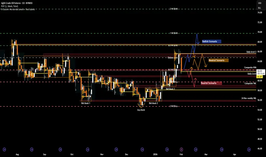
What the market has done
• In November 2025, the market was in a grind trend down to bid block 1, where there was a liquidity check and buyers responded by holding the 56 level.
• Since December, the market has been in a block step trend up due to improving risk sentiment, renewed geopolitical premium, and reduced willingness by sellers to press below established value.
• In the past week, the market imbalanced out of bid block 3 above the 62.4 area (the composite HVA) and rotated higher toward the 65 area at daily level 2. This move coincided with a noticeable rise in geopolitical risk premium in oil markets as tensions between the U.S. and Iran escalated. Markets were responding to reports that the U.S. was considering possible military action if Iran did not negotiate a settlement on key issues, which was interpreted by traders as increasing the chance of supply disruption in the Persian Gulf. This elevated risk pricing helped push crude higher into the 65 area as participants priced in the possibility that instability could affect exports or shipping routes through the Strait of Hormuz. During the same period, there were also reports that Iran had announced live-fire exercises in the Strait of Hormuz, a key oil chokepoint, reinforcing those risk premiums even though no actual supply disruption occurred. The combination of geopolitical headlines and elevated risk appetite drove sellers to defend higher levels only after the initial breakout, leading the market back down toward 62.5 where responsive orders re-entered.
• Sellers responded by pushing price back down toward the 62.5 area, which corresponds with the weekly 0.5 SD low, signaling responsive selling rather than initiative downside continuation. This pullback was supported by an easing of the geopolitical risk premium that had driven the prior breakout. Over the weekend, no U.S. strike on Iran actually took place, and comments from U.S. leadership over the weekend suggested that Iran and Washington were “seriously talking” about negotiations rather than immediate military action. These remarks reduced the acute fear of an imminent strike that had been pushing oil toward multi-month highs late last week. As a result, the risk premium priced into crude unwound somewhat when markets reopened, and prices retraced back toward the 62.5 area as traders reassessed the likelihood of a near-term supply disruption.
What to expect in the coming weeks
The 62.5 area, which marks the level where the market imbalanced out of bid block 3 last week, remains the key level to monitor.
Bullish Scenario
• If the market holds above the 62.5 area, expect a rotation back up toward the 66 area (daily level 2), where sellers are likely to respond initially.
• If sellers fail to regain control at 66, the market could extend higher toward the 67.5 area, which aligns with the 28 Jul 2025 VPOC and the weekly 0.5 SD high.
• Acceptance above that zone would open the door for a test of the 70 area, corresponding with the weekly 1.0 SD high and a more pronounced shift in medium term structure.
Neutral Scenario
• If buyers defend the 62.5 area but sellers respond firmly at 66, expect a two-way auction to develop.
• In this case, price is likely to re- establish value and work through the repair of the previous week’s LVA, favoring rotational trade rather than trend continuation.
Bearish Scenario
• If buyers fail to defend the 62.5 area, expect a move back down into bid block 3 toward 59.7, which aligns with the weekly 1.0 SD low.
• Further downside could test the 59 area, defined by the bid block 3 low and the CVAL, where buyers are expected to respond and attempt to stabilize price.
Conclusion
Crude oil is currently balancing well defined technical structure against an evolving geopolitical backdrop. Risk premiums re-entered the market as unrest in Iran, U.S. rhetoric around a potential strike, and Iran’s live firing exercises near the Strait of Hormuz raised concerns about supply disruption, even though no strike ultimately materialized. The absence of escalation over the weekend led to some unwinding of that premium, reinforcing the recent pullback as responsive rather than initiative selling. At the same time, Venezuela remains a moderating variable, with questions around sanctions enforcement and incremental supply limiting follow through on both extremes.
From a technical perspective, price remains anchored around the 62.5 area, which continues to act as the primary pivot for directional intent. Acceptance above this level would favor renewed upside rotation toward higher distribution targets, while failure to hold would suggest a return into lower value and corrective trade. As geopolitical headlines continue to ebb and flow, traders should remain focused on how price responds at key levels.
If you found this analysis helpful, consider sharing your own levels or scenarios and join the discussion below
Disclaimer: This is not financial advice. Analysis is for educational purposes only; trade your own plan and manage risk.
Acronyms:
C - Composite
w - Weekly
m - Monthly
VAH - Value Area High
VAL - Value Area Low
VPOC - Volume Point of Control
LVN - Low Value Node
HVN - High Value Node
LVA - Low Value Area
SP - Single print
Community ideas
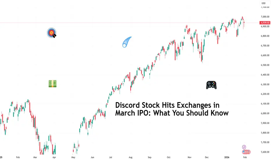
Discord Stock Hits Exchanges in March IPO: What You Should KnowDiscord NASDAQ:DISCORD has filed confidential IPO paperwork with the SEC and is aiming for a March debut (ref: the IPO calendar ), reigniting speculation around one of Silicon Valley’s most closely watched private companies.
The late-stage startup has lined up heavyweight underwriters Goldman Sachs NYSE:GS and JPMorgan Chase NYSE:JPM , a signal that things are getting serious. If market conditions cooperate, Discord could become one of the most prominent IPOs of the year.
🎮 From Gaming Sidekick to Internet Infrastructure
Discord began life in 2015 as a gamer-friendly voice chat tool. It quickly evolved into something far bigger. Today, Discord functions as a digital town square for creators, communities, developers, study groups, and friends who never leave the group chat.
User growth tells the story. Monthly active users expanded from 10 million in 2016 to 150 million by 2019, reaching around 200 million by early 2025. That scale places Discord among the largest real-time communication platforms in the world, well beyond its gaming roots.
Unlike enterprise tools that charge per seat, Discord leaned into a freemium model, keeping core features free and monetizing through optional subscriptions and add-ons. That choice helps build loyalty first and revenue later.
💸 Revenue Grows, Profit Still Waits
From an investor’s perspective, Discord’s financial arc looks familiar. Revenue climbed from $45 million in 2019 to an estimated $725 million by the end of 2024, a remarkable expansion that reflects the platform’s growing relevance.
At the same time, average revenue per user remains modest, and operating losses persist. Discord prioritized scale, product development, and community trust over near-term profitability.
That strategy won fans and mindshare. Public markets, however, tend to ask harder questions once the ticker symbol goes live.
🧠 The Microsoft That Got Away
Discord’s independence has become part of its mythology. In 2021, the company walked away from a reported $10 billion acquisition offer by Microsoft NASDAQ:MSFT , choosing to remain private and chart its own course.
That decision looks prescient today. Discord was last valued at $14.7 billion in a 2021 funding round that raised $500 million. IPO chatter now centers on a potential valuation in the $25 to $30 billion range, depending on market appetite and final timing.
📊 A Friendlier IPO Backdrop
Timing is big here. Discord’s filing arrives as public markets reopen their doors to tech companies after a cautious stretch. The IPO market improved meaningfully in 2025, encouraged by steadier rates, resilient equity indexes, and renewed investor appetite for growth stories.
That said, conditions remain fluid. Trade tensions, regulatory scrutiny, and macro surprises could still influence pricing or timing. Discord is reportedly still deliberating whether to proceed as planned, keeping flexibility as part of the strategy.
🧑🤝🧑 Community as a Competitive Advantage
One of Discord’s strongest assets does not appear on the balance sheet. The platform enjoys a community-first reputation that few tech companies manage to sustain at scale.
That dynamic could translate into strong retail investor interest, especially among younger audiences who already use the product daily. IPOs thrive when familiarity meets optimism, and Discord checks both boxes.
The challenge lies in converting engagement into durable margins without eroding the culture that fueled growth in the first place.
As March approaches, the real question centers on valuation and timing rather than viability. Discord already proved it can build something people care about. But can it get Wall Street onboard?
Off to you : Where do you think the IPO will go? Pop or flop? Share your views in the comments!
AUD/USD – H1 - Head & Shoulders BreakdownAUD/USD has printed a clean Head & Shoulders pattern on the H1 timeframe , signaling a potential trend reversal after a strong bullish run. Price has now broken below the neckline, confirming bearish momentum and opening the door for a deeper correction. OANDA:AUDUSD
🔍 Technical Analysis
🧠 Classic Head & Shoulders formation
Left Shoulder → Head → Right Shoulder clearly respected
❌ Neckline break confirms bearish bias
📉 Momentum shifting from bullish to bearish
🎯 Downside targets:
1.First Key Support Zone
2.Psychological level & lower demand zone
As long as price stays below the neckline, bearish continuation remains favored.
✅Psychological Discipline:
1️⃣Stick to plan – No Revenge Trades.
2️⃣Accept losing trades as part of the strategy.
3️⃣Risk only 1–2% of your account balance per trade.
✅ Support this analysis with a
LIKE 👍 | COMMENT 💬 | FOLLOW 🔔
It helps a lot & keeps the ideas coming!
⚠️ Disclaimer: This analysis is for educational purposes only and does not constitute financial advice. Forex trading involves high risk. Trade only with capital you can afford to lose and always do your own research.

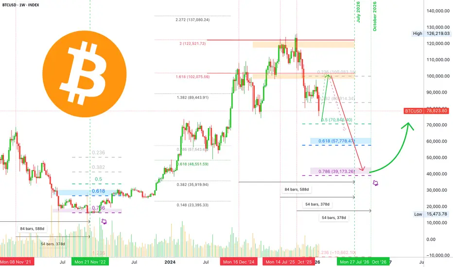
Bitcoin long-term: Full analysis year 2026 including 2027 & 2029My dear reader... It is my pleasure to write again for you today. I would like to show you the chart for Bitcoin long-term; what it looks like, what to expect.
Recently, we had a nice surprise with a bearish move that lasted just a few days longer than expected. A supposed retrace that went from $98,000 to $76,000 in a matter of 16 days. A drop more than 22% strong (-22.76%).
I was having doubts about the final wave of the relief rally. I continued to doubt its duration with an end date around mid-February being just too early, things just didn't add up.
The picture is clear now, based on the current move and the four consecutive red months close, we can easily see a full green February 2026 and also March 2026. The variation comes in March. It can be full green as well with a top in April, as it happened many times in previous cycles, or until mid-March. But now, the picture is clear when it comes to room for growth and duration for a relief rally.
Since $98,000 produced such a strong rejection, this becomes the main resistance on the way up. That is, ~$100,000 is the barrier now, keep this level in mind to prepare for short at the end of the C wave.
There is a saying in this market, "Sell in May and go away."
Let's start to map Bitcoin's long-term chart.
Q1 2026 bullish. Sometime around February, March and April. Can be just February and March. Allow for strong variations.
Q2-Q3 2026 bearish. Bear market climax. Two dates are available for the main lows. July 2026, a major low. October 2026, potential final low. Can be a lower low or higher low or double-bottom. October 2026 is of great interest because the peak happened October 2025. Bitcoin tends to turn bearish for a full year.
Q4 2026 neutral. Recovery period. Bottom consolidation. Some weak bullish action. The start of bullish action very late in the year.
Q1 2027 bullish recovery. The bullish recovery is confirmed.
Q2-Q3 2027 consolidation after initial bullish breakout.
Q4 2027 the start of a new bullish cycle. A new uptrend is fully formed and confirmed. Long-term growth until the final peak sometime around late 2029.
This is our long-term map. As the action unravels, we adapt to market conditions. The map is not the terrain.
Going deeper into the action:
February 2026 can be a bit tricky. While action can turn extremely bullish, an entire month is still a long time. The market can be quite cunning and deceiving. The month can start weak, red, only to turn at some point and produce strong bullish action; do not be deceived. Everything on this chart allows for a wave of growth.
With that said, there is a scenario where the market goes straight down but this is the least probable one but still possible.
A bullish wave in the coming months would produce the classic head and shoulders pattern to conclude Bitcoin's 2025 bullish cycle. The right shoulder is a lower high and this confirms the 2026 major lower low.
Remember how PAXGUSDT and TSLA went bearish recently, clearly showing a worldwide bearish bias in 2026.
It is not yet over, there is time to prepare. When the final high is in, I will share lots of instructions, techniques and opportunities to weather the bear market. We are going up next.
Namaste.
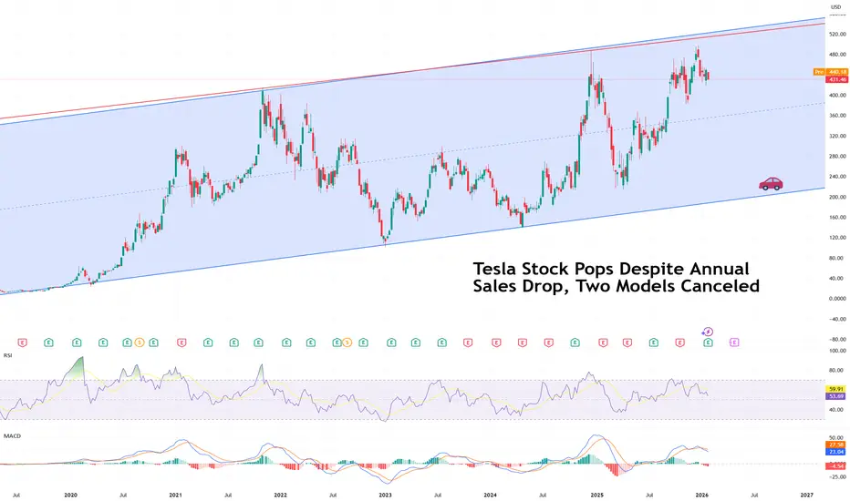
Tesla Stock Pops Despite Annual Sales Drop, Two Models CanceledTesla stock NASDAQ:TSLA managed a modest pop pre-market Thursday, rising about 3%, even as the company delivered a quarter that, on the surface, looked anything but celebratory.
Profits slid. Revenue dipped. Vehicle sales declined. Two iconic models were sent quietly into retirement. And yet, the stock bounced. Welcome to Tesla earnings season.
📉 Profits Fall, Reality Bites
Tesla reported a 61% drop in fourth-quarter profit, underscoring how much tougher the EV business has become. Revenue fell 3% in the quarter to $24.9 billion, bringing full-year 2025 revenue to $94.8 billion, also lower by 3% from the prior year.
EV sales dropped 16% year over year in Q4, and total vehicle deliveries for 2025 came in at 1.64 million, a 9% annual decline. That left Tesla trailing China’s BYD HKEX:1211 , which sold 2.26 million EVs last year and is now firmly wearing the global volume crown.
For a company that once defined EV dominance, this was a clear reminder that the market has caught up.
🏭 The End of an Era
Perhaps the most symbolic announcement came from Elon Musk himself. Tesla is ending production of the Model S and Model X, the premium vehicles that once represented the brand’s technological edge.
Sales have lagged behind Tesla’s mass-market models, and the economics no longer worked. “It’s time to basically bring the Model S and X programs to an end with an honorable discharge,” Musk said.
The Fremont factory space previously used for those vehicles will now be repurposed to manufacture Optimus humanoid robots, Musk said.
That decision alone tells you a lot about where Tesla believes its future lies. But also raises the question: New frontier or the perfect short entry?
🤖 From EV Maker to AI Builder
Tesla’s pivot toward artificial intelligence moved from abstract ambition to concrete capital this quarter. The company disclosed a $2 billion investment in xAI, Musk’s private AI startup, as part of its Series E funding round.
The move raised eyebrows, especially since Tesla shareholders had previously voted down a proposal to invest in xAI, with more “no” votes and abstentions than approvals. Tesla went ahead anyway.
SpaceX, which is eyeing a public listing in June, also committed $2 billion to xAI, reinforcing Musk’s push to build a vertically integrated AI ecosystem spanning cars, robots, rockets, and data.
Musk framed the effort as part of a broader mission. “There’s still obviously many who doubt our ambitions for creating amazing abundance,” he told investors, “but we’re confident it can be done.”
💸 Cash Flow Holds the Line
Despite the profit slump, Tesla delivered a small surprise where it mattered most to skeptics: cash flow.
Free cash flow came in at $1.4 billion, down 30% year over year but well ahead of analyst expectations, which had pointed to negative free cash flow. That cushion gives Tesla room to keep spending on AI and robotics without immediately stressing the balance sheet.
The company is clearly choosing to invest aggressively rather than defend margins, a decision that markets appear willing to tolerate, at least for now.
🚕 Cybercab Still on the Roadmap
Tesla also reiterated plans to begin production of Cybercab , its fully autonomous two-seater with no steering wheel or pedals, in April.
The vehicle remains one of the boldest expressions of Musk’s vision for an AI-first transportation future. It is also one of the least proven. Regulation, autonomy reliability, and consumer acceptance remain open questions.
Still, for investors inclined to think in decades rather than quarters, Cybercab represents optionality. For skeptics, it represents yet another promise waiting to be tested.
🌍 Competition Gets Real
Tesla’s challenges are no longer hypothetical. The EV market is crowded, price-sensitive, and increasingly competitive. Chinese manufacturers continue to scale aggressively. Government subsidies that once fueled demand are fading. Tesla’s lineup is aging faster than its innovation cycle can refresh it.
Musk’s strategy appears clear. EVs remain important, but they are no longer the center of gravity. AI, robotics, and autonomy now sit at the core of Tesla’s long-term story.
That pivot, however, comes with execution risk. Tesla still has to sell cars in the meantime, and margins remain under pressure.
🐻 The Bear Case Gets Louder
Not everyone is buying the vision. Veteran investor George Noble, former director at Fidelity International and founder of two hedge funds, has emerged as one of Tesla’s most vocal skeptics.
Speaking to Business Insider last week, Noble described Tesla as “possibly the biggest bubble in stock market history,” arguing that the stock is deeply disconnected from fundamental valuation.
What’s more, he believes shares should trade between $60 and $140, implying a potential drop of as much as 80% from recent levels.
In his view, Tesla remains primarily a car company with speculative upside attached, rather than an AI platform deserving of tech-multiple valuations.
📊 A Stock Caught Between Two Stories
That tension defines Tesla today. On the one side sits a slowing $1.4 trillion EV business facing global competition and margin compression. On the other stands an ambitious AI and robotics narrative that has yet to generate meaningful revenue.
The market’s reaction suggests investors remain willing to give Musk time, especially after they approved a hefty $1 trillion pay package . Tesla shares are still about 13% below their record high.
Peak earnings season continues with Apple NASDAQ:AAPL reporting after market close today.
Off to you : Where do you land? Do you believe Tesla’s pivot toward AI and robotics marks the start of a new chapter, or do you think gravity eventually reasserts itself and pulls the stock back to earth?
EURUSDHello Traders! 👋
What are your thoughts on EURUSD?
EUR/USD has successfully broken above the descending trendline as well as a key resistance zone, confirming a bullish breakout on the daily timeframe.
At current levels, price is approaching a resistance area. Therefore, a short-term correction is likely, with a potential pullback toward the broken trendline and former resistance zone.
As long as price holds above this reclaimed area, the pullback can be considered corrective, and bullish continuation toward higher targets remains the preferred scenario.
Don’t forget to like and share your thoughts in the comments! ❤️

Hellena | GOLD (4H): LONG to resistance 5200.Since the movement continues and clearly shows no signs of reversing, I had to slightly revise the wave count, and it looks as if the impulse has been extended.
This means that the higher-order wave “3” has just ended or will end soon.
This means that wave “5” is not over yet and we should expect another update of the maximum.
I expect the gap at 4984.97 to be closed, after which I expect the rather important and strong level of 5200 to be reached.
Alternatively, wave “3” has not yet ended and should be expected at the same level of 5200.
Manage your capital correctly and competently! Only enter trades based on reliable patterns!

Silver’s Generational Super Cycle: 31 Years of Waiting, 15 YearsWelcome to a special macro edition of the Mubite market analysis.
Today, we are zooming out to the 12-Month (Yearly) timeframe on Silver (XAG/USD).
In trading, patience is not just a virtue; it is a requirement for generational wealth. The chart we are looking at today tells a story of massive cycles, decades of consolidation, and the explosive payout that follows.
The Technical Story: The Cycle of Patience
As marked on the chart, Silver moves in massive waves. It doesn't just trend; it hibernates, and then it erupts.
1. The 1980 Peak ($48.00) This was the historic high driven by the Hunt Brothers. After this vertical move, the market entered a deep "winter."
The Wait: It took exactly 31 Years for price to return to this level.
2. The 2011 Peak ($49.83) In 2011, history rhymed. Silver revisited the $50 region, forming a massive "Double Top" on the generational chart. Once again, it was rejected.
The Accumulation: This time, the winter was shorter. It took 15 Years of consolidation (half the time of the previous cycle) to build enough energy to break through.
3. The 2026 Breakout ($108+) We are now living through history. The resistance that held for 46 years (1980-2026) has been shattered.
Current Status: Silver is in "Price Discovery," trading above $108. The ceiling of the last two generations has become the floor.
The Golden Rule: "The Trend is Your Friend"
When a commodity breaks a multi-decade resistance, it signals a fundamental shift in the asset's value. The energy stored during that 15-year consolidation is now being released.
...Until It’s Not
However, looking at the yearly candles of 1980 and 2011, we see that when the music stops, it stops abruptly.
The Warning: Vertical moves on a yearly timeframe eventually face mean reversion.
The Strategy: We are trend followers. As long as the price stays above the breakout zone ($50-$60), the trend is aggressively bullish. But be aware: these cycles are measured in decades, not days.
Summary
Cycle 1: 31 Years (1980-2011).
Cycle 2: 15 Years (2011-2026).
Current Trend: Super Cycle Breakout.
Disclaimer: This analysis by Mubite is for educational purposes only and does not constitute financial advice. Always manage your risk.
Do you think we will see $150 silver this year? Let us know in the comments below!

15 Million Tests, Zero Edge: The RSI The Relative Strength Index (RSI), developed by J. Welles Wilder in 1978, remains one of the most widely used technical indicators among retail traders. The conventional wisdom suggests that RSI values below 30 indicate oversold conditions (a buy signal) and values above 70 indicate overbought conditions (a sell signal). This study tests these claims across over one million parameter combinations, 16 different assets spanning five asset classes, and over two decades of market data. Our findings are unambiguous: the RSI overbought/oversold strategy provides no statistically significant edge after correcting for multiple testing. The results challenge fundamental assumptions held by millions of retail traders worldwide and raise important questions about the perpetuation of ineffective trading methodologies through popular financial education.
1. Introduction
Open any beginner's guide to technical analysis, or watch any YouTube tutorial on day trading, and you will encounter the same advice: buy when the RSI drops below 30, sell when it rises above 70. This recommendation has achieved the status of gospel truth among retail traders, repeated so frequently that its validity is rarely questioned. But what if this cornerstone of technical analysis is built on sand?
The RSI was introduced by Wilder (1978) in his influential book "New Concepts in Technical Trading Systems." Originally designed as a momentum oscillator to identify the speed and magnitude of price movements, the indicator has since been co-opted into a mean-reversion tool by generations of retail traders. This transformation occurred largely without empirical validation, propagated instead through repetition in trading education materials.
The financial implications of this belief are substantial. According to research by Barber and Odean (2000), individual investors who trade frequently underperform passive benchmarks by approximately 6.5 percentage points annually. While multiple factors contribute to this underperformance, the use of ineffective trading signals certainly plays a role. If millions of traders base entry and exit decisions on a fundamentally flawed premise, the aggregate wealth destruction becomes a matter of public interest.
This study aims to provide definitive evidence regarding the efficacy of RSI overbought/oversold signals through statistical testing that accounts for data mining bias, multiple comparisons, and the full parameter space that traders might reasonably employ.
2. Literature review
The academic literature on technical analysis has long been skeptical of its predictive power. Fama (1970) established the Efficient Market Hypothesis, arguing that prices fully reflect all available information, rendering technical analysis futile. Subsequent studies by Malkiel (2003) reinforced this view, famously comparing technical analysts to astrologers.
However, some researchers have found evidence of technical trading profitability. Brock, Lakonishok, and LeBaron (1992) documented that simple moving average rules generated excess returns in the Dow Jones Industrial Average from 1897 to 1986. Lo, Mamaysky, and Wang (2000) used pattern recognition algorithms to identify technically significant patterns and found some predictive content, particularly in NASDAQ stocks.
Regarding the RSI specifically, the academic evidence is sparse and mixed. Wong, Manzur, and Chew (2003) examined RSI performance in the Singapore stock market and found modest profitability, though their study did not adequately control for transaction costs or data mining bias. More recently, Neely, Rapach, Tu, and Zhou (2014) included RSI among numerous technical indicators in a comprehensive study and found that while some technical signals contain information, their predictive power has declined significantly since the 1990s.
Crucially, none of these studies examined the RSI overbought/oversold strategy with the methodological rigor required to draw definitive conclusions. Most used a single parameter setting (typically the default 14-period RSI with 30/70 thresholds) without exploring whether results hold across the parameter space. This study addresses that gap.
3. Data and methodology
3.1 Asset universe
We constructed a diverse asset universe spanning five categories to test whether RSI signals perform consistently across different market structures. The selection includes:
United States equities: SPY (S&P 500), QQQ (NASDAQ 100), IWM (Russell 2000), DIA (Dow Jones) representing the core of American equity markets with positive long-term drift characteristics.
International equities: EFA (MSCI EAFE), EEM (Emerging Markets) capturing developed and emerging market dynamics outside the US.
Commodities: GLD (Gold), SLV (Silver), USO (Oil) assets with no inherent yield and mean-reverting tendencies over certain horizons.
Fixed income: TLT (20+ Year Treasury), IEF (7-10 Year Treasury) interest rate sensitive instruments with low volatility characteristics.
Foreign exchange: EUR/USD, GBP/USD, USD/JPY, AUD/USD, USD/CHF zero-sum markets where mean reversion might theoretically be more likely.
Data was sourced from multiple providers including TwelveData, Tiingo, AlphaVantage, and EOD Historical Data APIs, covering periods from inception (where available) through January 2025. All equity ETFs use adjusted prices to account for dividends and splits.
3.2 Parameter grid
Rather than cherry-picking a single parameter combination, we conducted an exhaustive grid search across the following ranges:
RSI calculation periods: 2 to 60 days (59 values)
Oversold thresholds: 5 to 49 (45 values)
Overbought thresholds: 51 to 95 (45 values)
Holding periods: 1, 2, 3, 5, 7, 10, 15, 20, 30, 45, 60, 90 days (12 values)
This produced 1,432,620 parameter combinations per asset, totaling over 22 million potential tests across the full asset universe. After filtering for combinations that generated at least 15 signals (required for statistical validity), over 15 million complete test cases were analyzed.
3.3 Signal definition
We define an oversold signal as occurring when the RSI crosses below the oversold threshold from above. Similarly, an overbought signal occurs when the RSI crosses above the overbought threshold from below. This crossing requirement prevents counting multiple signals during extended periods in extreme territory.
For each signal, we calculate the forward return over the specified holding period. The "edge" is defined as the difference between the mean return following signals and the mean return of the baseline (all holding periods of the same length).
3.4 Statistical framework
We employ Welch's t-test to compare signal returns against baseline returns, accounting for unequal variances. Given the massive number of tests conducted, we apply both Bonferroni correction (dividing the significance threshold by the number of tests) and Benjamini-Hochberg False Discovery Rate control to guard against spurious findings.
The Bonferroni-corrected significance level for over one million tests at alpha = 0.05 is approximately 5 x 10^-8. This stringent threshold ensures that any surviving significant result is highly unlikely to be a false positive.
4. Results
4.1 Aggregate findings
Figure 1 presents the summary dashboard of our analysis. Panel A shows the distribution of edge values across all 15 million tests. The histogram is centered almost precisely at zero, with a slight negative skew. This visual immediately suggests that RSI signals do not consistently outperform random entry points.
Panel B displays the percentage of tests that achieved nominal statistical significance (p < 0.05) by asset category. Under the null hypothesis of no effect, we would expect exactly 5% of tests to appear significant by chance alone. The actual percentages range from approximately 3% (International Equity) to 13% (US Equity). While some categories exceed the 5% threshold, this does not indicate true predictive power; rather, it reflects the correlation structure within asset classes and the violation of independence assumptions.
Panel C reveals how the edge varies by holding period. No consistent pattern emerges. Some holding periods show marginally positive average edge, others marginally negative. The magnitudes are economically insignificant, typically less than 0.1 percentage points.
Panel D presents the distribution of p-values. Under the null hypothesis (no true effect), p-values should be uniformly distributed between 0 and 1. The observed distribution closely matches this expectation, providing further evidence that RSI signals lack predictive content. The slight excess of low p-values is consistent with the correlation structure among tests rather than genuine predictive power.
4.2 Results by asset class
Figure 2 displays box plots of the edge distribution for each asset category. The left panel shows oversold (buy) signals, the right panel shows overbought (short) signals. Each box represents the interquartile range of edge values across all parameter combinations for that asset class, with whiskers extending to show the full distribution.
Several observations stand out:
US Equity shows a small positive median edge for both signal types. However, this likely reflects the positive drift of equity markets rather than RSI timing ability. When the market has a positive expected return, buying at any point (including oversold RSI readings) will generate positive returns on average.
Commodity and Bond categories show predominantly negative edges. This is particularly damaging to the RSI hypothesis because these assets lack strong directional drift, so any timing ability should be more apparent.
Forex shows edges clustered tightly around zero, consistent with the efficient market hypothesis for currency markets.
International Equity mirrors the US Equity pattern but with smaller magnitude, reflecting lower historical drift in non US developed markets.
4.3 Parameter sensitivity
Figure 3 presents heatmaps showing how the edge varies across the parameter space. The top row displays oversold signal results, the bottom row overbought signals. The left column maps edge against RSI period and threshold, while the right column maps edge against threshold and holding period.
If RSI signals possessed genuine predictive power, we would expect to see consistent "hot spots" in these heatmaps - parameter regions that reliably generate positive edge. Instead, the patterns are noisy and inconsistent. Small positive regions are adjacent to equally sized negative regions, suggesting random variation rather than systematic predictive ability.
One might attempt to argue that the optimal parameters should be used rather than the full distribution. This reasoning is precisely the data mining trap that has led to the perpetuation of RSI mythology. Any indicator will show some parameter combinations that performed well historically by chance alone. The question is whether this performance persists, and the random pattern in these heatmaps suggests it will not.
4.4 Multiple testing correction
Figure 4 shows the distribution of p-values for oversold and overbought signals separately. The yellow vertical line marks the conventional 0.05 significance threshold. The key finding is revealed in the title: after Bonferroni correction, exactly zero tests remain statistically significant.
This result is devastating for RSI proponents. Out of over 15 million rigorously conducted tests across multiple assets, timeframes, and parameter settings, not a single one demonstrated predictive power that could withstand proper statistical scrutiny. The "significant" results at p < 0.05 are entirely consistent with the expected false positive rate under the null hypothesis.
4.5 Quantitative summary
The overall statistics tell a clear story:
Mean oversold (buy) edge: -0.01 percentage points
Mean overbought (short) edge: +0.00 percentage points
Tests significant at p < 0.05: 7.3% (oversold), 8.8% (overbought)
Tests significant after Bonferroni correction: 0
The slight elevation above 5% in nominal significance rates reflects correlations among tests (same underlying assets tested with different parameters) rather than genuine effects.
5. How professional traders actually use RSI
Given these findings, one might reasonably ask: do any market professionals use RSI, and if so, how?
The answer requires distinguishing between retail usage and institutional practice. Professional traders, when they use RSI at all, employ it fundamentally differently than the oversold/overbought paradigm suggests.
5.1 Momentum confirmation, not contrarian signals
Institutional traders who incorporate RSI typically use it as a momentum filter rather than a mean reversion signal. The approach is precisely opposite to retail wisdom: they buy when RSI is above 50 (indicating upward momentum) and sell or avoid positions when RSI is below 50.
Antonacci (2014) documented in his research on dual momentum that trend-following approaches consistently outperform mean-reversion strategies across most asset classes and time periods. RSI above 50 serves as a simple proxy for positive momentum, not a sell signal as retail traders often interpret strong readings.
5.2 Divergence analysis
Some technical analysts use RSI divergence situations where price makes new highs while RSI fails to do so (or vice versa). This approach has marginally better theoretical grounding, as divergence potentially captures changes in buying or selling pressure. However, empirical evidence for divergence strategies remains weak, and the subjective nature of identifying divergences makes systematic testing difficult.
5.3 Regime filtering
In quantitative strategies, RSI sometimes appears as one input among many in machine learning models or factor based approaches. Critically, it is never used as a standalone signal. Professional quants understand that any single indicator lacks the information content to generate reliable trading signals.
5.4 The uncomfortable truth
The most accurate answer to "how do professionals use RSI?" is: most do not use it at all. Surveys of institutional trading desks reveal that the vast majority of systematic trading strategies rely on fundamental factors, statistical arbitrage, or market microstructure - not classical technical indicators like RSI.
The persistence of RSI in retail trading education serves purposes other than profit generation. It provides a simple narrative that novice traders can understand, creates content for financial education products, and gives traders a false sense of control over inherently unpredictable market movements.
6. Why the myth persists
Given the weight of evidence against RSI efficacy, why does belief in oversold/overbought signals persist? Several psychological and structural factors contribute.
6.1 Confirmation bias
Traders remember the times when RSI worked and forget when it failed. A dramatic reversal following an RSI extreme creates a memorable story; a prolonged trend that ignores the indicator creates no narrative at all. This selective memory reinforces belief despite contradictory evidence (Kahneman, 2011).
6.2 The education industry
Countless books, courses, and YouTube channels teach RSI strategies. These content creators have financial incentives to perpetuate beliefs regardless of empirical validity. Questioning foundational technical analysis concepts threatens the business model of trading education.
6.3 Survivorship bias in trading stories
Traders who happened to succeed using RSI are more likely to share their stories and teach others. Those who failed quietly exit the markets. This creates the illusion that RSI strategies can work, when in reality success stories represent the lucky tail of a random distribution.
6.4 Complexity aversion
RSI provides a simple, actionable rule: buy at 30, sell at 70. The reality that markets are fundamentally unpredictable is psychologically uncomfortable. Simple indicators satisfy the human need for patterns even when those patterns are illusory.
7. Implications for traders
The findings of this study have direct practical implications:
7.1 Abandon mechanical RSI strategies
Traders should immediately stop using RSI overbought/oversold levels as entry or exit signals. The evidence is clear that this approach has no statistical edge and may actually destroy wealth, particularly in commodity and bond markets where negative edges were observed.
7.2 Recognize the limits of technical analysis
While some technical approaches may have marginal validity (particularly trend-following methods), indicators should never be used in isolation. Any edge from technical analysis has likely diminished as markets have become more efficient and algorithmic (Neely et al., 2014).
7.3 Focus on risk management
Rather than seeking prediction accuracy, successful trading requires managing position sizes, diversification, and downside risk. No indicator can predict the future, but disciplined risk management can ensure survival through inevitable losing periods.
7.4 Consider alternative approaches
For retail traders seeking systematic approaches, academic research supports factor-based investing (momentum, value, quality) far more strongly than technical analysis. These approaches have theoretical grounding in behavioral finance and structural market features that technical indicators lack.
8. Limitations and future research
This study has limitations that should guide interpretation and future research.
First, we examined only daily data. RSI behavior on intraday timeframes might differ, though microstructure research suggests shorter timeframes are even more efficient than daily data.
Second, transaction costs were not explicitly modeled. Including realistic costs would further degrade any marginal edge that might exist.
Third, we did not test combination strategies where RSI is one component of a multi-indicator system. However, adding noise (ineffective indicators) to a system generally degrades rather than enhances performance.
Future research might examine whether RSI contains any information when combined with fundamental factors, or whether adaptive threshold approaches (adjusting overbought/oversold levels based on market conditions) improve results.
9. Conclusion
This study conducted the most comprehensive test of RSI overbought/oversold signals in the academic literature, examining over 15 million parameter combinations across 16 assets spanning five asset classes over multiple decades. The results are unequivocal: RSI extreme readings provide no statistically significant predictive power after accounting for multiple testing.
The implications extend beyond individual trading decisions. The persistence of RSI mythology in trading education represents a broader failure of financial literacy. Millions of retail traders deploy capital based on beliefs that have no empirical foundation, contributing to the well-documented underperformance of individual investors.
The evidence does not support the thesis that buying oversold assets or selling overbought assets generates excess returns. Traders would be better served by indexing, factor based approaches, or at minimum, an honest acknowledgment that short term market movements are fundamentally unpredictable.
The RSI, whatever its original merits as a momentum descriptor, has become a misleading tool in the hands of retail traders seeking simple solutions to complex markets. This study provides the quantitative foundation to retire this particular myth from responsible financial education.
References
Antonacci, G. (2014) Dual Momentum Investing: An Innovative Strategy for Higher Returns with Lower Risk. New York: McGraw-Hill Education.
Barber, B.M. and Odean, T. (2000) 'Trading is hazardous to your wealth: The common stock investment performance of individual investors', Journal of Finance, 55(2), pp. 773-806.
Brock, W., Lakonishok, J. and LeBaron, B. (1992) 'Simple technical trading rules and the stochastic properties of stock returns', Journal of Finance, 47(5), pp. 1731-1764.
Fama, E.F. (1970) 'Efficient capital markets: A review of theory and empirical work', Journal of Finance, 25(2), pp. 383-417.
Kahneman, D. (2011) Thinking, Fast and Slow. New York: Farrar, Straus and Giroux.
Lo, A.W., Mamaysky, H. and Wang, J. (2000) 'Foundations of technical analysis: Computational algorithms, statistical inference, and empirical implementation', Journal of Finance, 55(4), pp. 1705-1765.
Malkiel, B.G. (2003) 'The efficient market hypothesis and its critics', Journal of Economic Perspectives, 17(1), pp. 59-82.
Neely, C.J., Rapach, D.E., Tu, J. and Zhou, G. (2014) 'Forecasting the equity risk premium: The role of technical indicators', Management Science, 60(7), pp. 1772-1791.
Wilder, J.W. (1978) New Concepts in Technical Trading Systems. Greensboro, NC: Trend Research.
Wong, W.K., Manzur, M. and Chew, B.K. (2003) 'How rewarding is technical analysis? Evidence from Singapore stock market', Applied Financial Economics, 13(7), pp. 543-551.

Silver at $110 in Fierce Rally, Gold Tops $5,100. What’s Behind?(What a chart.)
Silver OANDA:XAGUSD is on a tear. Actually, scratch that — silver is on a mission. Prices have surged more than 250% over the past year, including a blistering 50% jump in January alone, lifting the metal to around $109 an ounce and placing the $110 level firmly in sight .
That performance puts silver ahead of nearly every major commodity and even ahead of gold, the traditional anchor of the precious-metals complex. Momentum has been relentless, headlines have grown louder, and price action has moved from steady to explosive.
When markets accelerate this quickly, attention follows. So does risk.
🪙 Gold Climbs with Purpose
Gold OANDA:XAUUSD has also started 2026 in strong form, trading above $5,100 an ounce for the first time in history. The move builds on a powerful rally that delivered a 60% gain in 2025, driven by familiar macro forces that continue to shape investor behavior.
Compared with silver’s all-over-the-place sprint, gold’s climb looks measured and deliberate. That difference highlights the contrasting roles the two metals play in portfolios. Gold behaves like a heavyweight asset, absorbing large flows with relative calm. Silver responds more sharply to changes in sentiment and positioning.
⚙️ Silver’s Fundamental Case Gains Strength
Silver’s story extends beyond safe-haven demand. Industrial use now forms the backbone of the market. As one of the most efficient conductors of electricity, silver plays a central role in electronics, solar panels, circuit boards, and energy infrastructure.
According to Metals Focus, industrial demand now accounts for around 60% of total silver consumption, up significantly from a decade ago. That shift has aligned silver with long-term trends in electrification and renewable energy investment.
Supply dynamics add further pressure. Roughly three-quarters of new silver supply comes as a byproduct of mining other metals such as copper and zinc. Production responds slowly to price signals, and demand has exceeded supply every year since 2018. Last year’s deficit reached nearly 20%, with another shortfall expected in 2026.
📈 Speculation Takes the Wheel
But also, price behavior suggests fundamentals alone no longer explain silver’s trajectory. Speculative positioning has become a dominant force.
The silver market carries a total value of roughly $5.3 trillion, far smaller than gold’s $33 trillion footprint. That size difference amplifies volatility and accelerates moves when capital flows surge.
Intraday swings have grown aggressive. Moves of several dollars within minutes have become common, shifting hundreds of billions of dollars in market value in short bursts. Traders accustomed to slower commodity cycles have found themselves navigating price action that resembles high-beta equities.
🌍 Politics Add Energy to the Trade
Geopolitical tension is adding support for another leg up. President Donald Trump’s renewed trade and military rhetoric toward Europe, including commentary around Greenland , has reinforced demand for real assets.
At the same time, the administration clarified that tariffs on silver and other critical minerals remain off the table. That clarification did little to slow momentum, raising questions about how much of the rally rests on positioning rather than policy.
🥇 Gold’s Rally Follows Familiar Lines
On the other hand, gold’s advance reflects a broader macro backdrop. Elevated inflation, a weaker US dollar , and continued central-bank buying have supported demand.
Expectations for further Federal Reserve rate cuts in 2026 strengthen the case, as lower yields reduce the appeal of fixed-income alternatives. (Make sure you watch the economic calendar to catch any surprise announcements.)
Gold also benefits from deep scarcity. According to the World Gold Council, total gold mined throughout history amounts to approximately 216,265 tons, enough to fill just about four Olympic-size swimming pools.
The US Geological Survey estimates another 64,000 tons remain underground, though production growth is expected to level off as accessible deposits diminish. That constraint continues to anchor gold’s role as a long-term store of value.
⚖️ Valuation Questions Surface
Debate has shifted toward valuation. Very few analysts expect silver to revisit the $20-to-$30 range last seen in late 2022. Structural demand and supply dynamics suggest a higher baseline.
Prices above $100, however, place silver in rare territory where momentum and leverage exert significant influence. In such environments, price discovery becomes less orderly and reactions grow sharper.
🎁 The Takeaway
Silver and gold are rising for different reasons and behaving in distinct ways. But one thing unites them. Right now, it’s more about speculation than anything else.
Off to you : Are you sleeping on the rally or you’ve bet on either of these metals? Share your approach in the comments!

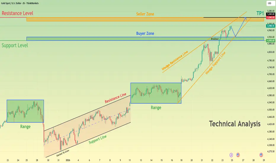
XAUUSD Bullish Structure Intact - $5,040 AheadHello traders! Here’s my technical outlook on XAUUSD (2H) based on the current chart structure. Gold continues to trade within a broader bullish context, maintaining a sequence of higher highs and higher lows. Earlier in the move, price spent a significant amount of time consolidating inside multiple range structures, indicating accumulation before continuation. After breaking out of the most recent range, XAUUSD accelerated higher and respected a rising trend structure, confirming sustained buyer control. This bullish impulse transitioned into a rising wedge formation, where price continued to climb while compressing between the wedge support and resistance lines. During this phase, pullbacks remained corrective, and buyers consistently defended higher support levels. Recently, Gold broke above the key Buyer Zone around the 4,900 level, confirming a successful breakout and acceptance above previous structure. This level has now flipped into support and aligns with the broader Support Level marked on the chart. Price is currently consolidating above this zone while respecting the wedge support line, suggesting continuation rather than exhaustion. Above the market, a well-defined Seller Zone and Resistance Level near 5,040–5,050 stands as the next major obstacle, where profit-taking or selling pressure may emerge. My scenario: as long as XAUUSD holds above the 4,900 Buyer Zone and continues to respect the rising wedge support, the bullish bias remains intact. I expect buyers to maintain control and attempt a continuation toward the 5,040 resistance area (TP1). A clean breakout and acceptance above this Seller Zone would confirm further upside continuation and open the door to new highs. However, a clear rejection from resistance could lead to a short-term pullback toward the Buyer Zone before the next directional move. A decisive breakdown below support would weaken the bullish structure and signal a deeper corrective phase. For now, market structure and momentum continue to favor buyers. Please share this idea with your friends and click Boost 🚀
Again C3.AI - 90 % potential profit - TARGET 24 USDOn the daily chart, the stock remains in a long-term downtrend; however, downward momentum has clearly weakened in recent weeks. Price has stabilized around the 12–13 USD area, which previously acted as a demand zone. This price behavior suggests a possible accumulation phase following a prolonged decline.
Volatility has compressed significantly near the lows, a condition that often precedes a strong directional move. The price has also started to interact more closely with shorter-term moving averages, indicating an improvement in short-term market structure. A potential rebound toward 24 USD aligns with a major former supply zone and the area of the long-term moving average, making it a logical upside technical target.
As long as price holds above the current support zone and buying volume increases, a short-term bullish recovery toward higher levels remains a valid scenario.
Potential TP: 24 $
This analysis is for informational and educational purposes only and does not constitute investment advice, a recommendation, or an offer to buy or sell any financial instrument. Investing involves risk, and past performance is not indicative of future results. Investors should conduct their own research and risk assessment before making any investment decisions.

3 Best Forex Scalping Strategies For 15-Minutes Minutes Trading
If you are looking for a profitable gold forex scalping strategy, but you are struggling to choose one among hundreds that are available,
I prepared for you 3 must-try profitable scalping strategies.
These strategies are very different and unique:
one is based on a p rice action analysis , one is smart money concepts based and one is a technical indicator strategy.
So you will definitely find the one that suits your trading style.
One important note before we start.
There is one crucial element that unites all these strategies:
we will strictly look for trading entries from 4H key levels: key horizontal supports and resistances.
Only when the price tests such structures, we will start searching for a trading signal on 15 minutes time frames.
For that reason, make sure that you execute structure analysis on a 4h time frame.
Here is how a 4h time frame structure analysis should look like.
You should underline recent, historically significant horizontal support and resistance areas.
Strategy 1
Price action
Scalping with a price action on 15 minutes time frames, you should look for:
- a bullish price action pattern after a test of a 4H support
- a bearish price action pattern after a test of a 4H resistance
Here is the list of bullish patterns:
Double bottom, horizontal range, inverted head & shoulders pattern,
cup & handle pattern, ascending triangle.
Your bullish signal will be a breakout - a candle close above a neckline of the pattern.
After a test of a 4H horizontal support, EURUSD formed an ascending triangle formation on 15 minutes time frame.
Its neckline violation is a strong bullish confirmation.
A perfect entry point should be a retest of a broken neckline.
The safest stop loss will be below the low of the pattern.
Target - the closest 15 minutes key resistance.
Formation of a bullish price action pattern and its neckline breakout signifies the strength of the buyers and confirms the validity of a structure that was identified on a 4H time frame.
Here is the list of bearish patterns:
Double top, horizontal range, head & shoulders pattern, inverted cup & handle pattern, descending triangle.
Your bearish signal will be a breakout - a candle close below a neckline of the pattern.
Take a look at the example:
after a test of a key horizontal 4H resistance, the price formed a double top formation on a 15 minutes time frame.
The violation of a neckline of the pattern is a strong bearish confirmation.
Set a sell-limit order on a retest of a broken neckline,
place stop loss above the highs of the pattern,
target will be the closest 15 minutes key support.
Formation of a bearish price action pattern and its neckline breakout signifies the strength of the sellers and confirm the validity of a structure that was identified on a 4H time frame.
Strategy 2
Smart Money Concepts
Scalping with SMC, key horizontal 4H supports and resistances will be perceived as liquidity zones.
Your bullish confirmation after a test of a bullish liquidity zone will be an inducement (a false violation of a lower boundary of the zone) with a consequent formation of an imbalance bullish candle that completely engulfs the range of a previous bearish candle with its body.
Here are the examples of bearish inducements - a false structure violation.
Here is the example of a bullish imbalance after the inducement.
An imbalance bullish candle should have a relatively big body and should completely engulf the entire range of a previous bearish candle.
You should open a long position immediately after the close of a bullish imbalance candle.
Stop loss should lie below its low.
Take profit - the closest 15 minutes resistance.
With bearish inducement, smart money are attempting to force buyers close their position in losses and force sellers to open short positions, grabbing their liquidity.
Formation of a bullish imbalance indicates a real intention of big players.
Your bearish confirmation after a test of a bearish liquidity zone will be an inducement (a false violation of an upper boundary of the zone) with a consequent formation of an imbalance bearish candle that completely engulfs the range of a previous bullish candle with its body.
Above is the example of a bullish inducement followed by a bearish imbalance that completely engulfed the range of a previous bullish candle.
Short position should be opened immediately after a close of an imbalance bearish candle.
Take profit - the closest 15 minutes support.
Stop loss above the high of the candle.
With bullish inducement, smart money are attempting to force sellers close their position in losses and force buyers to open long positions, grabbing their liquidity.
Formation of a bearish imbalance indicates a real intention of big players.
Scalping Strategy 3
Technical Indicators
Technical indicators can provide a strong confirmation after a test of key 4H horizontal structure.
One of the most accurate technical indicators is the combination of 2 Moving Averages with different ranges.
Their crossover will provide an accurate bullish and bearish signal.
For our strategy, we will take Simple Moving Average with 5 range and Exponential Moving Average with 9 range.
The crossover of Exponential Moving Average by Simple Moving Average from downside will be a strong bullish signal and a long position should be opened immediately then.
Stop loss should lie below the entire 4H horizontal support, and the target will be THE CLOSEST 4H resistance.
In comparison to 2 previous strategies, the Moving Average confirmation gives much bigger profit potential.
The crossover of Exponential Moving Average by Simple Moving Average from the upside will be a strong bearish signal and a short position should be opened immediately then.
Stop loss should lie above the entire 4H horizontal resistance, and the target will be THE CLOSEST 4H support.
Being applied properly, the strategy will provide very high accuracy and reward to risk ratio.
Try these 3 scalping strategies, backtest them and choose the one that suites your trading style.
❤️Please, support my work with like, thank you!❤️
I am part of Trade Nation's Influencer program and receive a monthly fee for using their TradingView charts in my analysis.

Only God or Nuclear War Can Break This Weekly Gold ResistanceA Resistance That Has Stopped Gold for 20 Years
On the weekly chart, gold has respected the same rising resistance line through every major global crisis:
May 2006 – ~$723
September 2011 – ~$1,900
Now / early 2026 projection – ~$5,000–$5,200
Each time price reached this zone, the world was under extreme stress; wars, financial crises, or systemic instability. Each time, gold stalled.
This level is not random. It’s historical memory.
What Drove Each Major Rally
-2006: Middle East wars, rising geopolitical tension, early cracks in the financial system
-2011: Global Financial Crisis aftermath, QE, eurozone debt crisis, loss of trust in banks
-2020–2022: COVID, unlimited stimulus, supply-chain breakdown
-2022–Now: Russia–Ukraine war
Middle East escalation
Red Sea trade disruptions
China–Taiwan tensions
Central banks aggressively buying gold
Exploding sovereign debt
De-dollarization no longer theoretical
This rally is not about greed. It’s about protection.
I’m Calling the Top (For Now)
I’m calling this a temporary top.
Gold has gone vertical into a multi-decade weekly resistance that has never been broken cleanly. Moves like this do not continue straight up. They pause, correct, and reset.
My base case is a meaningful correction toward the 38.2% Fibonacci retracement, around $3,800, to retest structure and flush late buyers.
Final Thought
Gold isn’t rallying because traders are bullish. It’s rallying because trust is breaking. But even fear respects structure.
This resistance has survived wars, crises, and pandemics.
If it breaks decisively, it won’t be because of technicals.
It will be because something bigger than markets forces it. Only God or something close to nuclear-level escalation does that !!

UJ, Yen takes over, Weekly Overview and Upcoming week PlanThe week:
Exiting week for the pair, first signs of weakness in the trend confirmed both by the pattern and level where it happen. A text book evening star at the same level where the found resistance and reversed on the week of 13 January last year, so know we have 3 confirmations: Time, Pattern and level, and to add more to it we have healthy volume above average, indicating that this is not just price manipulation but there is real market participation. Next Target for the bears is the weekly lower band at around 154.500 if it crosses this level successfully the next area of support is down at 146.500. Last year at this level the price entered in a waterfall without re-testing the high, but we should not exclude that.
Another interesting pattern is the shotting star that happened in June 2024 just about this level a bit higher, the are identical and also had a price waterfall after that (I marked them in the chart to visualise better). Now we all know that historical PA is a guidance only not a prediction of future PA, but those old levels are the bedrocks of the chart analysis.
Daily Chart:
All gains from December 24th were wiped in day, strong day for the bears was Friday and the change of sentiment is clear. Looking at the volume we can see that the selling started earlier in the week already on Tuesday we can identify that by looking at that narrow/doji candle and the huge volume that came with, institutions were already selling in a weak market.
4h Chart:
Getting even a closer look, what took my attention is that the re-test of the high on this TF is already done, so it gives some confidence to believe that the price it wont be going back to 159.000 again, if a correction is to happen from the current level I would expect to go as high as the Daily Mid Range, if you look at the chart you will notice that the mid ranges of 4h, daily and weekly are very near to each other and each of them is adding to the resistance at this level, further confirmation that it will be hard for the bulls to push it over those levels.
1h Chart:
Zooming into those trading ranges, is interesting to see that watching on the left from the current level we note that we are entering into the mid December trading levels and the most important level is 154.500 where the price found support on multiple occasions and this is where the bottom band of the weekly range is situated, perfect for a target on our entries.
The Plan
Short Breakout of the current low, before the breakout would be better to see a bit of correction as mentioned earlier, to around 157 level, this is where the first short positions can come and the add more at breakout of the low. Target Weekly low band 154.5 and Weekly -0.25 extension just above 153.
This is the only entry I'm interested in this week, obviously one might consider to join the bulls in that correction with a long there are good levels for SL and Target (i.e SL below 155.500 and target 157.250)
Thank you for dedicating some of your very precious time reading this idea.
If you want to know more about how to improve your trading confidence and optimise your Profits, soon I will be releasing a very interesting article which took me over an year to prepare on the importance of trading empirical data collection, if is something you might like follow to don't miss it.

BTC Is Not Weak — It’s Just Quiet Before the Next Big WaveIf I look at BTCUSDT right now through the lens of someone who has lived through multiple market cycles, what I see is a market that is calm rather than weak.
Recent news hasn’t delivered a major catalyst, and that is actually a positive sign. There is no new macro pressure, no unexpected bad news, and capital is still staying within Bitcoin. In that context, the market naturally chooses accumulation over panic selling.
On the chart, BTC is far from losing control . Price remains above the Ichimoku cloud, and the medium-term bullish structure is still intact. The 88,000 USD zone is acting as a psychological buffer — a level where sellers are losing momentum and buyers are starting to wait patiently.
The current volatility should be seen as a short-term position clean-up, not a reversal signal . The market is digesting the previous rally, quietly rebuilding energy for the next move.
As long as BTC continues to hold this price base, the probability of a retest toward the 94,000 USD zone remains high. This is the kind of market that does not reward impatience, but favors traders who understand that sustainable uptrends always need a pause in between.

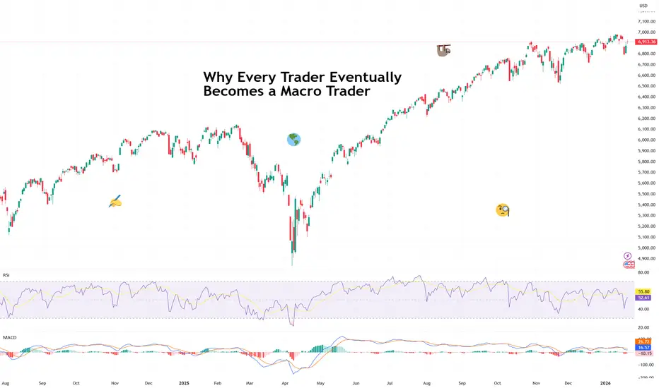
Why Every Trader Eventually Becomes a Macro Trader(And secretly enjoys it.)
Most trading careers begin the same way: a chart, a setup, a belief that price action alone is a complete and self-contained universe. Support, resistance, maybe a moving average or two. Clean. Elegant. Pure.
Macro? That’s for economists, right? Or people who say things like “financial conditions” without irony.
And yet, somewhere along the way — usually after a perfectly good trade gets steamrolled by a CPI print ECONOMICS:USCPI or a central banker saying “Good afternoon” — something changes.
That’s when the questions start.
🤔 “Why Did That Happen?”
You nailed the technicals. Entry was clean. Risk was defined. And then the market moved so quickly you gasped for air while looking at the chart. You zoom in and out but you’re still chart-only.
And that’s when you need to look outside the chart and into the top market-moving headlines and the economic calendar .
You’ve just taken your first step into macro trading — whether you meant to or not.
Why did yields spike?
Why did the dollar suddenly strengthen?
Why did stocks sell off even though earnings were fire?
🧭 Macro Isn’t About Prediction — It’s About Context
Macro trading isn’t about forecasting GDP or guessing the next Fed move six months in advance. It’s about context.
Macro explains the background music playing behind your trades. It tells you whether the market is dancing to growth, inflation, liquidity, fear, or some awkward remix of all four.
You don’t need to trade bonds to care about yields.
You don’t need to trade FX to care about the dollar.
You don’t need to trade commodities to feel inflation.
Macro leaks into everything — slowly, then all at once.
🏦 Central Banks: The Characters You Can’t Ignore
At some point, every trader realizes that central banks are a main character.
The Federal Reserve cuts rates , and suddenly risk assets float.
The Bank of Japan is expected to hold ‘em , and global carry trades pick up the pace.
The ECB pauses , and currencies recalibrate their personalities.
You may still be trading stocks or crypto or indices — but now you’re watching press conferences, parsing language, and wondering whether “data dependent” sounded more confident this time.
📈 Even Charts Are Quietly Macro
Most traders already trade macro without admitting it.
That breakout after CPI? Macro.
That trend that only worked during easing cycles? Macro.
That volatility compression before a Fed meeting? You bet.
Price action reflects expectations. Expectations are shaped by macro forces.
At some point, ignoring macro makes you start feeling incomplete — like reading the last chapter of a book without knowing the plot.
🎢 The Emotional Upgrade You Didn’t Expect
Here’s the part nobody warns you about: macro actually makes trading less stressful.
Once you understand the bigger forces at play, fewer moves feel random. You stop blaming yourself for every losing trade and start recognizing regime changes.
Macro doesn’t make you smarter overnight — but it makes you calmer. And calm is a competitive advantage.
🧩 From “Sectoral Trader” to “Narrative Trader”
This is where the secret enjoyment kicks in.
Macro gives trades a story and you start thinking in themes:
Growth vs. inflation
Liquidity vs. tightening
Risk appetite vs. fear
Policy divergence vs. convergence
Suddenly, trades feel connected. One market leads, another follows. Correlations make sense — until they don’t, which also makes sense .
🧠 The Quiet Shift in Identity
The funny thing is, most traders never announce this transition. One day you just realize you’re checking bond yields before opening a stock chart. You care about currencies even if you don’t trade them.
You know when not to push risk — and that’s an edge, too.
🎁 The Takeaway
Every trader eventually becomes a macro trader — not because they want to, but because markets demand it.
The best part? Once the puzzle pieces start fitting together, it becomes quietly fascinating.
So if you’ve caught yourself watching central banks, tracking yields, or wondering how one market’s move might ripple into another — you’re going macro.
Off to you : When did you first find out that central banks, currencies, stocks, and crypto are tied into the same global macro narrative? Share your macro journey in the comments!
Want to Know Where Gold is Heading? Look at JP10Y!Want to Know Where Gold is Heading? Look at JP10Y!
+0.89 correlation: Did you know about this relationship between Japanese bonds and gold?"
One of the most overlooked indicators by gold investors is Japanese Government Bonds (JP10Y). When we examine the price movement over the past 5 years, a surprising relationship emerges: wherever JP10Y goes, gold follows!
📊 Correlation Analysis
The correlation coefficient between the two instruments is at +0.89 level, which means a very strong positive relationship.
On the chart, the red (JP10Y) and yellow (XAU/USD) lines move almost parallel. When JP10Y enters an uptrend, gold ounce seriously follows it, especially since January 2024, gold has caught a strong bull trend together with the rise in JP10Y.
🧠 So Why Does This Relationship Exist?
Why does gold rise when Japanese bond yields go up?
Japan kept interest rates very low for years, almost at 0% level. That's why investors borrowed cheaply from Japan and invested this money in high-interest countries. This strategy is known as "Carry Trade" and was very profitable for years.
Now the situation has changed. Japanese bond yields have started to rise and borrowing from Japan is becoming expensive. Investors are beginning to review their carry trade positions, saying "this business is not that profitable anymore."
When JP10Y rises, investors think: carry trade risk is increasing, uncertainty in markets may rise, and I may need to flee to safe haven. Also, when JP10Y rises, the Japanese Yen strengthens, a strong Yen puts pressure on the dollar, and a weak dollar pushes gold up because gold is priced in dollars.
As a result, when JP10Y rises, both the safe haven search and dollar weakness feed gold.
💡 Important Note for Investors
JP10Y can be used as a leading indicator for gold.
When JP10Y is in an uptrend, the expectation of a rise for gold may strengthen, if a sudden drop is seen in JP10Y, a correction may occur in gold, and the breakdown of correlation can be an early warning signal for a trend change.
📌 Conclusion
When investing in gold, it's not enough to just look at the dollar, the FED, or geopolitical events. Indirect indicators like JP10Y can also seriously affect your portfolio strategy. Critical level to watch: JP10Y holding above 1,5 may give a positive signal for gold.
Thanks for reading.

Doge and a BIG rise!Hi!
As shown on the chart, DOGE has clearly broken above the long-term descending trendline, which had been acting as resistance for several weeks. Following this breakout, price moved higher and confirmed the shift in market structure.
Importantly, the breakout was supported by a strong bullish engulfing move, taking out the previous local high. This price action strengthens the case for a trend reversal rather than a simple relief bounce.
After the impulsive move up, DOGE is now pulling back toward a key demand zone around $0.11–$0.13, which aligns with prior structure support and the breakout retest area. This zone offers a favorable risk-to-reward opportunity for long positions.
As long as price holds above this support, the upside target remains around $0.17, which corresponds to the next major resistance level and the projected move from the breakout.

Netflix Stock Dives as Crowds Reach for the Remote: Binge Over?Netflix NASDAQ:NFLX investors who hit play heading into the earnings were expecting a feel-good episode. Instead, they got a cliffhanger — and not the good kind.
Shares of the streaming giant are lower by about 5% pre-market Wednesday, even after the company posted better-than-expected fourth-quarter earnings.
So what happened? In short: margins. Or rather, the lack of excitement around them.
Netflix reported a Q4 profit of 56 cents per share, edging past expectations , with revenue jumping nearly 18% year over year to $12.05 billion. Then Netflix dropped its 2026 margin guidance, and the mood changed fast.
💰 The Numbers
On paper, the quarter looked solid. Net income climbed to $2.42 billion, up from $1.87 billion a year earlier. Revenue beat forecasts. Subscriber momentum held with 325 million paid users around the globe.
Looking ahead, Netflix guided full-year 2026 revenue between $50.7 billion and $51.7 billion, comfortably around — and slightly above — Wall Street’s expectations. So far, so binge-worthy.
But then came the fine print. Netflix expects an operating margin of 31.5%, below the 32.6% analysts had penciled in. In an environment where every basis point is treated like a plot twist, that was enough to send shares tumbling.
🎬 The Warner Deal
Margins didn’t just slip on their own. Netflix said its outlook includes about $275 million in expenses tied to its planned acquisition of Warner Bros. Discovery’s NASDAQ:WBD streaming and studios assets — a move that’s ambitious, expensive, and not without controversy.
The deal carries a price tag of roughly $83 billion, valuing the Warner assets at about 25 times expected 2026 EBITDA. For comparison, Disney trades at around 11 times its expected EBITDA. Investors noticed the gap, apparently. Also, Paramount NASDAQ:PSKY is still trying to figure out how to grab the entire Warner Bros. studios.
Netflix has also paused its share buybacks, choosing instead to conserve cash to fund the acquisition. That may make strategic sense, but buybacks are a favorite comfort blanket for shareholders — and taking it away rarely goes well.
📚 The Content
Management made the strategic case clear. Warner’s library, development pipeline, and IP — plus HBO Max — would supercharge Netflix’s content offering and allow for more personalized and flexible subscription options.
Co-CEO Ted Sarandos called the deal a “strategic accelerant,” insisting Netflix can pursue it while still delivering “healthy growth.”
Still, investors aren’t just weighing the upside. There are real risks:
A hostile bid from Paramount Skydance complicating the landscape
Regulatory scrutiny that could delay or derail the transaction
Integration challenges that could pressure margins further
📉 The Stock
Markets don’t trade earnings only; they also trade expectations. And Netflix entered this report priced for near-perfection.
Shares are now set to open around $82, a one-year bottom, and are lower by more than 35% from the $134 peak hit last June. That’s a brutal correction for a company that still dominates global streaming.
But this is what happens when growth stocks promise expansion and efficiency at the same time. If one wobbles — even slightly — the reaction can be swift.
🛋️ A Buying Opportunity?
Not everyone is reaching for the remote, though. Some analysts argue the pullback creates a chance to snap up shares at a relatively attractive valuation, especially for a company that continues to grow profits and cash flow — whether or not the Warner deal closes.
Netflix still has scale, pricing power, and a global audience most media companies would happily trade their studios for. The question isn’t whether Netflix is broken. It’s whether investors are comfortable sitting through a more complicated chapter.
The earnings season continues with Intel NASDAQ:INTC reporting tomorrow. A bunch of Magnificent Seven folks are slated for updates next week, including Apple NASDAQ:AAPL , Microsoft NASDAQ:MSFT , Amazon NASDAQ:AMZN , Meta NASDAQ:META , and Tesla NASDAQ:TSLA .
Off to you : Are you looking to snap it up? Or waiting for the dip of the dip? Share your views in the comments!

XAUUSD (GOLD) – 4-Hour Timeframe Tradertilki AnalysisGuys,
I have prepared a XAUUSD-Gold analysis for you on the 4-hour timeframe.
My friends, the levels of 4657.0 and 4599.0 are the best buy entry points.
When price reaches these levels, I will definitely open a buy position and aim for the following targets:
My targets:
1st Target: 4690.0
2nd Target: 4730.0
3rd Target: 4790.0
My friends, since the U.S. president has recently imposed tariffs on Europe, there is currently strong buying volume in XAUUSD-Gold. From a fundamental perspective, this is the biggest reason for gold’s upward movement.
NOTE – Since the U.S. president has not lifted these tariffs regarding Greenland and has opened a trade war against European countries, XAUUSD-Gold may rise even from these levels and reach my 3 targets.
My friends, I share these analyses thanks to each like I receive from you. Your likes increase my motivation and encourage me to support you in this way.🙏
Thank you to all my friends who support me with their likes.❤️

Why Micron’s 26,000% Legacy is Just the BeginningWhy Micron’s 26,000% Legacy is Just the Beginning
To learn how to operate in the stock market it is interesting to stop thinking about money for a while and start understanding what is actually happening.
Today I bring you an example with NASDAQ:MU a company that in less than 20 years has offered a 26,000% return and is now a global benchmark.
However this has not always been the case and certain events have determined market movements for months and years. Learning from these movements helps you better capture the long term essence of the market what is valued and what is not. Understanding that suffering is temporary if the company knows how to reverse it and that these drops can offer wonderful opportunities.
1️⃣ Micron did not start as a multinational. In fact it was 4 people with a consulting vocation in the 70s but they quickly pivoted to manufacturing DRAM the short term memory of a computer and became famous for being the scrappy low cost leader . While many American chipmakers quit when faced with fierce Japanese competition in the 80s Micron survived by being leaner and more efficient than anyone else.
2️⃣ From the year 2000 Micron was a slave to PC cycles . As seen in the 2000 Dot Com crash and the 2015 price wars if people stopped buying computers Micron’s profits vanished . But they transformed the company. During these winters Micron played a game of Last Man Standing . When competitors like Qimonda in 2009 went bankrupt Micron did not just survive they expanded . By acquiring rivals like Elpida in 2013 they helped turn a crowded chaotic market into a stable Oligopoly dominated by just three players Samsung SK Hynix and Micron .
3️⃣ Recently Micron has made one more masterstroke . It has no longer just achieved being part of a commodity oligopoly. They are now the architects of HBM or High Bandwidth Memory. Think of HBM as a super highway for data . This is CRUCIAL since AI chips like those from Nvidia are incredibly fast but they need memory that can keep up. Micron’s transformation into a specialized AI partner means they now command higher prices and stronger loyalty than ever before.
On the other hand I leave you a chronology of the most outstanding fundamental events and how they fit with the chart and the trend change points.
Key Historical Market Movers
🔴 September 21 2000 -> The Dot Com Crash and Intel Warning Intel issued a massive profit warning due to weak PC demand in Europe triggering a sector wide collapse . Micron’s stock plummeted as the era of irrational exuberance for hardware components came to a violent end.
🔴 October 4 2006 -> Lexar Integration and Windows Vista Delay Micron reported disappointing quarterly margins following the acquisition of Lexar Media. The market reacted negatively to the integration costs and the delayed launch of Windows Vista which stalled the expected PC refresh cycle.
🟢 January 23 2009 -> Qimonda Bankruptcy and Market Bottom German rival Qimonda filed for insolvency significantly reducing the global supply of DRAM . This event created a long term price floor for the industry and marked the start of a massive recovery for surviving players like Micron.
🔴 January 7 2015 -> Samsung’s Price War and PC Weakness Concerns peaked as Samsung signaled aggressive capacity expansion despite slowing PC sales. Investors fled Micron fearing a return to the race to the bottom in memory pricing leading to a sharp double digit decline.
🟢 May 23 2016 -> The Bernstein Upgrade , analysts at Bernstein upgraded the stock spotting a fundamental shift toward supply discipline among the big three. This call accurately predicted the end of the memory winter and the start of a multi year bull run .
🟢 March 20 2024 -> AI Validation and Nvidia Partnership Micron reported a surprise profit and confirmed that its high bandwidth memory HBM3E was sold out for the year. This solidified the company’s role as a critical pillar in the AI infrastructure alongside Nvidia.
🟢 May 22 2025 -> The AI Supercycle Peak Guidance Capitalizing on the insatiable demand for AI servers Micron issued record breaking guidance for the second half of the year. This news triggered a massive rally as the stock broke through major psychological resistance levels.
🧑💻 Taking advantage
This transformation can make MU prices go to levels never before seen or imagined but we also have the support of the charts.
Recently we have broken a Double Top to the upside and this usually implies very very significant increases in the long term.
It seems that NASDAQ:MU can easily exceed 1,000 dollars in the coming years as it has such important technology for the new era of AI. I will not go into the technical part but almost 75 percent of cases of a double top breakout send the price to the equivalent of a 700 percent rally from the breakout of this double top.
That is why it is vital to be attentive to chart patterns to catch these types of operations where the fundamental and technical parts match perfectly. Furthermore knowing this about the long term it is very easy to find bullish entries in the short term and take advantage of the small rallies that arise within a rally of so many years like this one for MU.
👇 WANT MORE?
Hit the rocket , read my profile or follow so we can find each other again.

Magnificent 7: a decisive short-term technical compressionCan the S&P 500 index avoid a corrective move back toward its former all-time high zone (6,150–6,200 points) after posting nine consecutive months of gains and trading at very demanding valuation levels? This is the central question for equity markets in the first quarter of 2026, and the answer largely depends on the technology sector, particularly the Magnificent Seven stocks.
The key fundamental and technical factors are as follows:
• The technology sector represents 34% of the S&P 500 index calculation.
• The Magnificent Seven will begin reporting quarterly earnings from late January.
• Technical analysis of the technology sector index reveals a chart compression pattern that should resolve soon, with the direction of the breakout likely to have a strong impact on the S&P 500.
• At this stage, financial analysts remain optimistic about the 12-month performance outlook for Magnificent Seven stocks.
From a technical standpoint, the technology sector index has been trading for several weeks within a symmetrical triangle compression pattern. This setup reflects a temporary balance between buyers and sellers following the strong rally seen in 2025. As the compression matures, the eventual breakout tends to be more directional and impulsive. The direction of this breakout should provide a clear indication of the S&P 500 trend toward the end of January.
The market therefore appears to be waiting for a clear catalyst capable of triggering a decisive reallocation. That catalyst could well be the earnings season of the Magnificent Seven, which concentrate growth expectations, elevated valuation multiples, and a significant share of U.S. market capitalization.
On the fundamental side, consensus expectations remain broadly supportive. Twelve-month projections still point to upside potential for most stocks in the group, particularly Nvidia, Microsoft, and Meta, driven by themes such as artificial intelligence, cloud computing, and platform monetization. This confidence contrasts with the case of Tesla, where expectations appear more cautious or even negative due to margin pressure and a more challenging competitive environment.
The chart below shows the average upside expected by financial analysts (according to Bloomberg) for Magnificent Seven stocks over the next 12 months.
Finally, this analysis should be placed within the broader context of sector concentration. With nearly one-third of the S&P 500’s weight, technology acts as a true market pivot. A bullish breakout from the technical compression would reinforce the scenario of an S&P 500 capable of consolidating sideways or continuing higher without a deep correction. Conversely, a downside break, even a limited one, could trigger a more pronounced consolidation phase, with a move back toward medium-term support levels.
The table below highlights the weight of the 11 super sectors in the S&P 500 index. The technology sector alone accounts for 34% of the index.
In summary, the market is entering a decision phase. In the short term, the trajectory of the S&P 500 will largely depend on how the technology sector reacts to its earnings results and on the ability of the Magnificent Seven to justify, with hard numbers, already demanding valuations.
DISCLAIMER:
This content is intended for individuals who are familiar with financial markets and instruments and is for information purposes only. The presented idea (including market commentary, market data and observations) is not a work product of any research department of Swissquote or its affiliates. This material is intended to highlight market action and does not constitute investment, legal or tax advice. If you are a retail investor or lack experience in trading complex financial products, it is advisable to seek professional advice from licensed advisor before making any financial decisions.
This content is not intended to manipulate the market or encourage any specific financial behavior.
Swissquote makes no representation or warranty as to the quality, completeness, accuracy, comprehensiveness or non-infringement of such content. The views expressed are those of the consultant and are provided for educational purposes only. Any information provided relating to a product or market should not be construed as recommending an investment strategy or transaction. Past performance is not a guarantee of future results.
Swissquote and its employees and representatives shall in no event be held liable for any damages or losses arising directly or indirectly from decisions made on the basis of this content.
The use of any third-party brands or trademarks is for information only and does not imply endorsement by Swissquote, or that the trademark owner has authorised Swissquote to promote its products or services.
Swissquote is the marketing brand for the activities of Swissquote Bank Ltd (Switzerland) regulated by FINMA, Swissquote Capital Markets Limited regulated by CySEC (Cyprus), Swissquote Bank Europe SA (Luxembourg) regulated by the CSSF, Swissquote Ltd (UK) regulated by the FCA, Swissquote Financial Services (Malta) Ltd regulated by the Malta Financial Services Authority, Swissquote MEA Ltd. (UAE) regulated by the Dubai Financial Services Authority, Swissquote Pte Ltd (Singapore) regulated by the Monetary Authority of Singapore, Swissquote Asia Limited (Hong Kong) licensed by the Hong Kong Securities and Futures Commission (SFC) and Swissquote South Africa (Pty) Ltd supervised by the FSCA.
Products and services of Swissquote are only intended for those permitted to receive them under local law.
All investments carry a degree of risk. The risk of loss in trading or holding financial instruments can be substantial. The value of financial instruments, including but not limited to stocks, bonds, cryptocurrencies, and other assets, can fluctuate both upwards and downwards. There is a significant risk of financial loss when buying, selling, holding, staking, or investing in these instruments. SQBE makes no recommendations regarding any specific investment, transaction, or the use of any particular investment strategy.
CFDs are complex instruments and come with a high risk of losing money rapidly due to leverage. The vast majority of retail client accounts suffer capital losses when trading in CFDs. You should consider whether you understand how CFDs work and whether you can afford to take the high risk of losing your money.
Digital Assets are unregulated in most countries and consumer protection rules may not apply. As highly volatile speculative investments, Digital Assets are not suitable for investors without a high-risk tolerance. Make sure you understand each Digital Asset before you trade.
Cryptocurrencies are not considered legal tender in some jurisdictions and are subject to regulatory uncertainties.
The use of Internet-based systems can involve high risks, including, but not limited to, fraud, cyber-attacks, network and communication failures, as well as identity theft and phishing attacks related to crypto-assets.